
- Hakan Ertan
- March 9, 2025
- No Comments
- 8 minutes
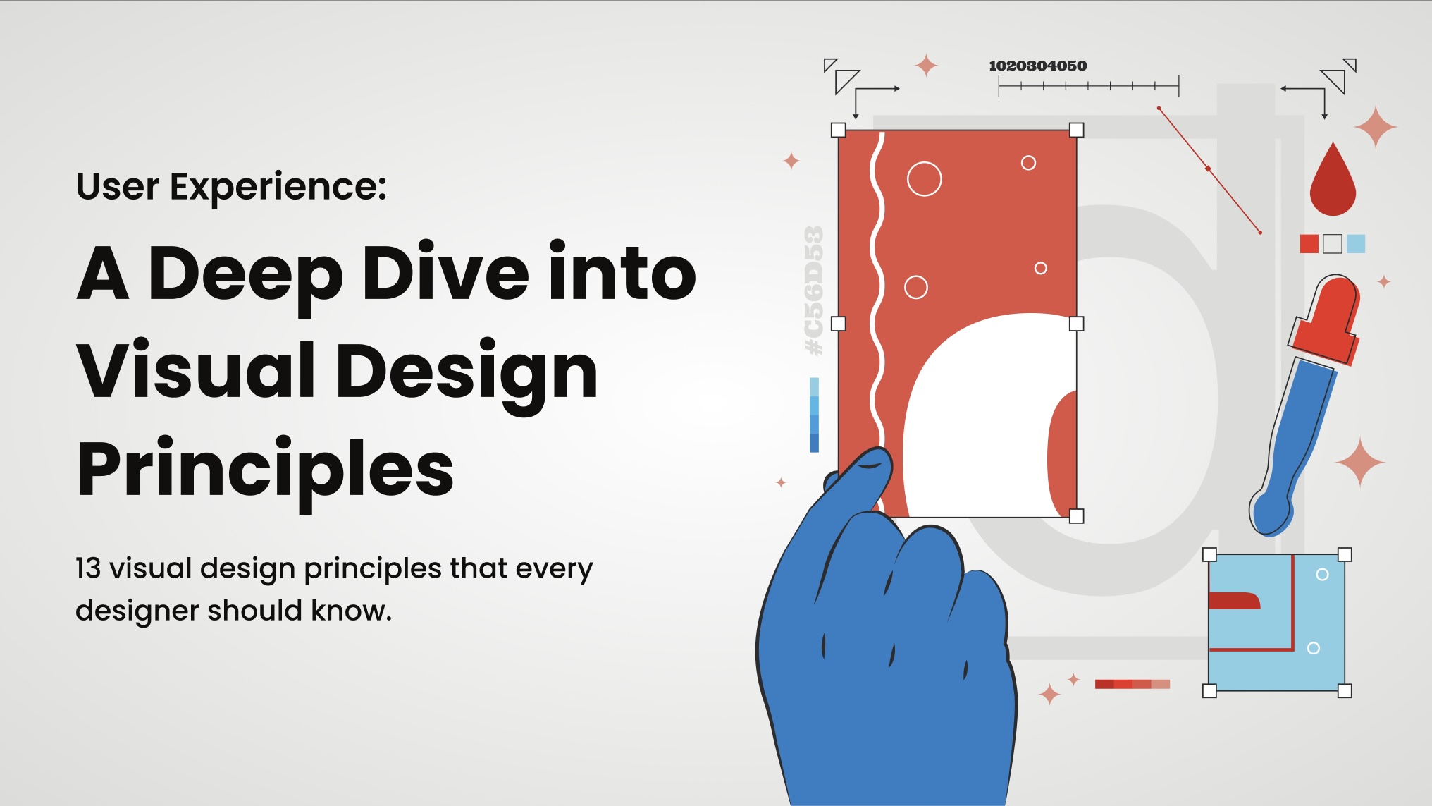
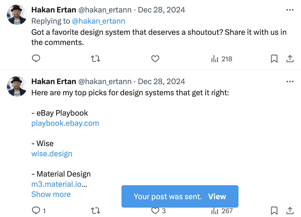
The Ultimate Design System Glossary: 133 Terms to Know in 2025
Ever fumbled through a design meeting, lost in terms like “tokens” or “patterns”? A solid design system glossary is your lifeline—unifying teams and streamlining workflows.
In this blog, I unpack 133 essential terms across six categories, giving you the ultimate resource to master design systems and boost collaboration.
Table of Contents
1. UI Components
UI elements forming the building blocks of interfaces, ensuring all common components are represented.
Interactive Elements
Button
A clickable element that triggers actions, like submitting forms or navigating pages.
Progress Bar
A visual indicator showing the progress of an operation, helping users track completion.
Slider
A control for selecting a value from a range, such as volume or brightness.
Spinner/Loader
An animation indicating that content is loading or a process is ongoing.
Switch
A toggle control for on/off states, simplifying binary choices.
Toggle
A button that switches between two states, like on/off or play/pause.
Forms
Check Box
A control for selecting multiple options from a set.
Color Picker
A tool for selecting colors, typically used in design or customization settings.
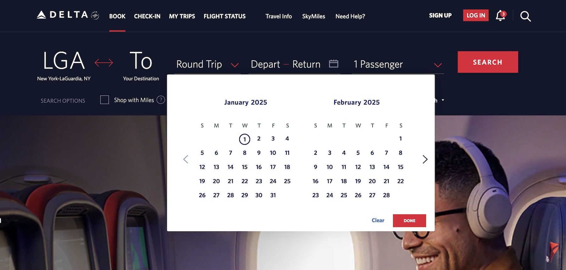
Date Picker
A control for selecting dates from a calendar interface.
File Uploader
A component allowing users to upload files, often with drag-and-drop functionality.
Input Field
A field for user data entry, such as text, numbers, or passwords.
Label
Text describing or identifying another element, like a form field.
Radio Button
A control for selecting one option from a set.
Text Area
A multi-line input field for longer text entries.
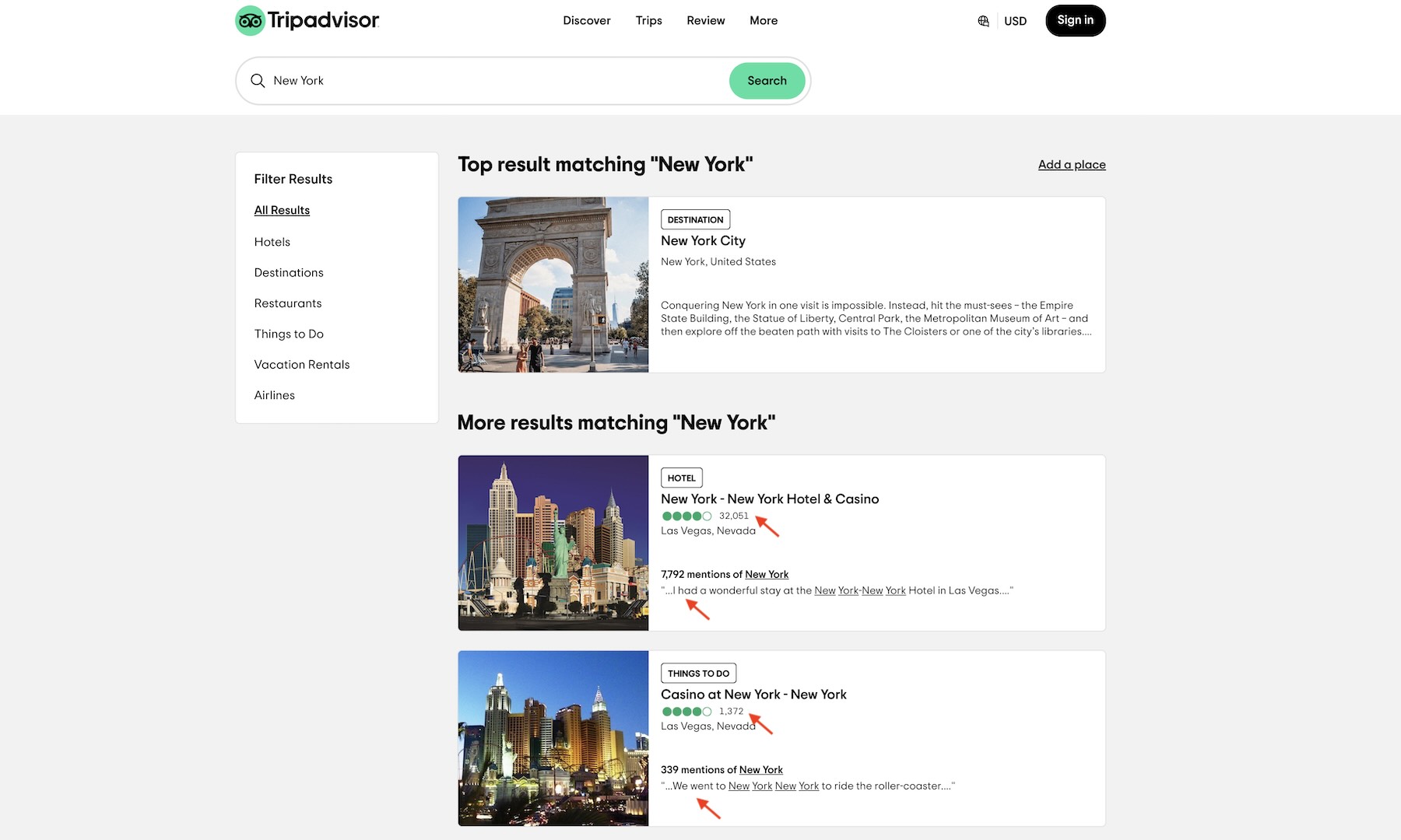
Search Bar
A specialized input field for entering search queries, often with a magnifying glass icon.
Select Box (Dropdown)
A list of options where users can select one or more items.
Time Picker
A control for selecting time, often with hour and minute inputs.
Validation Message
Feedback text indicating whether form inputs are valid or need correction.
Navigation
Breadcrumb
A navigation aid showing the user’s location within the site hierarchy.
Menu
A list of options or links, often used for navigation or actions.
Navigation Bar
A bar providing links to different sections of the site or app.
Pagination
Controls for navigating through multiple pages of content, like search results.
Stepper
A component guiding users through a multi-step process, such as checkout or onboarding.
Tab
A component for switching between different views or sections within the same context.
Content Display
Avatar
A visual representation of a user, often a profile picture or initial.
Badge
A small indicator showing status, notifications, or counts.
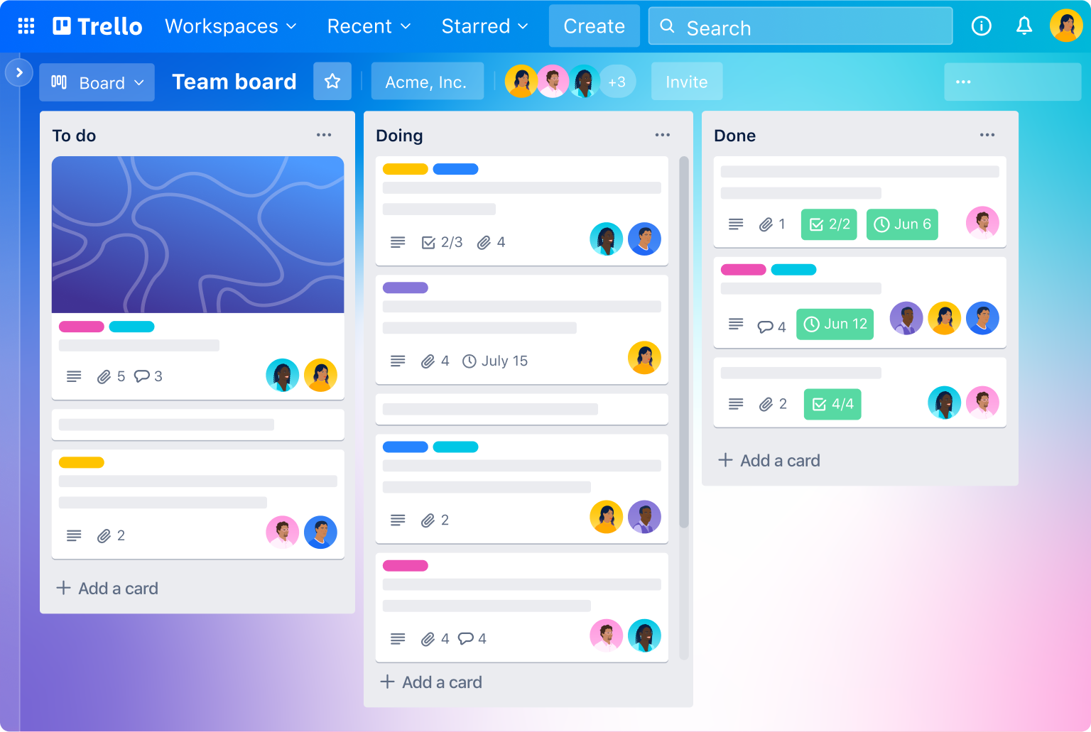
Card
A container for grouping related content, often with images, text, and actions.
Divider
A horizontal or vertical line used to separate content sections.
Header
A text element for titles and headings, providing content hierarchy.
Icon
A small, symbolic image representing actions, objects, or concepts.
Image
A visual element for displaying pictures, photos, or graphics.
Link
A collection of items, which can be ordered, unordered, or descriptive.
Table
A structured grid for displaying data in rows and columns, often with sorting and filtering.
Modals and Overlays
Alert Dialog
A modal for critical messages that require acknowledgment.
Confirmation Dialog
A modal asking users to confirm an action, like deleting an item.
Drawer
A sliding panel that appears from the side, often used for navigation or additional content.
Modal
A dialog that appears over the main content, requiring user interaction.
Popover
A small overlay that appears on click, often used for menus or additional options.
Tooltip
A small pop-up providing additional information on hover or focus.
Feedback and Notifications
Alert
A message that requires user attention or action, often for errors or warnings.
Notification (Toast):
A temporary message that appears on the screen to inform users of an event.
Progress Indicator
A visual cue (e.g., circular or linear) showing the status of an ongoing process.
Snackbar
A brief message that appears at the bottom of the screen, often with an action.
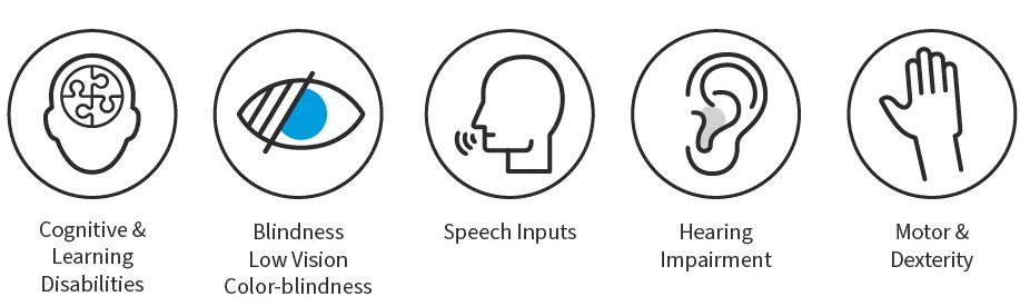
Accessibility Components
ARIA Roles and Landmarks
Attributes that define the role and structure of elements for screen readers.
Focus Indicator
A visual cue (e.g., outline) showing which element currently has keyboard focus.
Skip Link
A navigation link allowing users to bypass repetitive content, improving accessibility.
Layout and Structure
Accordion
A vertically stacked list of items that can be expanded or collapsed to show/hide content.
Carousel
A rotating set of content items, often used for images or featured content.
Container
A wrapper element that holds and constrains content within a defined area.
Flex Container
A flexible box layout for arranging elements in a row or column.
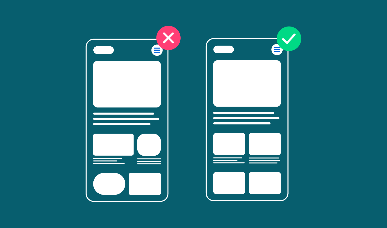
Grid
A layout system for aligning elements in rows and columns, ensuring responsive design.
Spacer
An invisible element used to create space between other components.
Media and Specialized Components
Audio Player
A component for embedding and controlling audio playback.
Chart/Graph
Visual representations of data, such as bar charts, line graphs, or pie charts.
Container
A wrapper element that holds and constrains content within a defined area.
Map
An interactive component for displaying geographical data or locations.
Rich Text Editor
A tool for formatting text, often used in content management systems.
Video Player
A component for embedding and controlling video playback.
2. Design System Concepts
Foundational and structural aspects defining how design systems function and scale.
Atomic Design
Breaks design into atoms, molecules, organisms, templates, and pages for modularity.
Component
A reusable snippet of code or design element, like a button or input field.
Component Library
A collection of pre-built UI elements, like buttons, ready for design and development use.
Consistency
Maintains uniform design across platforms, reducing user confusion and dev rework.
Component Library
A collection of pre-built UI elements, like buttons, ready for design and development use.
Cross-Functional Collaboration
Unites designers, devs, and stakeholders, aligning system goals across teams.
Component API
Defines how components interact with code, bridging design and development seamlessly.
Design Debt
Tracks shortcuts needing fixes, planning refinements to maintain system health.
Design Handoff
Transfers system specs to developers, ensuring accurate implementation with clear docs.
Design Language
A shared visual and functional style, tying all system elements together cohesively.
Design System
A centralized set of components, guidelines, and tools ensuring consistent design across products.
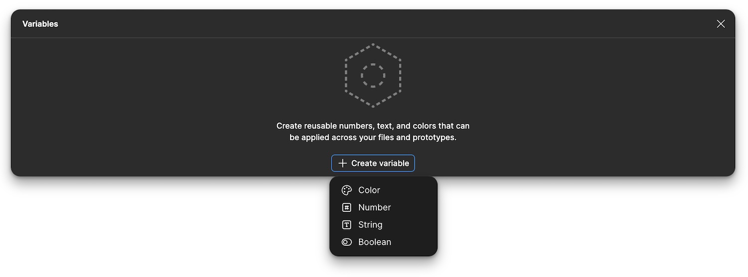
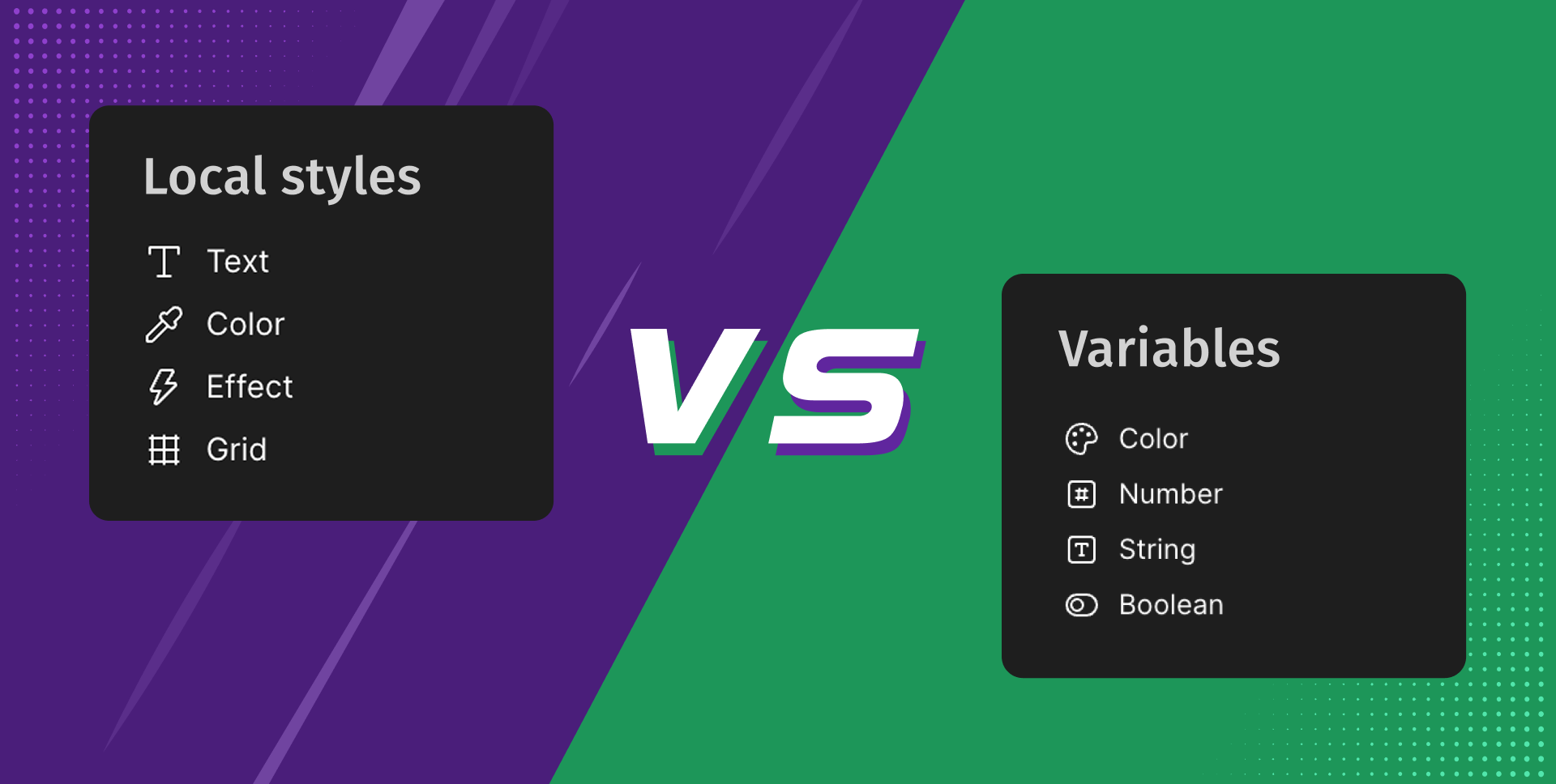
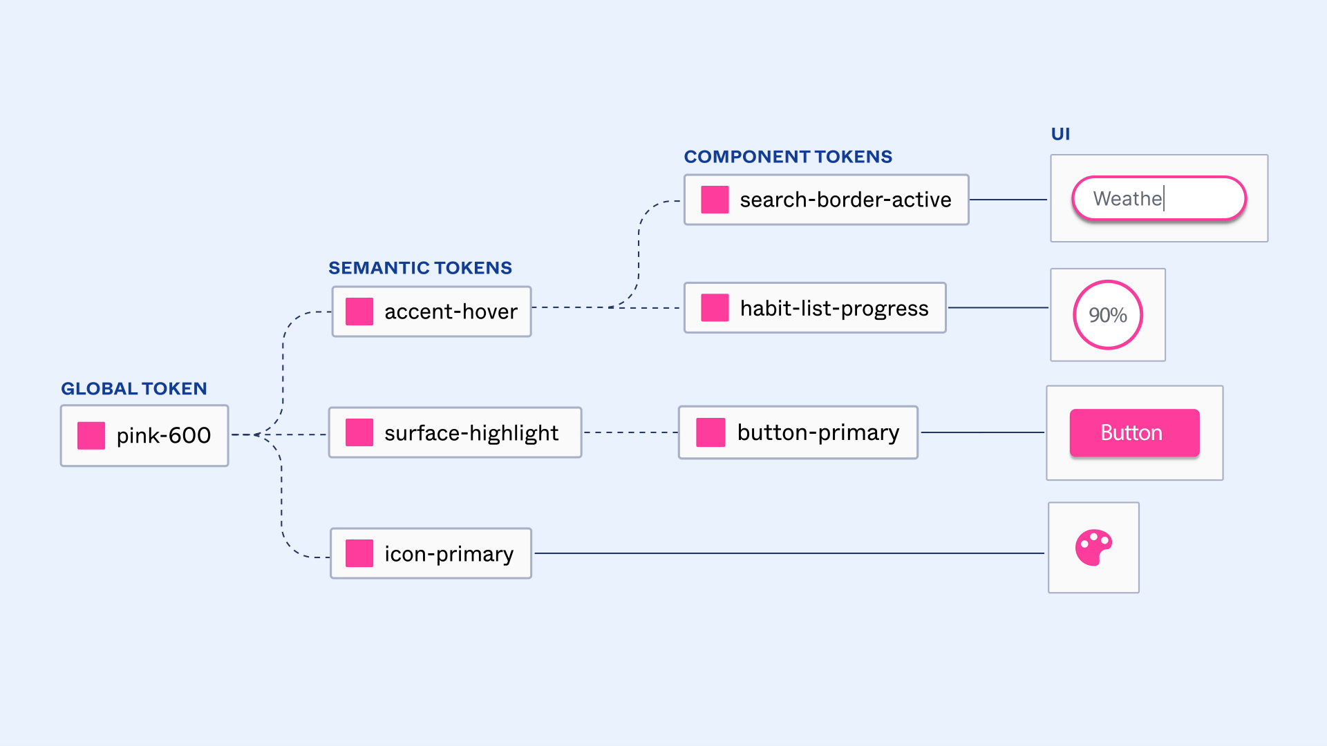
Design Tokens
Core values (e.g., color codes, font sizes) stored for consistent use across platforms.
Documentation
Explains system usage with examples, helping teams adopt and apply it effectively.
Grid System
Aligns elements with a structured layout, ensuring balance and responsiveness.
Iconography
Curates a set of icons, standardizing visual cues for quick user recognition.
Modularity
Builds components independently, allowing updates without affecting the whole system.
Scalability
Plans system growth, adapting to new features or products without breaking consistency.
State
Component condition (e.g., active, disabled) for interactive feedback and behavior.
Style Guide
Defines visual standards—colors, typography, spacing—for a unified look across interfaces.
System Adoption
Encourages team use of the system, embedding it into workflows for efficiency.
Theme
Sets a customizable visual style (e.g., light/dark mode) applied system-wide.
Token (Code Tokens)
Variables in code representing design values, ensuring consistency.
Tokens Workflow
Manages design token creation and updates, syncing them across tools and teams.
UI Kit
Offers a ready-to-use set of interface elements, speeding up prototyping and coding.
Utility
Helper classes or functions aiding component use, separating logic from display.
Variant
Component version (e.g., primary/secondary button) offering design flexibility.
Version Control
Tracks changes to system assets, keeping updates organized and accessible for teams.
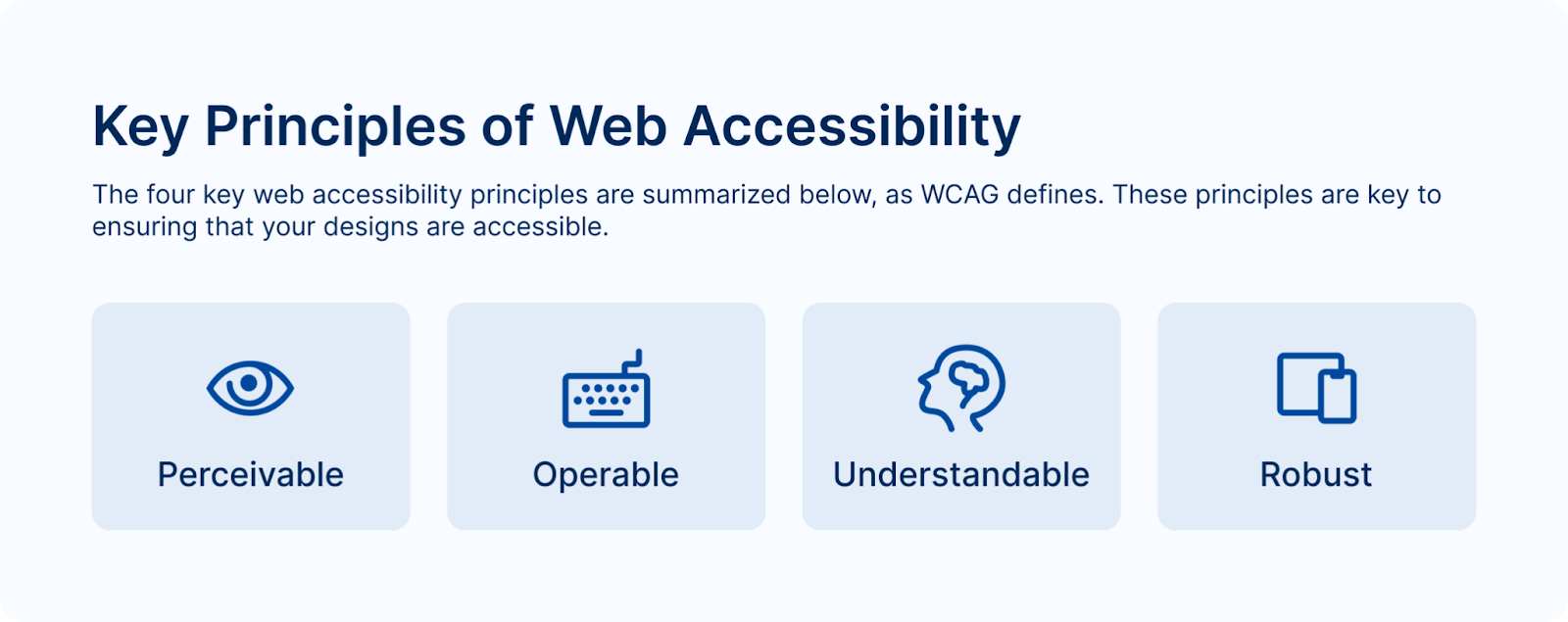
3. Guidelines and Standards
Rules and best practices ensuring consistent and inclusive application.
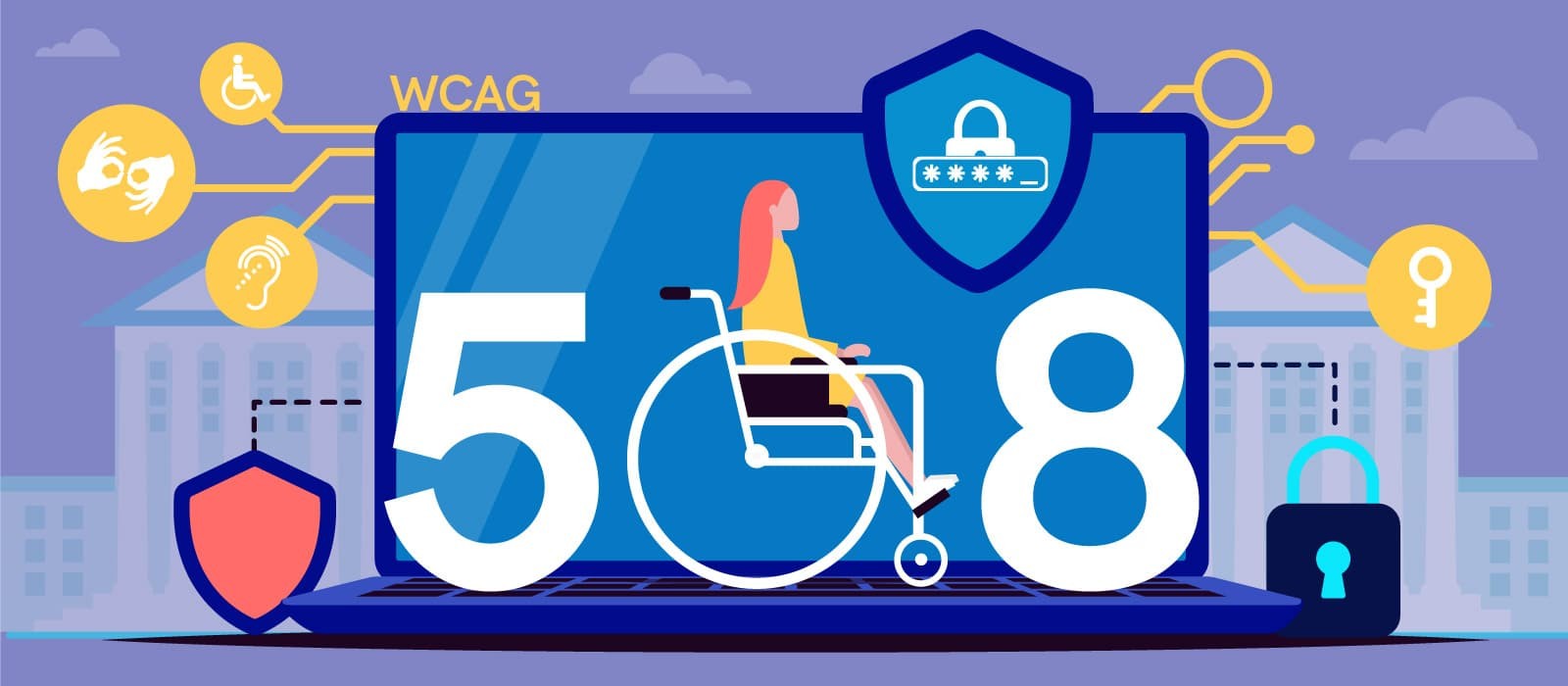
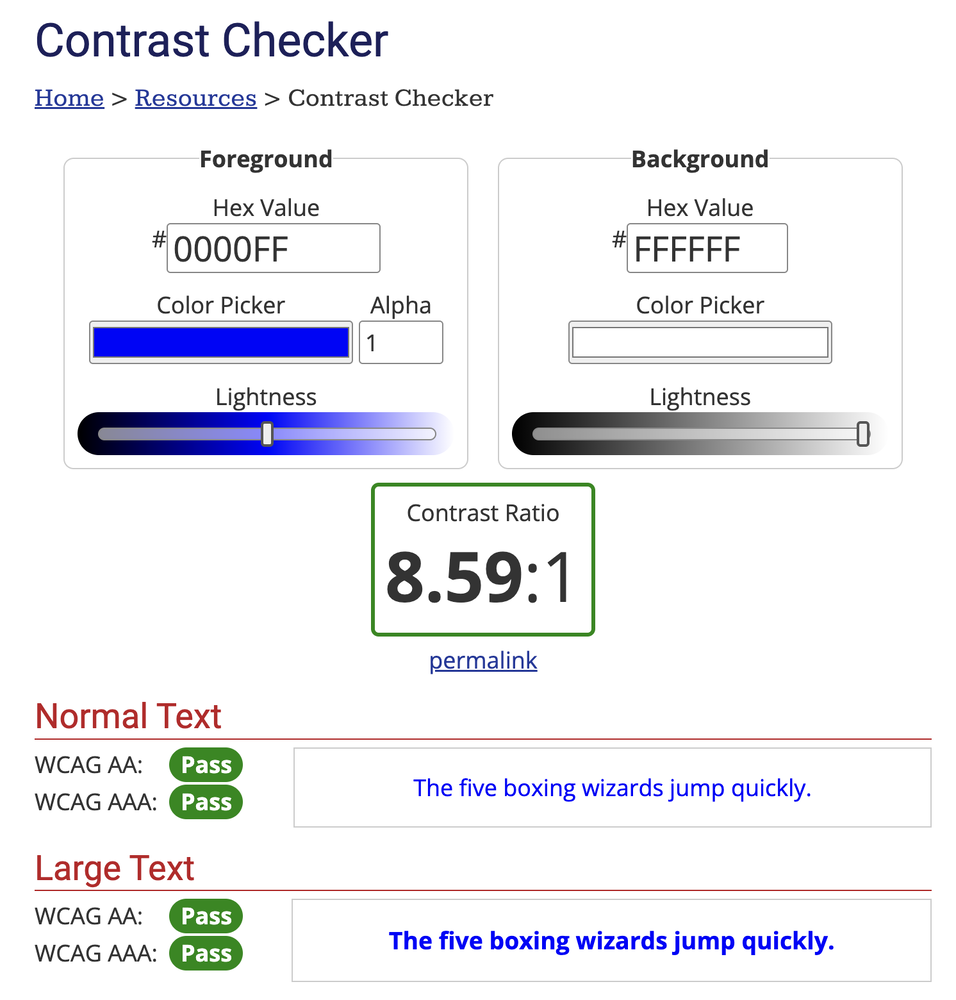
Accessibility
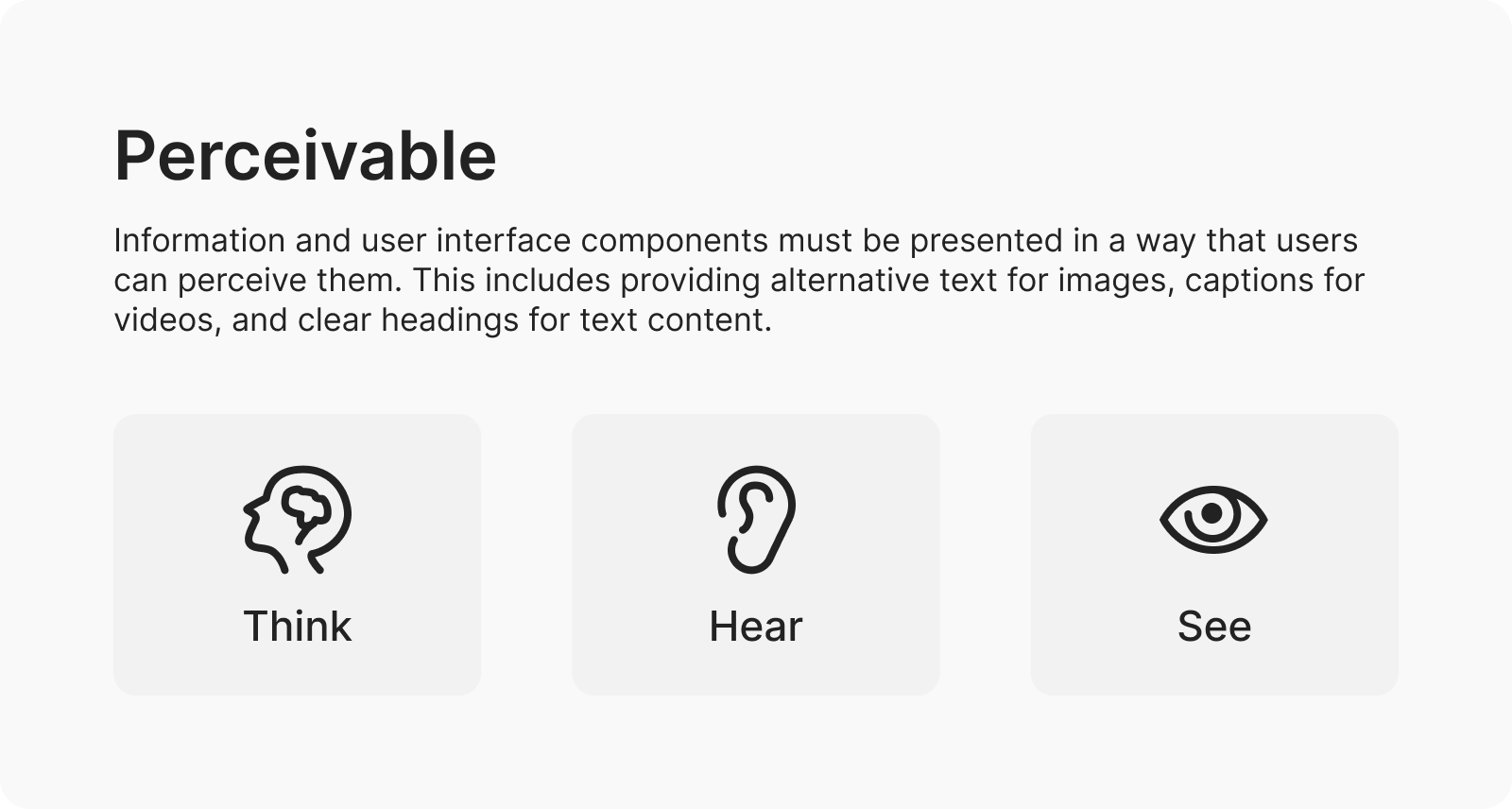
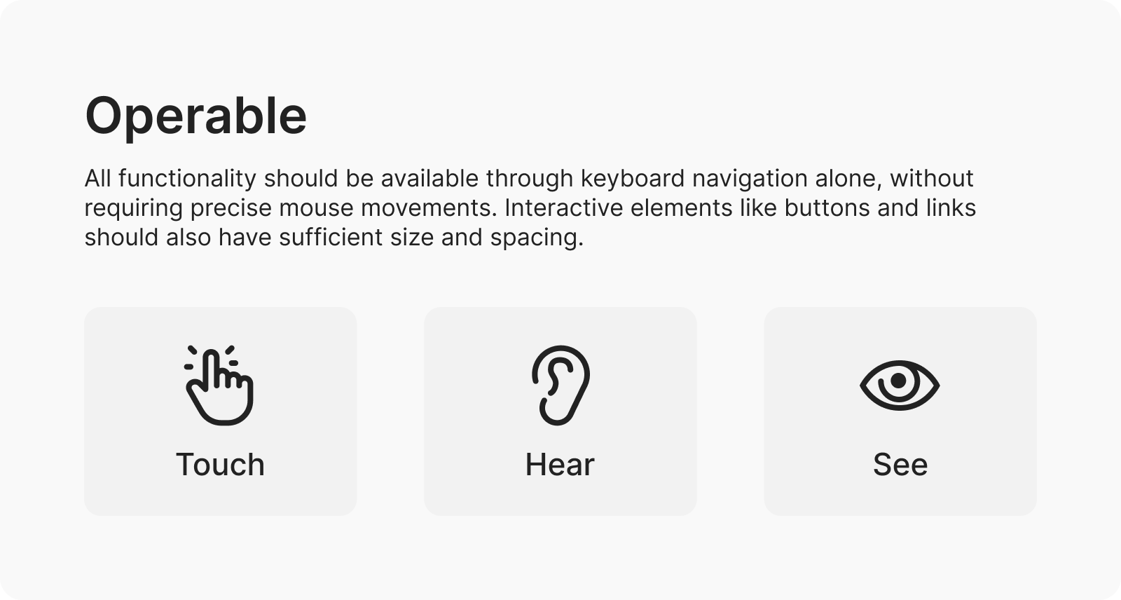
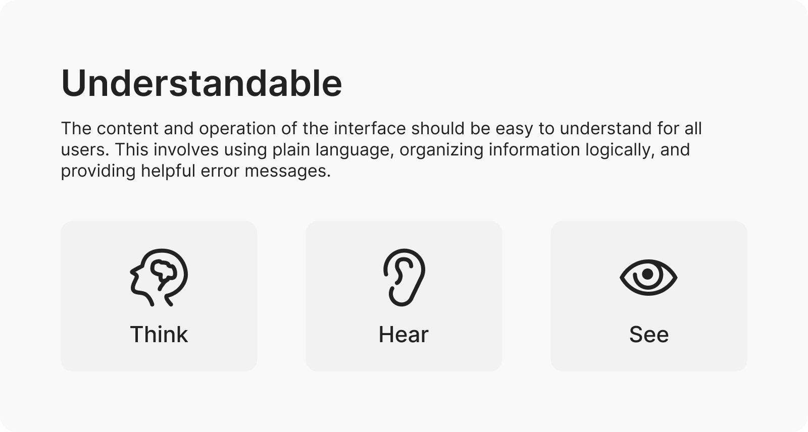
Ensures designs are usable by all, including those with disabilities (e.g., WCAG).
Accessibility Standards
Ensures components meet guidelines like WCAG, making designs inclusive for all users.
Brand Voice
Sets tone and language guidelines, reflecting brand personality consistently.
Component Governance
Sets rules for adding/updating components, keeping the system orderly.
Design Principles
Core values (e.g., clarity, efficiency) shaping design decisions system-wide.
Guidelines
Suggestions or rules for using the design system, covering principles and branding.
4. Patterns and Templates
Reusable solutions for common design problems and layouts.
Chunking
Divides content into manageable sections, improving comprehension and recall.
Error Handling
Defines reusable solutions for displaying and managing errors, ensuring clear user feedback.
Fitts’s Law
Optimizes target size and placement, making interactions faster and easier.
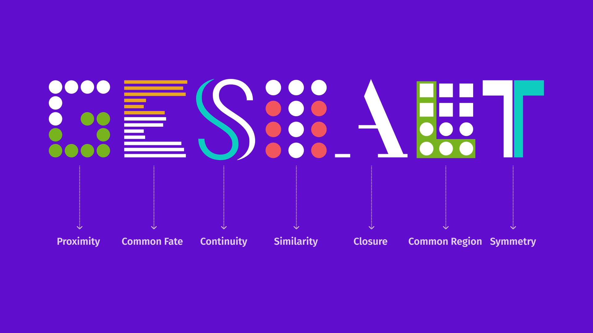
Gestalt Principles
Leverages perception rules (e.g., proximity) for intuitive, cohesive layouts.
Hick’s Law
Reduces options to speed up decisions, simplifying user choice processes.
Microinteractions
Small animations (e.g., button clicks) boosting engagement and feedback.
Motion Design
Uses animation to guide users, clarifying actions and enhancing experience.
Navigation
Organizes user movement through a product, enhancing findability and ease.
Onboarding
Introduces users to products with clear, guided steps for quick adoption.
Pattern
A reusable flow or combination of components solving common design problems.
Pattern Library
Documents reusable design solutions, like forms, for common user tasks or layouts.
Progressive Disclosure
Reveals information gradually, preventing overwhelm and aiding focus.
5. Tools
Software and resources supporting design system creation and maintenance.
Abstract
Streamlines design file management, tracking versions for efficient workflows.
Adobe XD
Supports design, prototyping, and team collaboration, integrating with Adobe suite.
CSS Modules
CSS files with locally scoped names, avoiding conflicts in large projects.
Figma
Collaborative tool for designing, prototyping, and sharing components in real time.
GitHub
Hosts version control for system code and assets, enabling team collaboration.
Sketch
Vector-based design tool for creating system interfaces, focusing on precision.
Storybook
Environment for developing and testing UI components independently, with live previews.
Stylesheet
CSS file defining visual appearance of components and pages.
Tokens Studio
Manages design tokens, syncing across platforms for consistent design values.
UXPin
Prototypes with code-based components, offering realistic testing environments.
Zeroheight
Centralizes design docs, aligning teams on guidelines and fostering collaboration.
Zeplin
Bridges design and development, exporting assets and specs for seamless handoff.
6. Processes
Workflows and methodologies for managing and evolving design systems.
Accessibility Audit
Reviews components for inclusivity standards, ensuring compliance.
Sketch
Tracks component updates, managing changes for compatibility.
Design Critique
Uses feedback sessions to refine system components collaboratively.
Design System Audit
Reviews system health, identifying gaps for improvement.
Federated Model
Multiple teams contribute to the system, distributing responsibility.
Governance
Approach to keep the system updated, including contribution processes.
Iteration
Refines system through continuous feedback, enhancing design over time.
Modular Design:
Emphasizes reusable components, promoting flexibility and maintainability.
Pilot
A proof-of-concept project testing system implementation before adoption.
Prototyping
Builds mockups with components, testing ideas early for feedback.
Reference Site
A URL displaying the component library and guidelines as a source of truth.
Release Management
Coordinates system updates and deployments, ensuring rollouts and version tracking.
Stakeholder Alignment
Ensures all parties agree on system goals, fostering buy-in.
System Maintenance
Updates and optimizes the system, keeping it relevant.
User Testing
Validates usability with real users, identifying issues for improvement.

