- Hakan Ertan
- December 21, 2024
- No Comments
- 1 minute
How to Use Principles of Design
Visual design principles are a framework for product design. They help designers craft interfaces that better communicate with users. As a product designer, I discovered the huge impact these principles play in driving digital innovation. They design everything, from where to put elements on a page to how to use whitespace and contrast. Applying visual design principles, you can craft designs that will put the needs and goals of the users in their rightful place.
In this article, we will explore 13 foundational principles:
Scale
Visual Hierarchy
Balance
Contrast
Gestalt Principles
Consistency
Negative Space
Emphasis
Unit
Accessibility
Simplicity
Movement
Repetition
1. Scale
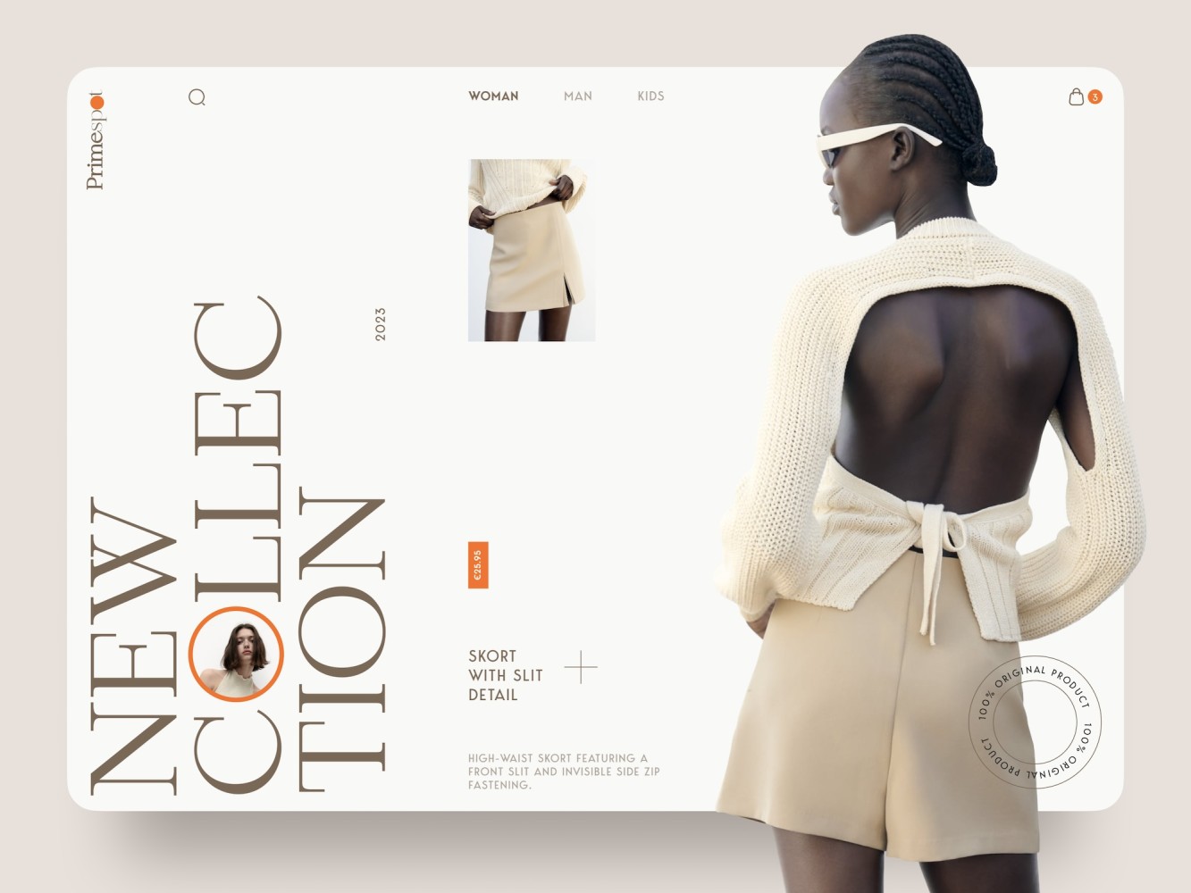
Scale refers to the relative size of elements, such as text, buttons, or images, used to create visual hierarchy and enhance user experience. By intentionally varying sizes, designers guide attention, emphasize key content, and ensure interfaces are intuitive and visually balanced.
How scale works
Scale operates by adjusting the size of design elements to establish relationships and prioritize information:
- Visual hierarchy: Larger elements attract more attention, signaling importance (e.g., a bold headline overshadows smaller text).
- Emphasis: Key actions or content, like a prominent “Sign Up” button, are scaled up to stand out.
- Balance and proportion: Proper scaling prevents cluttered or empty layouts, maintaining harmony.
- User Guidance: Scaled elements direct users naturally, such as oversized navigation icons for easy interaction.
Applying scale
- Prioritize content: Use larger sizes for critical elements, like a 48px hero title paired with a 24px subtitle and 16px button text, to guide focus.
- Maintain consistency: Ensure proportional scaling across elements to avoid visual chaos.
- Adapt for responsiveness: Adjust scale for different devices, keeping elements functional and balanced on mobile or desktop.
- Test for clarity: Validate that scaled elements enhance usability and don’t overwhelm or confuse users.
2. Visual hierarchy
Visual hierarchy is a crucial aspect of design. It uses many principles and tactics to guide the user’s focus accordingly.
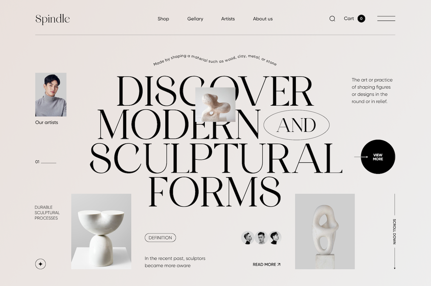
Factors affecting the visual hierarchy include:
1. Size: A larger element can capture more attention than a smaller one.
2. Color: A bright or contrasting color will draw more attention to an element in its surroundings.
3. Contrast: Variations in brightness, saturation, or texture create visual differences that will attract attention.
4. Placement: Elements in prominent places or the center of a design tend to be perceived as important.
The techniques to establish a visual hierarchy:
- Element hierarchy: Grouping related elements and utilizing differences in size, color, or placement to denote their significance.
- Typography: Employing variations in font styles and sizes to emphasize crucial text.
- Whitespace: Incorporating space around vital elements to enhance their visibility.
- Visual cues: Utilizing arrows, icons, or other graphical elements to direct attention towards specific focal points.
- Progressive disclosure: Gradually unveiling information, starting with the most pertinent details.
By applying these techniques in the right way, you can maximize the user experience, making sure information is communicated without overwhelming the audience.
3. Balance
Balance is the distribution of visual elements within a composition to create a sense of equilibrium and stability. It’s about arranging elements in a way that feels harmonious and visually pleasing.
How balance works
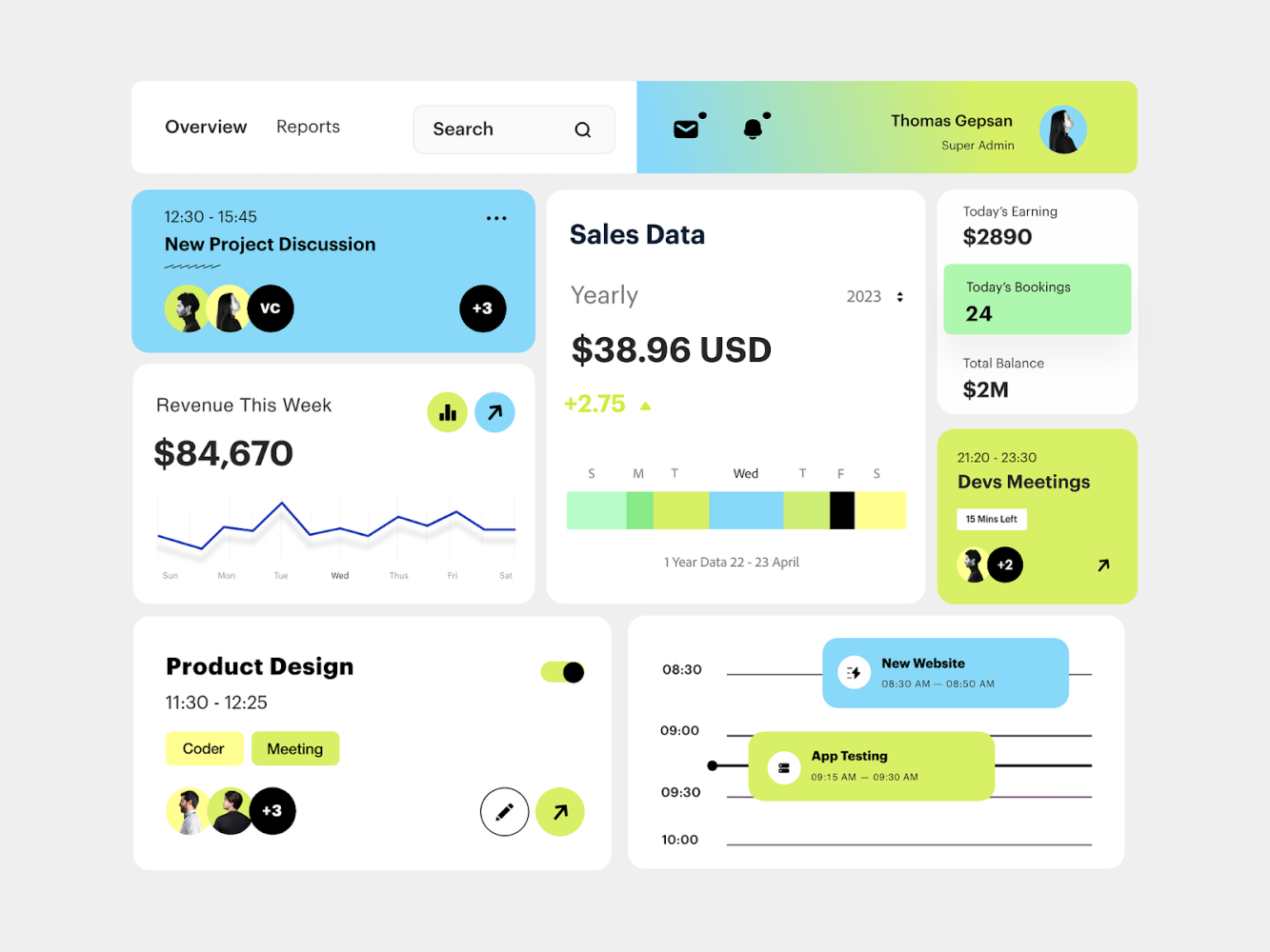
There are several types of balance in design, including symmetrical, asymmetrical, radial, mosaic, and discordant.
Symmetrical balance
Symmetrical balance involves arranging elements in a way that mirrors each other on either side of a central axis, creating a sense of stability and order.

Asymmetrical balance
Asymmetrical balance, on the other hand, involves arranging elements of different sizes or visual weights to achieve balance through contrast and variation.

Radial balance
Radial balance radiates outward from a central point, creating a dynamic and cohesive composition.
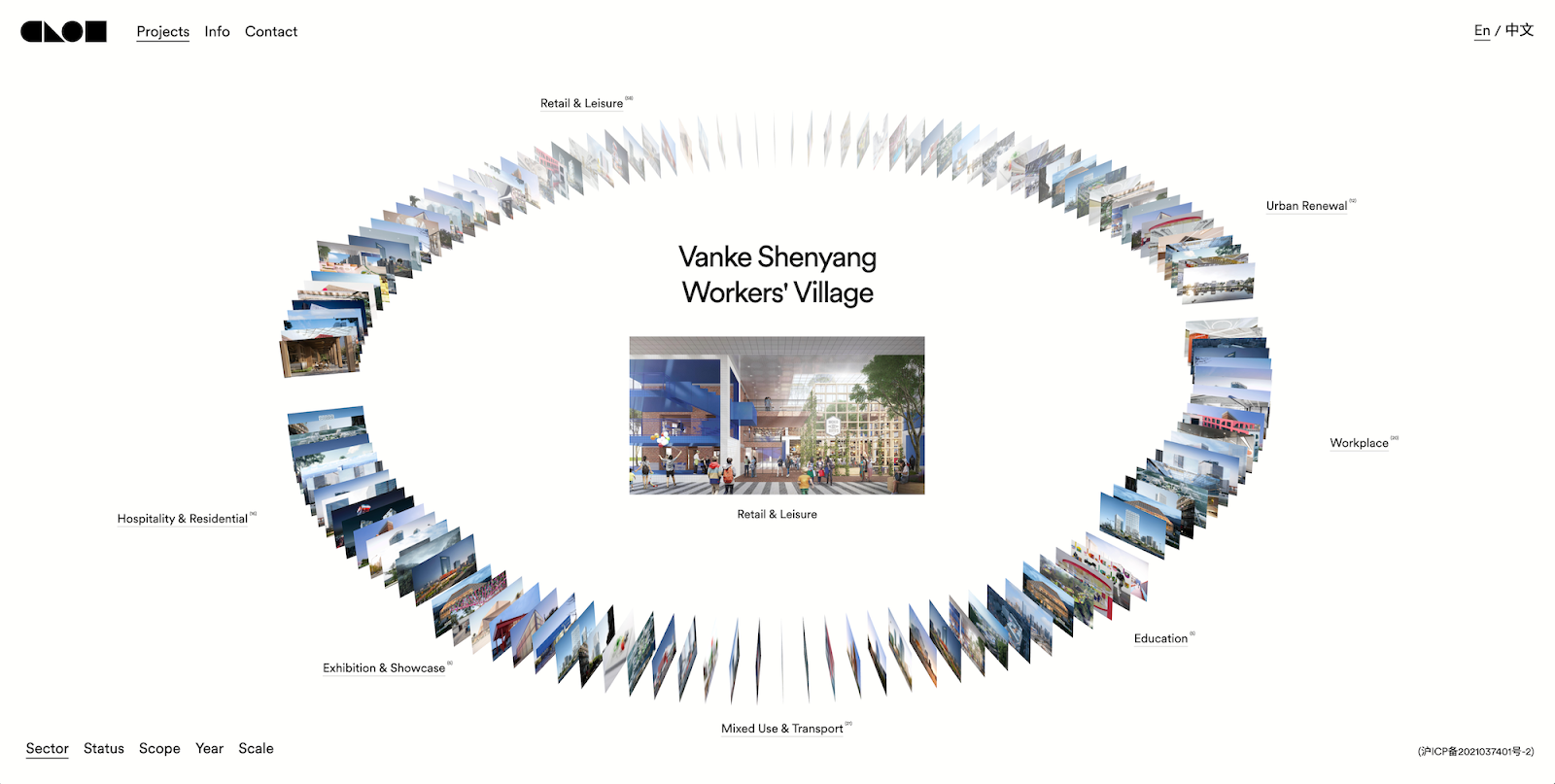
Mosaic balance
Mosaic balance involves seamlessly integrating a variety of diverse elements into a unified and cohesive whole.
Applying balance
You can achieve balance by strategically arranging elements within a composition to create visual harmony and cohesion. This may involve using:
- Symmetrical balance for formal and traditional designs
- Asymmetrical balance for more dynamic and contemporary compositions
- Radial balance for designs that radiate outward from a central focal point
Understanding and applying the principles of balance enables you to create compositions that are visually engaging, aesthetically pleasing, and effectively convey their intended message.
Mosaic balance involves seamlessly integrating a variety of diverse elements into a unified and cohesive whole.
What others are looking at right now
4. Contrast
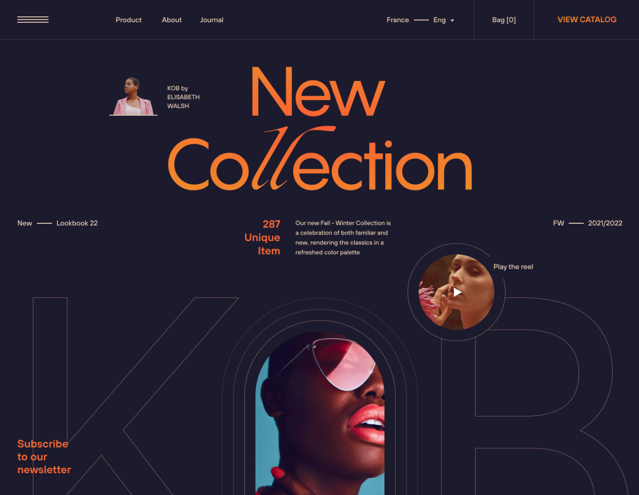
Contrast is like a powerful surge of energy that grabs your attention in any design. It’s all about how different elements in a composition interact with each other, creating excitement and guiding the user’s eye toward important areas.
How contrast works
Contrast adds life to design by placing elements with different characteristics side by side—whether it’s color, size, or texture. This adds visual appeal and directs the user’s attention to important areas, making the design more engaging and understandable.
Contrast serves as a powerful tool for:
- Highlighting key information
- Creating the hierarchy
- Improving readability in design
Applying contrast
Contrast can be strategically used to create visual impact. By carefully selecting and pairing elements with contrasting attributes, such as light and dark colors, large and small sizes, or smooth and textured surfaces, you can create dynamic compositions.
- Use light and dark colors to create a sense of depth and dimension.
- Use large and small elements to establish a hierarchy and guide the user’s focus.
Whether used subtly or boldly, contrast adds depth and dimension to design, making it visually compelling and engaging.
Items recently browsed by shoppers
5. Gestalt principles
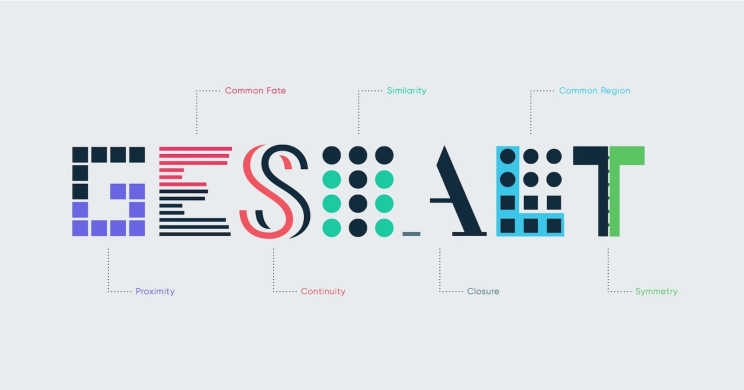
Gestalt principles explain human perception and visual input organization, describing how our minds assemble parts in a puzzle to reveal meaningful patterns.
How Gestalt works
Gestalt principles, rooted in the idea that the whole is more than the sum of its parts, explain how our brains process visual data:
Proximity: Elements that are close to each other are understood as related.
Continuity: A preference is given to smooth, flowing elements vs disrupted segments.
Similarity: Objects that share some characteristics in color, shape, or size are grouped.
Closure: Our minds have a natural tendency to complete shapes or patterns that are incomplete to view them as a whole.
Figure-Ground Relationship: Items are usually perceived as either in the foreground or the background.
Applying Gestalt
Using Gestalt principles, you can create unified and user-friendly designs by:
- Direct user attention where you want them to go.
- Demonstrate a visual hierarchy.
- Connect independent elements of design.
Integrating Gestalt principles into your creations provides intuitive functioning and long-lasting appeal, whether in web design, app development, or print media.
6. Consistency
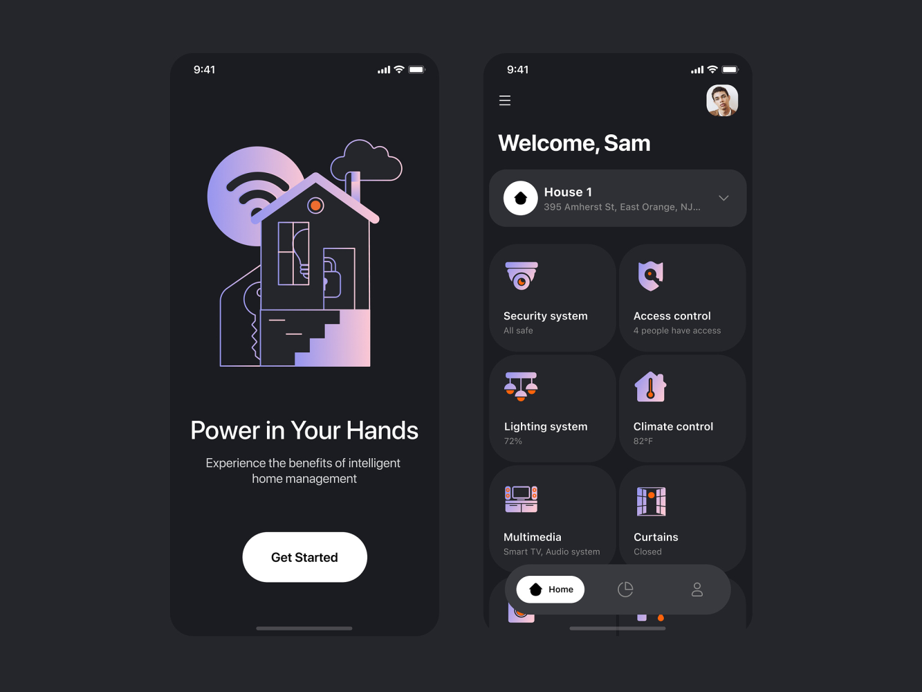
Consistency is the basis of good design and can also create a sense of familiarity and predictability for the user when interacting with a product or interface.
How consistency works
Consistency refers to the idea that design elements should remain the same across different pages or sections of a product or interface. This includes aspects such as:
- Color
- Font
- Layout
- Interactions
Maintaining consistency in these areas enables users to quickly adapt to your design’s visual style and interaction patterns. This, in turn, allows them to navigate through your design more easily and understand how the interface works intuitively.
Applying consistency
To achieve consistency, it is crucial to establish and adhere to design standards and guidelines throughout the entire design process.
1. Defining key design elements like:
- Color palettes
- Font styles
- Button styles
- Icons
2. Documenting these design elements for future reference.
3. Ensuring their consistent application across all instances of the interface.
Consistency also extends beyond visual aspects. It encompasses how tasks are performed within the interface:
- Similar actions yield similar results
- Users can rely on familiar patterns to accomplish their goals
You can create a cohesive user experience by incorporating consistency principles into your design approach.
7. Negative Space
Negative space, aka whitespace, is the area between design elements like text, images, graphics, and illustrations. Whitespace helps to provide harmony, hierarchy, and clarity in a design.
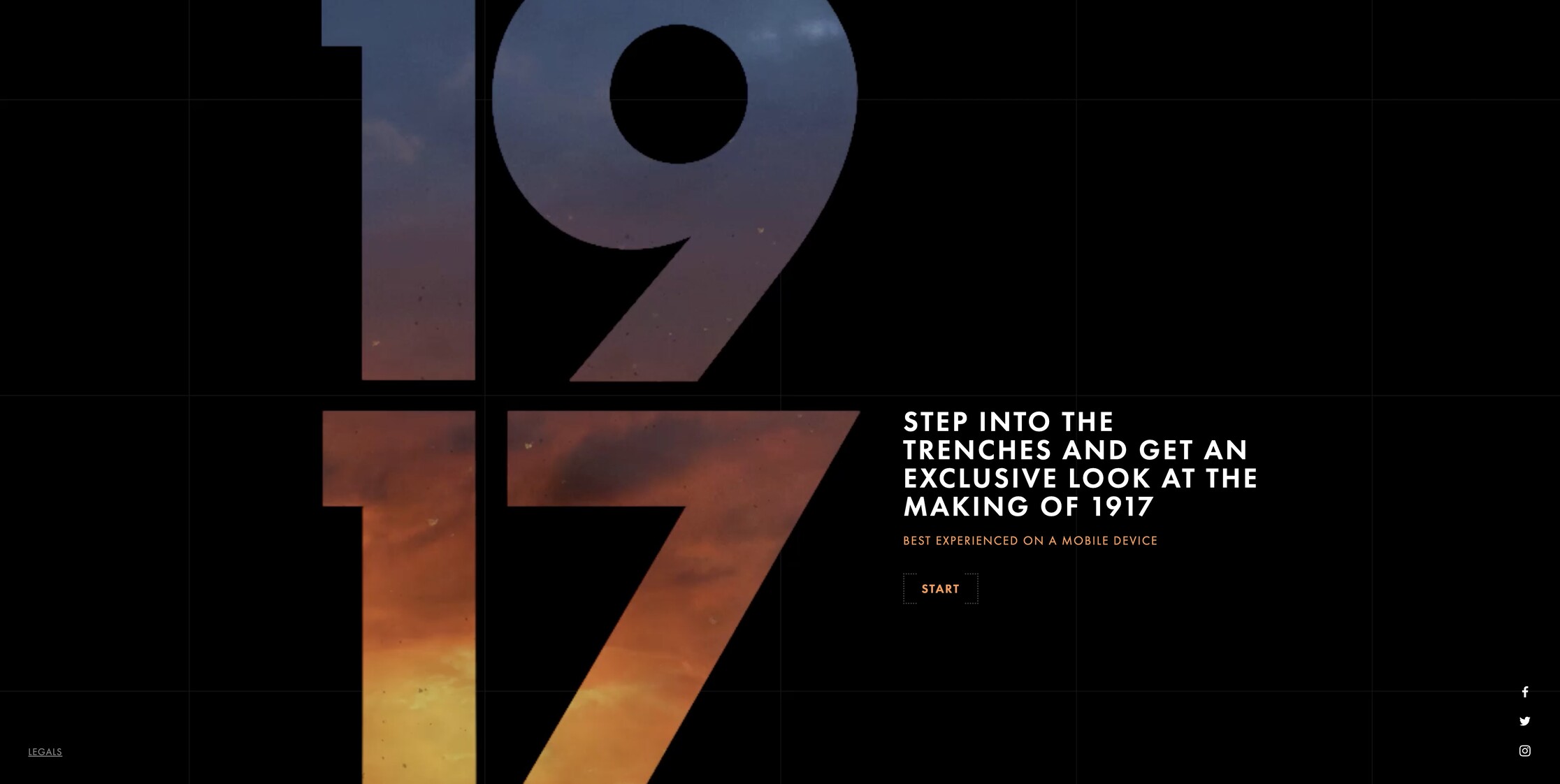
How negative space works
Whitespace serves several purposes in design:
- Breathing room: Generates breathing space within designs, allowing elements to stand out and making it easier to understand the content.
- Visual organization: Helps declutter visuals by separating different elements and guiding attention toward important content or features.
- Emphasis: Whitespace can be used strategically to highlight specific elements. Elements surrounded by more whitespace naturally appear more prominent than those with less surrounding space.
Applying negative space
You can use negative space intentionally to enhance both the visual appeal and functionality of their designs.
- Highlighting key elements: By adding whitespace around important elements like headings, images, or buttons, you can make them visually stand out and create a sense of elegance.
- Improving readability: Whitespace can also improve readability by increasing line height, making it easier to read.
- Maintaining balance: It’s crucial to find the right balance between whitespace and content. Too much whitespace can make a design feel empty and unfinished, while too little can overwhelm users with visual clutter.
8. Emphasis
Emphasis represents the strategic use of design elements to draw attention, create a focal point, and manage the user’s attention.
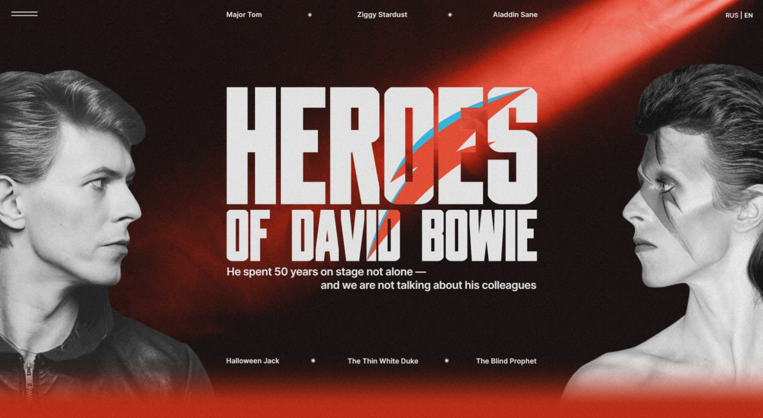
How emphasis works
Emphasis is the process of making some things more noticeable than others. It manages the user’s behavior by forcing them to immediately focus on high-priority details.
You can add emphasis to elements using these techniques:
- Color: Use bold or contrasting colors to make elements visually distinct.
- Size: Increase the size of important elements to make them more noticeable.
- Typography: Choose fonts that convey significance or use variations like italics or bold.
- Contrast: Place light colors against a dark background to create visual separation.
- Placement: Position crucial elements in central or prominent locations on the page.
Applying emphasis
You can apply emphasis by carefully selecting and highlighting key elements within a design.
Some common ways of applying emphasis include:
- Using bold or vibrant colors to make certain elements pop
- Increasing the size or weight of text to make it more prominent
- Positioning important elements in a central or prominent location on the page
- Creating contrast by placing light-colored elements against a dark background
You need to use emphasis judiciously and in a way that enhances the overall user experience. Overuse of emphasis can lead to visual clutter and confusion, while underuse can result in important information being overlooked.
9. Unity
As the term suggests, unity describes the overall coherence and harmony of a composition or layout. When the various elements of a website complement each other, a sense of completeness and harmony is achieved.
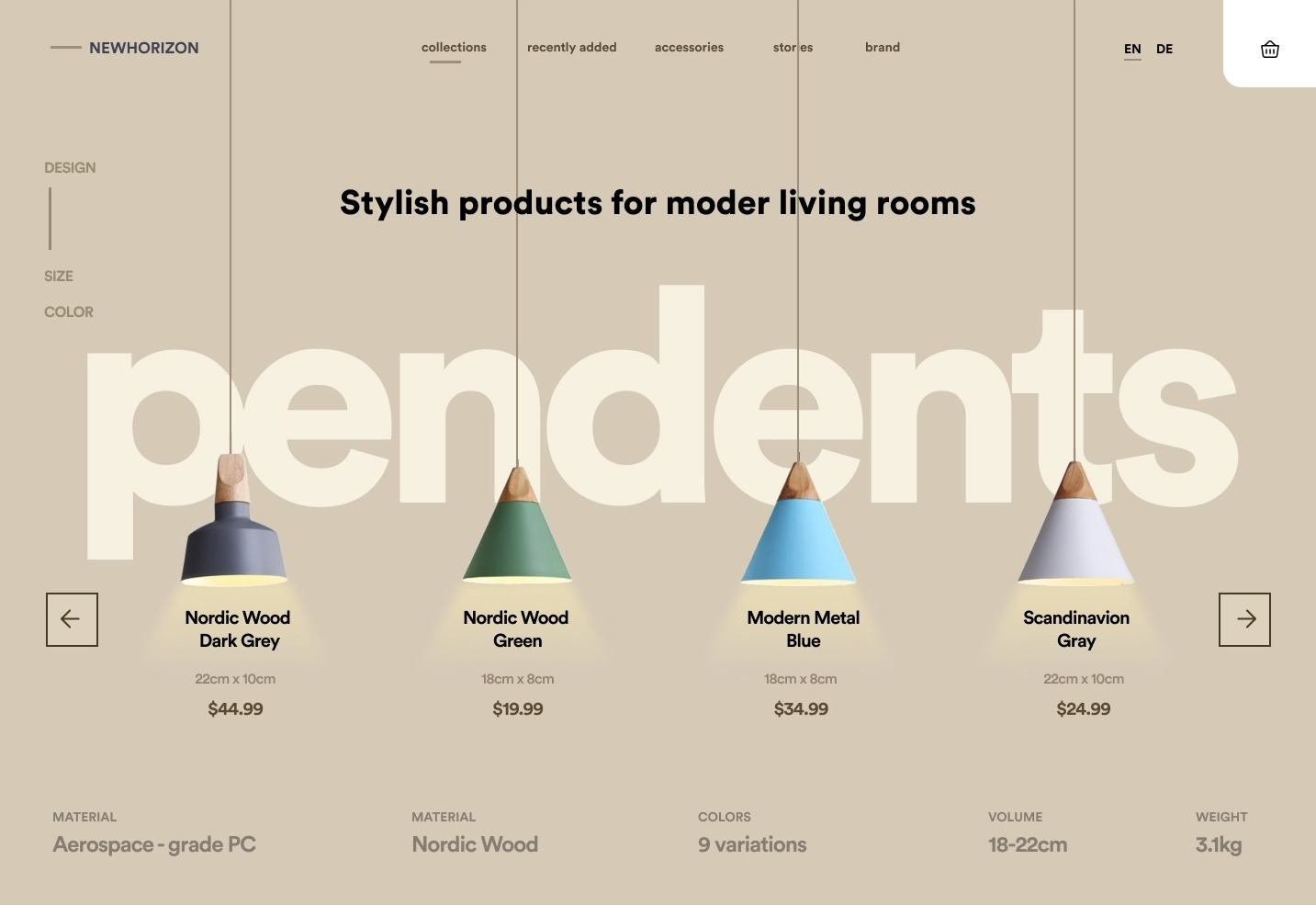
How unity works
Unity is achieved when all design elements, such as colors, typography, images, layout, and style, are consistent with a shared visual theme or concept. Ideally, every element of the design should contribute to the design’s message or aim rather than detract from it.
Applying unity
Unity can be applied by ensuring every element of a design contributes to a unified and coherent whole. This involves selecting complementary colors, fonts, and imagery, as well as maintaining consistent spacing, alignment, and styling throughout the design.
The ways Unity can be applied:
- Proximity: Elements close to one another appear to form a unified group.
- Alignment: Elements that align with one another appear to be connected.
- Repetition: Repeated elements help to give a sense of oneness, especially when done in a regular rhythm.
10. Accessibility
Accessibility in UX design is about ensuring that digital products and interfaces are usable by everyone, including those with disabilities.

How accessibility works
Inclusive design requires products and interfaces to be accessible to all users. This involves incorporating features such as alternative image text, color contrast for readability, keyboard navigation options for mouse-disabled users, and screen reader compatibility for visually impaired individuals.
Here are some important aspects of inclusive design:
1. Removing barriers: Design products and interfaces in a way that removes obstacles to access.
2. Meeting diverse needs: Accommodate the different requirements of users.
3. Key considerations:
- Alternative text for images.
- Proper color contrast for readability.
- Keyboard navigation for users who cannot use a mouse.
- Interfaces that are compatible with screen readers for visually impaired users.
Applying accessibility
Make accessibility a priority right from the start of the design process by following these practices:
- User research: Understand the needs of different user groups through research.
- Prototype testing: Test design ideas with users who have varying abilities.
- Guidelines and standards: Follow established accessibility guidelines and standards, such as the Web Content Accessibility Guidelines (WCAG).
11. Simplicity
Adopting simplicity in design involves simplifying complexity to prioritize clarity and user-friendliness, resulting in intuitive, efficient, and user-centric designs.
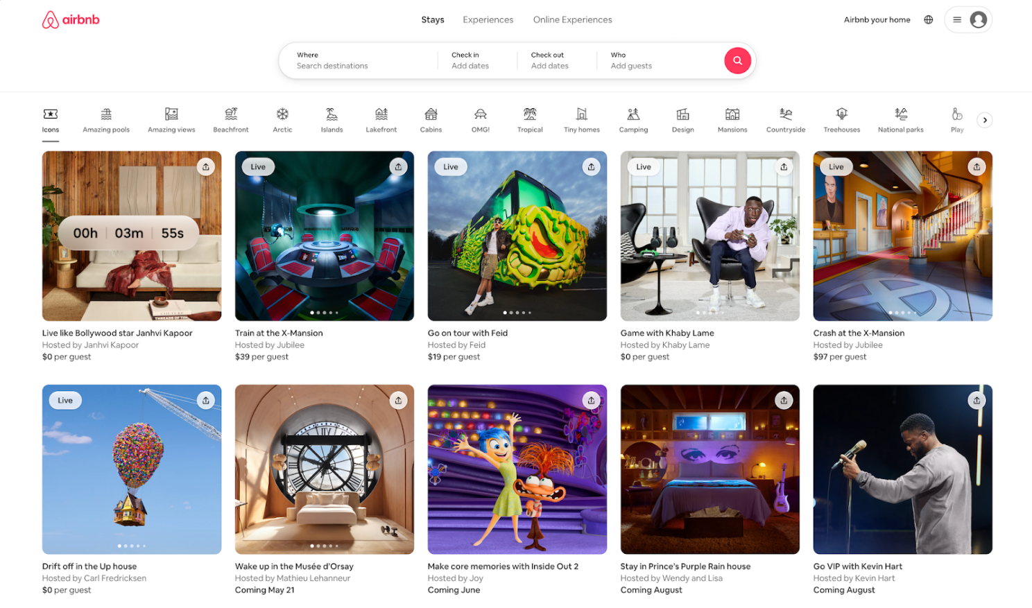
How simplicity works
When it comes to simplicity, you should remove unnecessary elements and interactions from your designs, refine the user experience, and highlight essential content and functionality. Simplicity enables designers to achieve their goals quickly and easily by minimizing clutter and complexity.
Applying simplicity
You can implement simplicity by prioritizing clarity, coherence, and usability in your designs, which may encompass:
- Embracing clean and minimalist aesthetics
- Streamlining interfaces
- Structuring content in a logical and user-friendly manner
By incorporating these principles into your design process, you can create visually appealing and highly functional designs that provide seamless experiences.
12. Movement
Movement orchestrates the visual dance within a composition, guiding the viewer’s gaze and infusing the design with vitality and progression.
How movement works
You can establish movement through careful decisions in lines, shapes, colors, and typography, with each element playing a part in guiding attention. Whether incorporating arrows or lines for direction or arranging elements strategically to indicate motion, movement guides the user through the design.
When used effectively, movement can:
Create a sense of dynamism and energy in your designs.
Capture users’ attention and keep them engaged.
Highlight important information or calls-to-action.
Enhance the overall user experience by making content more accessible and intuitive.
Applying movement
Infuse movement by incorporating elements that suggest motion or directionality within a composition. This not only adds rhythm and visual interest but also directs the viewer’s attention towards key focal points or significant areas.
Understanding common eye movement patterns provides insight into how users navigate content.
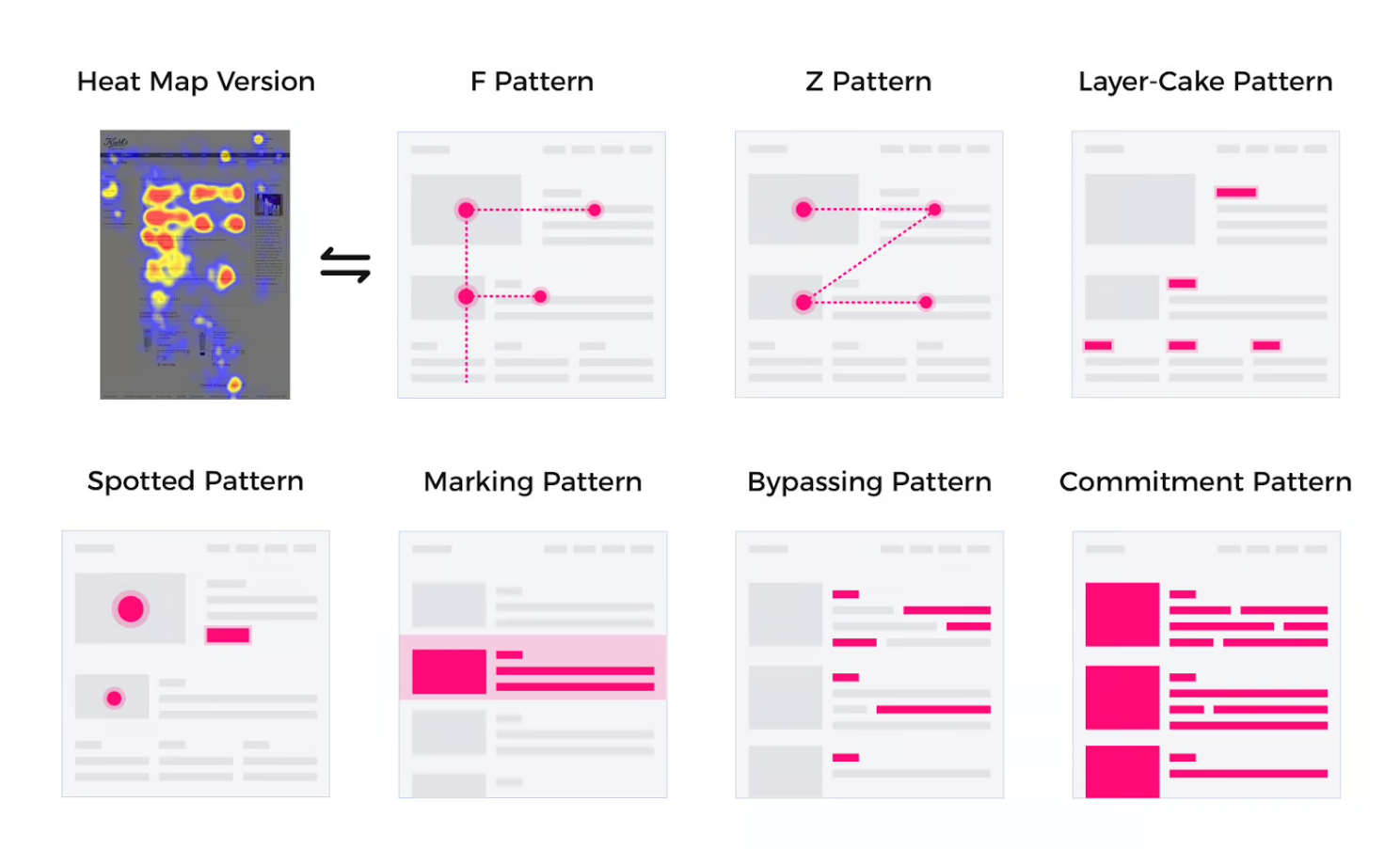
- F-pattern: Commonly found in image-rich layouts, where viewers scan horizontally across the top and then vertically down the left side.
- Z-pattern: Similar to the F-pattern, viewers start at the top left, but instead of going straight down, they move diagonally to the right before scanning horizontally again.
- Layer cake pattern: This pattern emerges in text-heavy designs with clear hierarchical structures. Viewers read from top to bottom, focusing on headings and subheadings.
Remember, the goal is not to incorporate movement for the sake of it but rather to use it strategically in a way that supports the message and purpose of your
13. Repetition
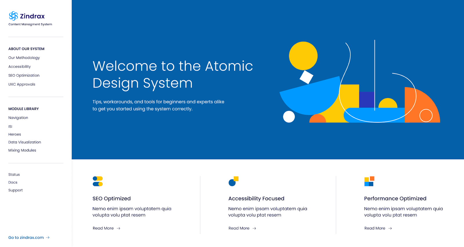
Repetition in design is about the consistent use of visual elements such as colors, shapes, patterns, or styles to create a feeling of cohesion and support the improvement of visual identity.
How repetition works
Repetition creates rhythm and consistency in a design by consistently repeating elements, which brings the composition together, creates visual harmony, and makes the design feel cohesive and ordered.
Applying repetition
Repetition can be applied by first selecting key visual elements and then repeating them throughout the design. This would include repeating colors, fonts, shapes, or graphic elements to create a consistent visual language.
Through repetition, you can:
- Help solidify brand identity
- Provide continuity from one piece to the next
- Bring about a higher level of user experience by giving cues that help the viewer perceive and understand the
Conclusion
Visual design principles are essential for effective design. They empower designers to create interfaces that not only look great but are also intuitive and accessible to everyone. Whether you’re working on a website, app, or digital product, incorporating visual design principles is crucial to ensuring your designs meet the needs of your audience.
Our dedication to crafting meaningful user experiences drives every aspect of our work. Visual design principles act as our North Star, guiding us to create lasting impressions on users and propelling the success of products and brands.
Thank you for reading. Don’t forget to share with your network.





No comment yet, add your voice below!