Designer’s Ultimate Spacing Guide: From Design Tokens to Final Design

Designer’s Ultimate Spacing Guide: From Design Tokens to Final Design

Great spacing is the heartbeat of a clear, user-friendly design. It organizes information and guides people’s eyes and clicks with ease. Grids and spacing methods act as the framework that holds everything together, bringing structure, rhythm, and flow to your layouts. When you use them well, they simplify tough choices like where to place text or how big a button should be, and they create a design that feels natural and intentional. 

Master these tools, and you’ll cut through the clutter, building interfaces that are easy to navigate and a joy to use, every single time.

In this article

1. Why spacing matters

Space in design keeps your text easy to read, your buttons simple to tap, and your layouts clear instead of crowded. I’ve watched users ditch apps in seconds when the spacing was too tight, and trust me, it’s a big deal. Good spacing isn’t just for show; it builds an experience that feels smooth and natural.

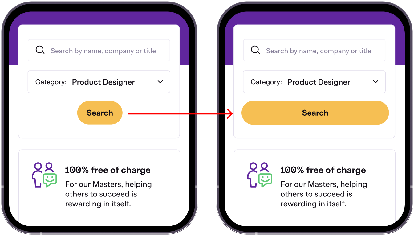
I once designed a mobile app where the button padding was a measly 4px. Clicks plummeted. Then, I nudged it up to full-width, and suddenly, users couldn’t stop tapping. 

The takeaway? Even your pixels deserve a little space to shine.

2. Benefits of proper spacing in UI design

When spacing works, your design clicks—literally and figuratively.

Here’s why I swear by it:

  1. Visual hierarchy: The arrangement of elements to emphasize importance, drawing attention to key areas. Spacing, like spacing-8 for buttons or spacing-16 for sections, highlights important elements, guiding user focus.
  2. Readability: The ease of reading text without strain. Line height at 1.3–1.6x font size, using spacing-16 or spacing-20, makes text clear and comfortable to read.
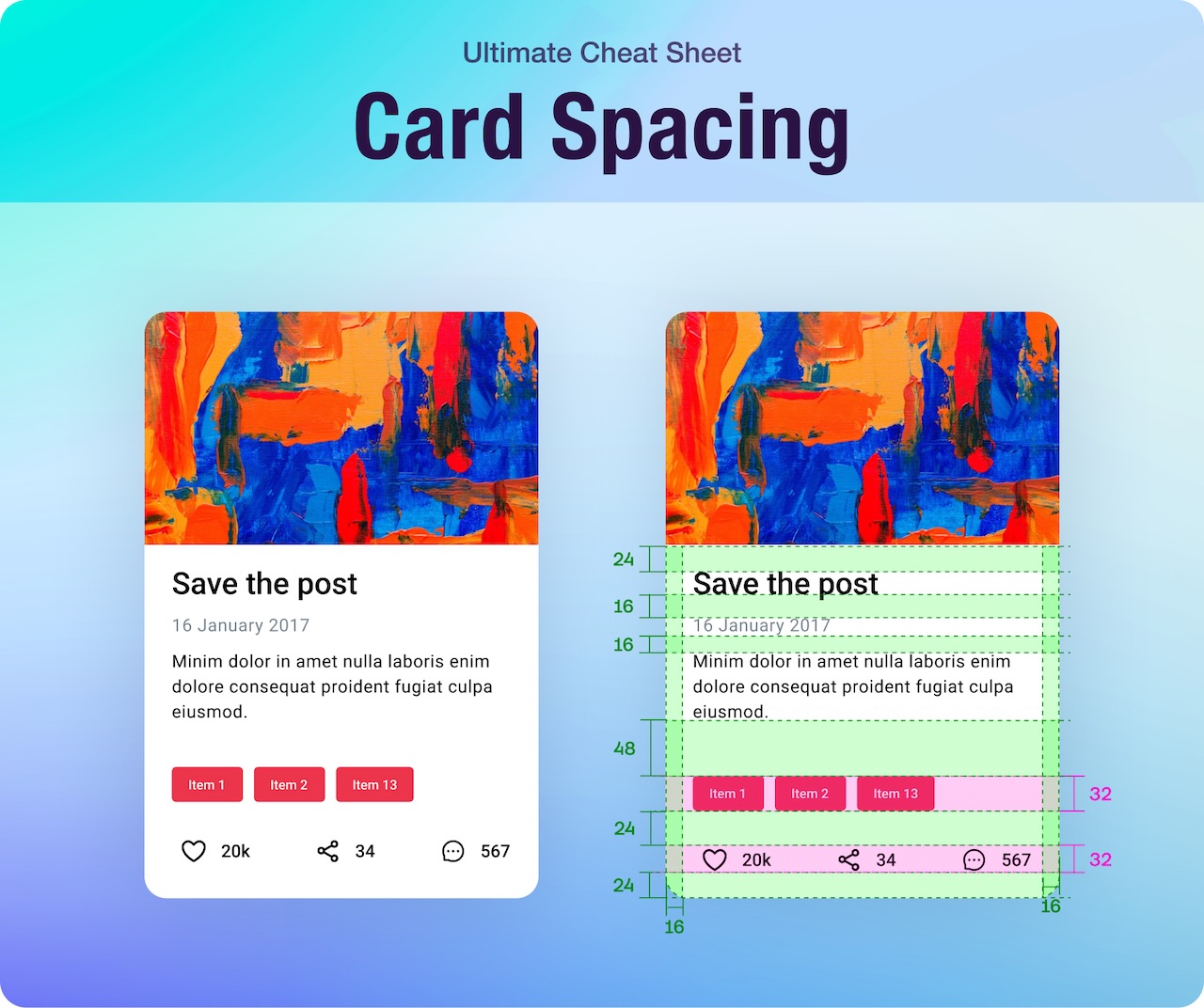
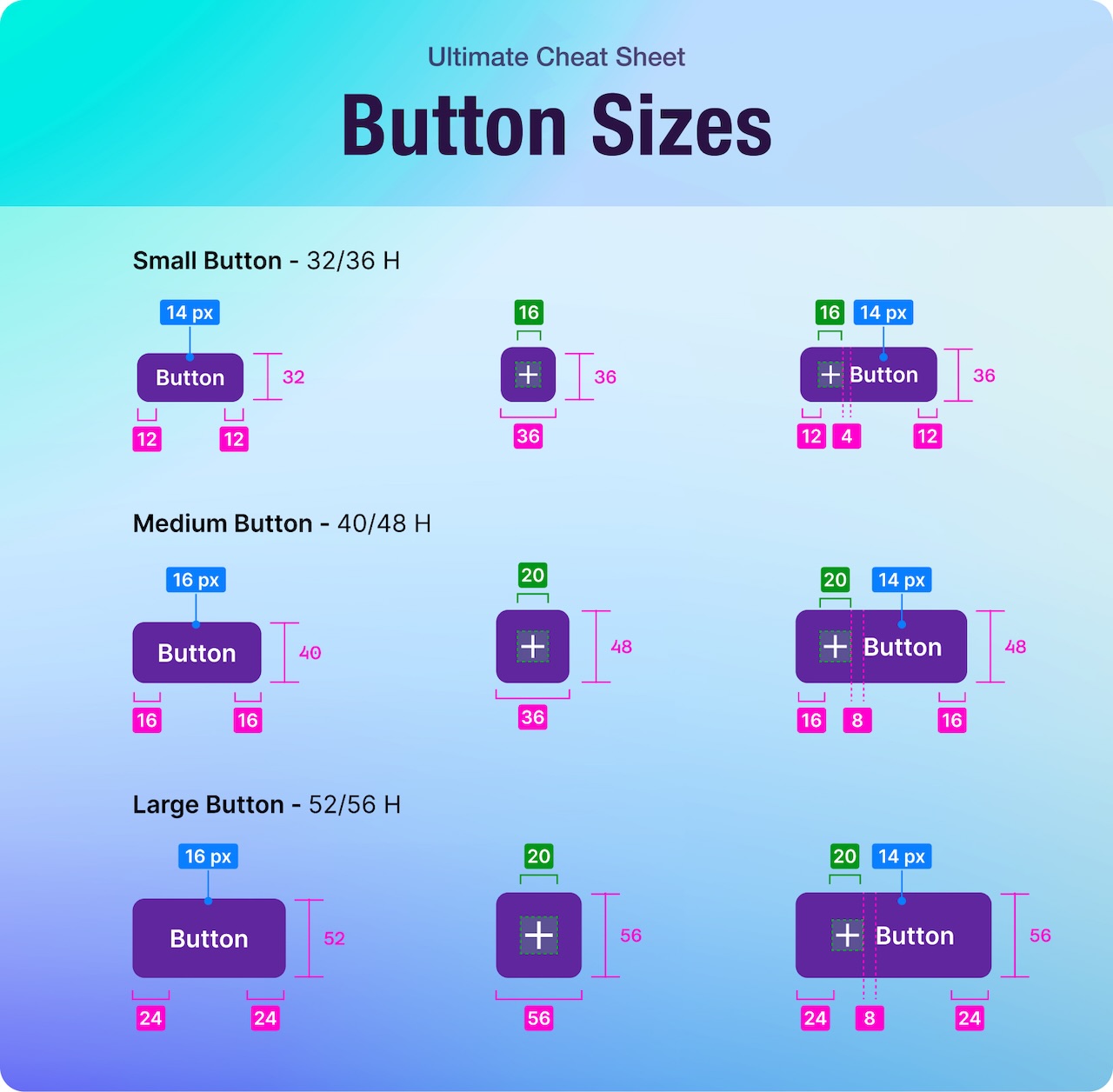
  3. Consistency: Uniform spacing across a design for a cohesive look. Using 4pt or 8pt grid steps, such as spacing-4 and spacing-12, ensures layouts feel predictable and harmonious.
  4. Increased engagement: Creating an inviting, uncluttered interface that encourages users to stay. Whitespace with spacing-24 or gaps with spacing-8 reduces visual noise, keeping users interested.
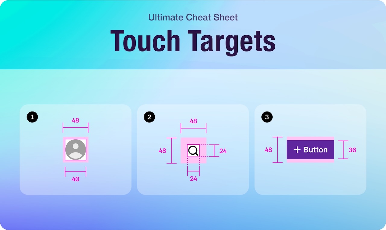
  5. Accessibility: Ensuring designs are usable for all, including those with motor or visual challenges. 48px tap targets with spacing-8 or spacing-12 improve touch accuracy and readability.

These advantages make spacing essential for effective designs.

3. Grid Systems: Your spacing superpower

The 4pt and 8pt grid systems are my go-to tricks for perfect spacing in design. They make layouts clean, consistent, and easy to scale. I’ve used these grids for years to turn messy drafts into designs that feel just right. Big names like Google’s Material Design and Apple’s Human Interface Guidelines love them too. Here’s why they’re so great, plus my step-by-step guide to using them.

Why use 4-point grid system?

The 4pt grid is all about precision. It’s built on 4px steps, which makes it really flexible. You can cut it down to 2px for small tweaks or bump it up to 8px, 12px, or 16px for more space. This keeps everything lined up perfectly, with no strange gaps like 5px or 7px messing things up. I turn to it when I need tight, detailed spacing, like in mobile apps or busy forms.

Google Material Design team uses it because it works so well. I saw its magic on a mobile app redesign once. The original had random 6px and 10px spacings, and it felt off. Switching to a 4pt grid with 4px, 8px, and 12px steps made everything fit together. Text looked neat, buttons balanced out, and the difference was clear right away. It’s ideal for keeping things sharp and controlled, no matter the screen.

How to implement 4-point grid system?

Here’s my step-by-step:

  • Tool setup: In Figma, I switch on the 4px grid and set nudges to 4px.
  • Add tokens: Create Figma variables like spacing-4 for 4px, spacing-8 for 8px, and spacing-12 for 12px.
  • Snap it: Every element locks to that grid: text, icons, boxes. I apply spacing-4 or spacing-8 to stay tight and neat.
  • Scale it: Think spacing-4 for small padding, spacing-8 for medium gaps, spacing-12 for big breaks.
  • Team sync: I share the grid plan and tokens so devs can follow along without a hitch.

It works perfectly on high-res screens too. Everything stays crisp and clear.

Why use 8-point grid system?

The 8pt grid is the bolder version of the 4pt system. It uses 8px steps, which makes it quick and roomy. I love it for bigger layouts like dashboards, landing pages, or anything made for touch. The larger jumps, like 8px, 16px, and 24px, create a flow that feels natural and easy to use. Apple’s Human Interface Guidelines back it because it matches how people tap and swipe, especially on screens where fingers need space.

I used it on a tablet dashboard once when I was new on product design. The first version had tight 10px gaps, and users couldn’t tap buttons easily. Switching to an 8pt grid with 8px padding and 16px margins gave everything room to breathe. Clicks improved, and complaints stopped. It’s less about tiny details and more about clear, confident spacing that works anywhere.

How to implement 8-point grid system?​

Here’s my step-by-step:

  • Tool setup: In Figma, I switch on the 8px grid and set nudges to 8px.
  • Add tokens: I set Figma variables like spacing-8 for 8px, spacing-16 for 16px, and spacing-24 for 24px. 
  • Snap it: Every element locks to that grid: buttons, cards, sections. I use spacing-8 or spacing-16 to keep it clean.
  • Scale it: Think spacing-8 for small padding, spacing-16 for medium gaps, spacing-24 for big breaks.
  • Team sync: I share the grid plan and tokens so devs can keep up without a struggle.

It fits touchscreens like a glove. Designs look sharp and feel right on any device.

Why use Fibonacci grid system?

The Fibonacci grid focuses on natural proportions. It uses steps based on the Fibonacci sequence—2px, 3px, 5px, 8px, 13px, 21px—creating a visually pleasing rhythm. This keeps elements spaced harmoniously, avoiding abrupt jumps like 4px to 10px. I choose it for organic layouts, like in creative websites or editorial designs.
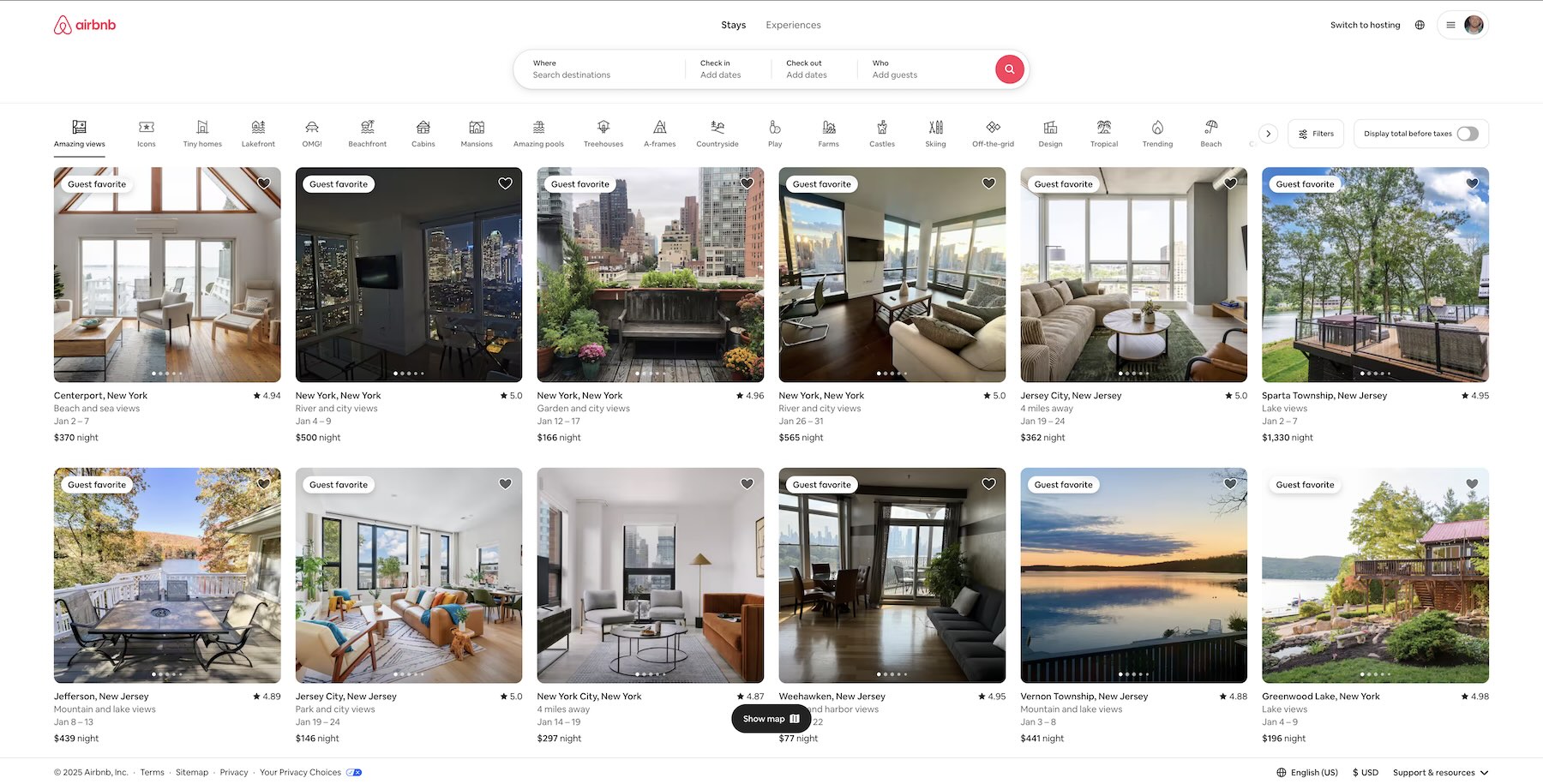
Designers at companies like Airbnb use it because it mimics nature’s balance. I once redesigned a landing page with uneven 6px and 12px gaps; it felt off. Switching to a Fibonacci grid with 5px, 8px, and 13px steps made everything flow naturally. Text felt balanced, sections harmonized, and the design looked polished instantly. It’s ideal for artistic, dynamic layouts across screens.

How to implement Fibonacci grid system?

Here’s my step-by-step:

  • Tool setup: In Figma, I switch on a custom grid with Fibonacci steps, like 5px or 8px, and set nudges to match.
  • Add tokens: I set Figma variables like spacing-2 for 2px, spacing-5 for 5px, and spacing-8 for 8px.
  • Snap it: Every element locks to that grid: buttons, cards, text. I use spacing-5 or spacing-8 to keep it balanced and natural.
  • Scale it: Think spacing-2 for small padding, spacing-8 for medium gaps, spacing-13 for larger breaks.
  • Team sync: I share the grid plan and tokens so devs can keep up without a struggle.

It works perfectly on high-res screens too. Everything stays crisp and clear.

Grid types for effective spacing

Grids enhance the 4pt and 8pt grid systems, ensuring consistent, structured spacing in UI/UX design. They organize layouts, maintain visual harmony, and adapt to devices and content, aligning with spacing principles for content density and platform needs. The main types—Fixed, Fluid, and Adaptive—each offer unique spacing benefits, supporting clean, scalable designs with 4pt and 8pt steps.

  • Fixed grid: A rigid grid with set pixel widths, such as 4px or 8px steps, maintaining precise spacing like 8px gaps or 16px margins. It uses fixed pixel values for consistent, simple layouts, ideal for desktops or static designs, but lacks flexibility for varying screens.
  • Fluid grid: A flexible grid that adjusts spacing, such as 16px gaps, based on screen size using percentages or relative units. It ensures adaptability for responsive designs, suiting websites or apps, but may lose exact precision on smaller devices.
  • Adaptive grid: A grid that changes spacing, like 8px to 12px gaps, at specific breakpoints. It balances precision and flexibility, maintaining consistent layouts across device sizes, such as phones, tablets, and desktops, for complex designs.

These grid types work seamlessly with the 4pt and 8pt systems, supporting clean, effective spacing that meets content, platform, and user needs in UI/UX designs.

4. Design tokens and Figma variables: The building blocks

Design tokens are simple values like 4px or 16px for spacing. Figma variables make them reusable and super quick to update. I used to fix spacing on every screen one by one, which took forever. Now, I change one variable, and it’s done. It’s a huge win for keeping designs clean and fast. 

Here’s how I do it with the 4pt grid, step by step, with all the details.

Naming conventions

I use names that click fast. Size-based ones like spacing-4 or spacing-12 are my go-to. They’re simple to read: spacing-8 means 8px, no questions. I also use names like padding-button or margin-section when it’s tied to something specific, like a button’s inside space. I never go crazy with names like tiny-space-love. That’s just confusing.

I stick to one style across the board. If I start with spacing-4, I don’t switch to gap-big later. On a website redesign, my team had names like space-10px and padding-small. It was a mess. We switched to spacing-4, spacing-8, spacing-12, and kept it clean. Devs turned them into CSS variables like —spacing-12 without any hiccups. Good names make life easier for everyone.

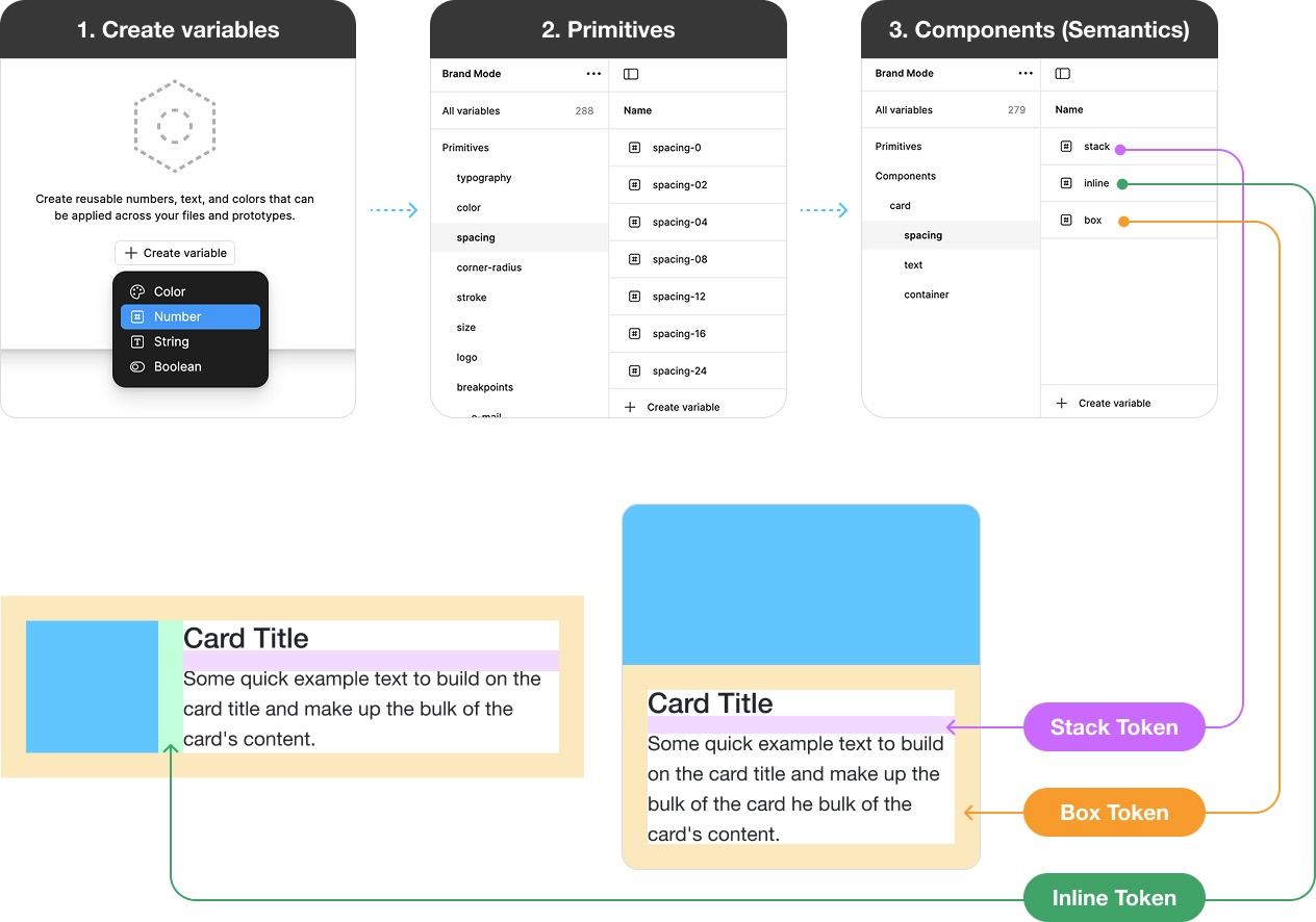
Defining Figma variables

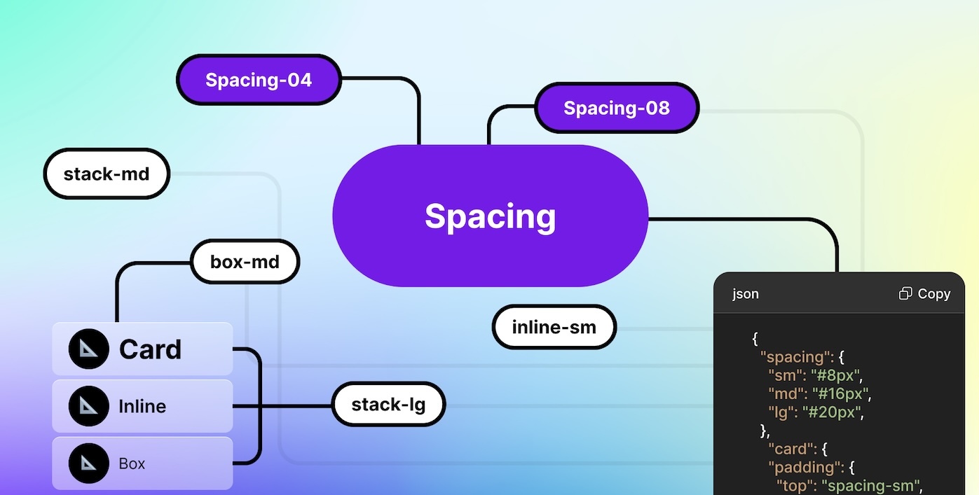
I create my spacing tokens in Figma’s Variables panel. First, I click “Create variable,” chooseNumber” as the type, type the name, and set the value in pixels. I stick to the 4pt grid, using steps like 4px, 8px, 12px, and so on. This keeps spacing neat and easy to scale.

The image below shows how I set this up: I start with primitive tokens like spacing-04 at 4px, spacing-08 at 8px, and so on, under the “Primitives” mode. Then, I use these to build component-based tokens, or semantic tokens, like stack-md or box-lg for cards, under “Components (Semantics)” mode. Now my spacing tokens are ready to create reusable, meaningful spacing for layouts.

On a mobile app project, I used spacing tokens across 30 screens. When the client wanted more room, I bumped stack-md from 12px to 16px. Every card and modal updated in a flash. I also add descriptions in Figma, like “Use stack-md or stack-sm for card padding,” so my team knows what’s what. It’s all about saving time down the road.

Testing

I test to make sure my spacing is spot-on. Here’s my detailed process:

  1. Screen check: I try different spacing sizes on various devices. I use spacing-4 on small phone screens, spacing-8 on mid-size tablets, and spacing-12 on desktops. It needs to look good everywhere. I also check zooms like 100% and 150% to catch blurry spots or tight areas. On a tablet app, spacing-4 felt too cramped for button padding. I switched to spacing-8, and it looked perfect.
  2. User input: I show the design to users and watch how they use it. If they pause or miss a button, I tweak the spacing. In a prototype, a button with spacing-8 padding got ignored because it was hard to tap. I switched to spacing-12, and users tapped easily. I ask questions like “Does this feel right?” or “Is it easy to read?” Their feedback guides me.
  3. Layout check: I zoom out to 25% to see the whole design. If it looks clean and balanced, I know it’s ready. If sections look crowded or gaps feel off, I adjust. For example, spacing-16 between sections looked tight at 25%. I tried spacing-20, and it flowed better.
  4. Dev sync: I test with developers too. I export my tokens as JSON, and they use them in code, like –spacing-12 for CSS. On a web project, spacing-16 showed up as 15px in the browser. We found a typo, fixed it, and synced back to 16px. Testing catches those small mistakes early.

Testing with design tokens and the 4pt grid makes spacing sharp and simple. It cuts extra work, keeps designs clear, and makes updates easy. Try it, and you’ll see how fast it get

5. Types of spacing in UI design

Padding

Internal space within an element.

Margin

External space around an element.

Inset Spacing

Internal space in nested elements.

Kerning

Space between specific letter pairs.

Line Height

Vertical space between text lines

Tracking

Internal space in nested elements.

Leading

Precise vertical space between
text lines.

Grid Gap

Space between grid columns
or rows.

Whitespace

Empty areas for focus.

6. Spacing best practices

Spacing is essential for user-friendly, attractive designs. Follow these guidelines for consistency and usability, using the 4pt and 8pt grid systems and design tokens effectively.

  • Use consistent grid steps: Stick to 4px or 8px steps, like spacing-8 for padding or spacing-16 for gaps, to maintain rhythm and avoid odd values like 7px.
  • Balance density and whitespace: Use spacing-4 or spacing-8 for dense layouts, and spacing-16 or spacing-24 for open spaces, matching content and platform needs.
  • Prioritize accessibility: Ensure 48px tap targets with spacing-8 or spacing-12, and set line height to 1.4–1.6x font size with spacing-16 for readability.
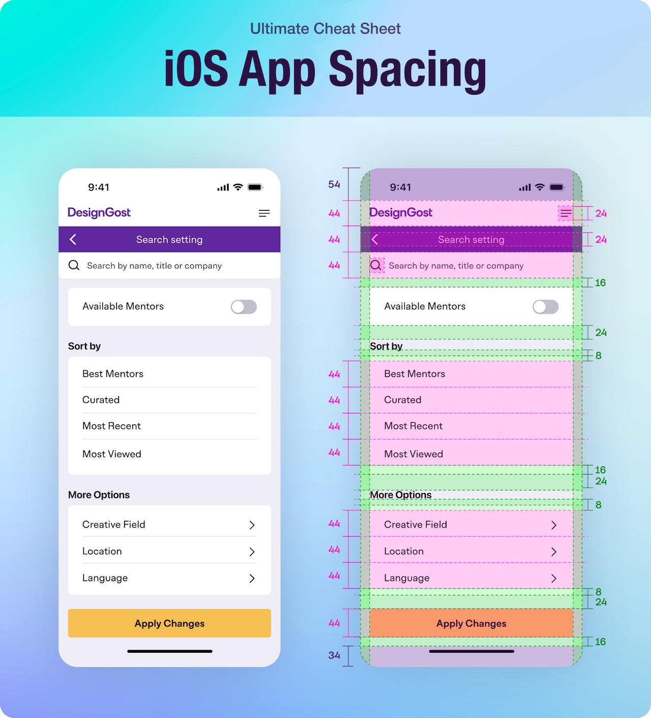
  • Align with platform guidelines: Follow iOS’s 8pt grid with spacing-8, spacing-16, spacing-24, or Android’s 4pt grid with spacing-4, spacing-8, spacing-12.
  • Test across devices: Check spacing-4 on phones, spacing-8 on tablets, and spacing-16 on desktops using fixed, fluid, or adaptive grids.
  • Sync with development: Share tokens like spacing-8 as —spacing-8 in CSS, ensuring consistent spacing with developers.

Wrapping up

Spacing may not steal the spotlight, but it saves designs from looking like a cluttered mess—believe me, I’ve seen that chaos! It’s key to clear, user-friendly UI/UX designs. Use the 4pt and 8pt grids with tokens like spacing-4, spacing-8, and spacing-16 for consistent spacing. Master types like padding, margin, and whitespace, and follow best practices for accessibility and development sync.

Ready to level up your next project? Try adjusting one spacing-12 gap—your users will notice the difference!

Open for new opportunities and collaboration! Whether it’s a professional collaboration or just a friendly chat, I’m all ears.

The UX Designer’s Secret Weapon: Usability Heuristics

The UX Designer’s Secret Weapon: Usability Heuristics

Usability heuristics are the unsung heroes of effective design. They’re the principles that guide me to create intuitive, user-friendly interfaces, helping users achieve their goals seamlessly. Whether you’re a seasoned UX designer or just starting your journey, understanding these heuristics can transform your approach to creating digital experiences. They’re not just guidelines; they’re the backbone of intuitive design. 

In this post, I’ll walk you through what usability heuristics are, why they matter, and how we can apply them to elevate our designs.

In this article

What are Usability Heuristics?

Usability heuristics, first introduced by Jakob Nielsen, serve as a checklist for evaluating user interfaces. They’re essentially design principles that help ensure products are user-friendly. In my work, I use these heuristics to pinpoint areas where users might encounter difficulties, allowing me to refine and enhance the user journey.

Since their introduction in 1994, these heuristics have become a cornerstone of UX design. By focusing on user needs and behaviors, I find that these principles help create designs that are not only functional but also enjoyable to use.

The 10 Usability Heuristics

1. Visibility of system status

Users should always be informed about what is happening. For example, a loading bar or a simple “Please wait…” message can keep users engaged.

Use case: When uploading a file, showing progress keeps users informed, reducing frustration or confusion about the process.

Tips:

  • Implement real-time feedback for actions like form submissions or data processing.
  • Use clear, status indicators for different states (e.g., “Saving…”, “Complete”).
  • Ensure feedback is immediate or within a reasonable time frame to maintain user engagement.

2. Match between system and real world:

I often emphasize using language and concepts familiar to the user. This means translating technical jargon into everyday language.

Use case: A banking app uses terms like “Deposit” and “Withdraw” instead of “Credit” and “Debit” for clarity.

Tips:

  • Use metaphors or analogies that resonate with your audience’s real-world experiences.
  • Avoid industry-specific terms unless your audience is familiar with them.
  • Design forms or interfaces that mimic real-world processes, like a digital shopping cart.

3. User control and freedom:

Providing “undo” and “redo” options is something I advocate for. It gives users the confidence to explore without fear of making irreversible mistakes.

Use case: Allowing users to cancel a subscription without complex navigation or to revert changes in a document.

Tips:

  • Offer clear ways to exit from unintended actions, like a prominent “Cancel” button.
  • Ensure users can navigate back to previous steps or screens easily.
  • Implement a confirmation step for critical actions to prevent accidental commitments.

4. Consistency and standards:

In our designs, we aim for consistency in actions and navigation, making the interface predictable and easier to learn.

Use case: All buttons for actions in an app follow the same style and placement, reducing cognitive load for users.

Tips:

  • Maintain consistent iconography, color schemes, and typography across your product.
  • Follow platform conventions (e.g., iOS or Android guidelines) for a familiar user experience.
  • Use similar interaction patterns for similar tasks to lower the learning curve.

5. Error prevention:

Instead of just fixing errors, we focus on designing systems where errors are less likely to occur, like using confirmation dialogs before major actions.

Use case: Form fields that validate data in real-time to prevent submission of incorrect information.

Tips:

  • Use constraints in design to limit possible errors (e.g., only allowing numeric input for phone numbers).
  • Implement auto-correction or suggestions for common input mistakes.
  • Provide clear, immediate feedback when an error is about to occur, allowing users to correct it.

6. Recognition over recall:

Minimizing what users need to remember by keeping important options visible, like using icons or labels consistently.

Use case: A navigation menu always visible at the top or side of the page for easy access to different sections.

Tips:

  • Place critical information or actions in prominent, easily accessible locations.
  • Use visual cues like icons alongside text to aid recognition.
  • Group related functions or information together to reduce the need for recall.

7. Flexibility and efficiency of use:

We implement shortcuts for experienced users while keeping the interface accessible for novices.

Use case: Keyboard shortcuts in software applications speed up workflow for power users, while menus remain for beginners.

Tips:

  • Offer customizable interfaces where users can set up their preferred layouts or shortcuts.
  • Provide tooltips or hints on first use to guide novices, which can be disabled for experts.
  • Design for both mouse and keyboard interactions to cater to different user preferences.

8. Aesthetic and minimalist design:

I believe in the power of simplicity. An interface cluttered with unnecessary elements confuses rather than helps.

Use case: Streamlined dashboards focus on key metrics, avoiding information overload.

Tips:

  • Eliminate all unnecessary elements; every piece on the screen should serve a purpose.
  • Use white space effectively to guide the user’s focus and reduce visual noise.
  • Keep the design clean, ensuring that each element adds value to the user’s experience.

9. Help users recognize, diagnose, and recover from errors:

Error messages should be clear and constructive, guiding users towards a solution.

Use case: A failed login attempt provides specific advice, like “Password must be at least 8 characters long.”

Tips:

  • Use human-readable language in error messages, avoiding technical terms.
  • Suggest immediate actions or solutions to rectify the error.
  • Color-code errors (e.g., red for errors) for quick visual recognition.

10. Help and documentation:

While the goal is to make interfaces intuitive enough not to need documentation, when necessary, it should be easy to find and understand.

Use case: An in-app help center with searchable FAQs or instructional videos.

Tips:

  • Place help resources contextually where users might need them, like next to complex features.
  • Ensure documentation is concise, up-to-date, and written in plain language.
  • Offer different formats for help content (text, video, images) to cater to various learning styles.

Why Usability Heuristics matter

In my journey, I’ve come to appreciate how foundational usability heuristics are to creating products that not only work but are a joy to use.

Here’s why they matter:

  • Cost-Efficiency: Heuristics allow us to identify usability issues early in the design process, significantly reducing the cost of redesigns post-launch. By catching potential problems before they reach the user, we save on both time and resources.
  • User Satisfaction: At the heart of every product should be user satisfaction. Heuristics guide us toward designing interfaces that feel intuitive, thereby enhancing user experience and satisfaction. Happy users are more likely to return, recommend, and engage with your product.
  • Competitive Edge: In today’s market, where many products offer similar functionalities, the user experience can be the differentiator. Applying usability heuristics can give your product a competitive edge by ensuring it’s not just functional but delightful to use.
  • Accessibility: Heuristics like “Match between System and the Real World” or “User Control and Freedom” naturally lead to designs that are more accessible to a broader audience, including those with different abilities or from varied backgrounds.
  • Consistency Across Teams: When everyone in the design and development process understands and applies the same usability principles, it leads to a more cohesive product. This consistency is crucial for large teams or when working across different departments or even companies.
  • Scalability: As products grow or evolve, maintaining usability can become complex. Heuristics provide a scalable approach to keep user experience at the forefront of growth, ensuring that as features are added or interfaces expand, they still adhere to principles that make them user-friendly.
  • Feedback Loop: Using heuristics not only helps in designing but also in evaluating the product. They offer a structured way to critique existing designs, providing clear feedback that can be acted upon to improve the interface.

Heuristics are not just about checking boxes; they’re about embedding a user-centric philosophy into every aspect of product development. They’re the compass that keeps our designs aligned with human needs and behaviors, ensuring that technology serves us, not the other way around.

Challenges & Limitations

While usability heuristics are invaluable tools in the UX design toolkit, they come with their own set of challenges and limitations:

  • Subjectivity: Heuristics are guidelines, not strict rules. Their application can be subjective, leading to different interpretations among designers or evaluators. What one designer sees as a match to real-world conventions, another might not.
  • Over-Reliance: There’s a risk of over-relying on heuristics at the expense of other user research methods. Heuristics can miss out on real user behavior or cultural nuances that aren’t captured by these general principles. They should be complemented by user testing, analytics, and other forms of research.
  • Contextual Fit: Not all heuristics will be equally applicable or beneficial in every situation. For instance, in very specialized software, “Aesthetic and Minimalist Design” might be less critical than in consumer applications. Designers need to balance the relevance of each heuristic to their specific context.
  • Innovation Limitation: Strict adherence to heuristics might stifle innovation. Sometimes, breaking from established norms can lead to breakthrough designs, but this is often where heuristics suggest caution. It’s a fine line between creating a unique user experience and ensuring usability.
  • Scale and Complexity: For large or complex systems, applying heuristics uniformly can be challenging. As the number of features or user scenarios increases, ensuring every part of the interface adheres to these principles becomes more labor-intensive and potentially less effective.
  • Learning Curve: For new designers or those not deeply familiar with heuristic evaluation, understanding how to apply these principles effectively can be daunting. There’s a learning curve associated with knowing when and how to apply each heuristic appropriately.
  • Static vs. Dynamic: Heuristics have traditionally been more suited to static interfaces rather than dynamic, interactive, or AI-driven systems. As technology evolves, these guidelines might not fully address the unique challenges posed by modern, adaptive user interfaces.
  • Cultural Differences: Heuristics are largely based on Western design principles and might not fully cater to cultural differences in user behavior, preferences, or expectations. This can lead to usability issues when designing for a global market.

Understanding these challenges and limitations does not diminish the value of usability heuristics but rather underscores the importance of a holistic approach to UX design. They should be used as part of a broader strategy that includes direct user feedback, iterative testing, and a willingness to adapt or even innovate beyond traditional guidelines when necessary.

Tools & Resources

Here are some valuable tools and resources to help you with heuristic evaluations and to deepen your understanding of usability heuristics:

  • Heuristic evaluation templates:
  • UX Design Tools:
    Figma and Sketch – These are frequently highlighted for UI/UX design work.
  • Tools for User Testing and Feedback (which complement heuristic evaluations):
    • Maze – For user testing and gathering user feedback.
    • Hotjar – Heatmaps, session recordings, and feedback polls.

Remember, while these tools and resources are excellent, the real magic happens when you apply these principles in practice. I suggest experimenting with these tools on a small project or part of your interface to see how they align with the usability heuristics discussed. If you need more specific guidance or have questions about using these tools, don’t hesitate to ask in the comments or reach out directly.

Conclusion

In wrapping up, usability heuristics are like the North Star for UX design, guiding us toward creating interfaces that resonate with users on an intuitive level. I’ve seen how these principles can turn good designs into exceptional ones, fostering user satisfaction and loyalty.

However, it’s crucial to approach them with a balanced perspective, acknowledging their limitations and complementing them with diverse user research methods. By doing so, we can deliver experiences that not only meet but exceed user expectations, adapting to the ever-evolving landscape of technology and user behavior.

Questions related to Usability Heuristics

What is the difference between usability heuristics and user testing?

A: Heuristics focus on evaluating design against established principles, while user testing involves observing real users interacting with the design. I see both as complementary—heuristics identify potential problems, and user testing validates their impact on users.

Can usability heuristics be applied to all types of digital products?

A: While they're adaptable, the application might vary. For instance, a mobile app might prioritize different heuristics compared to a desktop software due to different user contexts.

Do usability heuristics guarantee a great user experience?

A: Not entirely. While they’re a powerful tool, heuristics should be part of a broader usability strategy, including research, testing, and iteration.

How often should I perform a heuristic evaluation?

A: Ideally, perform a heuristic evaluation at least twice during a project: once in the early design phase and again before finalizing the design. However, this can vary based on project complexity and resource availability.

Availability

Open for new opportunities and collaboration! Whether it’s a professional collaboration or just a friendly chat, I’m all ears.

Psychological Principles for Successful Product Design

Psychological Principles for Successful Product Design

Great product design goes beyond aesthetics and functionality—it’s about understanding psychological principles and human behavior. As designers, we create experiences that shape how users interact with products, but these interactions are driven by the way people think, feel, and act. By incorporating psychological principles into design, we can craft products that resonate on a deeper emotional level, driving user engagement and loyalty.

Psychology helps us understand the “why” behind user behavior. From simplifying decision-making to triggering emotions, psychology allows us to create intuitive, effective, and engaging designs. These principles help guide users seamlessly through an experience, making products not just functional, but also memorable.

In this post, we’ll dive into 41 key psychological principles that every product designer should know. Through real-life examples, we’ll explore how these principles have been successfully applied to improve user experiences.

When I incorporate psychology into product design, I ensure that experiences feel natural and rewarding, resulting in higher user satisfaction and loyalty. Whether I’m using Hick’s Law to streamline decisions, Social Proof to build trust, or the Aesthetic-Usability Effect to enhance desirability, I try to transform good designs into exceptional ones.

Great design isn’t accidental; it’s informed by a deep understanding of how people interact with products. 

  • Decision-making made simple: Psychology helps streamline user choices, reducing cognitive load and improving decision-making.
  • Emotionally engaging experiences: Tapping into emotions creates a deeper connection between the user and the product.
  • Memorable interactions: Products that delight and surprise users are the ones they remember—and recommend.

Psychological principles in product design

Psychological principles are essential tools for designers looking to create meaningful and user-centered experiences. Here are powerful psychological principles every designer should have in their toolkit:

1. Hick’s Law

What to do: Simplify decision-making by reducing the number of options presented to the user.

Why it matters: Hick’s Law states that the time it takes to make a decision increases with the number and complexity of choices. Reducing options helps users act more quickly and confidently, improving their overall experience.

How to implement:

  • Limit the number of options displayed on a single screen or menu.
  • Group related items into categories to make navigation intuitive.

Netflix categorizes recommendations into genres, like “Action,” “Comedy,” and “Drama,” rather than displaying an endless list of titles. This allows users to easily navigate and find content based on their preferences, making their experience more intuitive and less overwhelming.

2. Miller’s Law

What to do: Design interfaces that respect the user’s cognitive limits by presenting manageable chunks of information.

Why it matters: Miller’s Law states that people can hold about 7 (plus or minus 2) items in their working memory at a time. Overloading users with too much information leads to confusion and reduces the effectiveness of the design.

How to implement:

  • Break down content into smaller, digestible chunks or steps.
  • Use progressive disclosure to reveal information as needed.

Google search results display links in groups of 10 per page, keeping the amount of information manageable and allowing users to focus on a subset of options at a time.

3. Jakob’s Law

What to do: Design your product or interface in a way that aligns with user expectations based on their experiences with other, commonly used websites or applications.

Why it matters: Jakob’s Law states that users spend most of their time on other sites and apps, so they develop specific expectations for how things should work. By adhering to familiar conventions, you make your design more intuitive and reduce the learning curve for users.

How to implement: Use common UI elements like standard navigation menus, familiar iconography, and typical page layouts (e.g., top navigation bar, bottom footer with links) to ensure users instantly recognize how to interact with your site or app.

Many websites, like Amazon, place the shopping cart icon at the top right corner of the page. This is a widely recognized convention that users expect to find, making it easier for them to navigate your site and complete purchases without confusion.

4. Fitts’s Law

What to do: Make frequently used and important interactive elements easy to reach and interact with by optimizing their size and position.

Why it matters: Fitts’s Law highlights that the time required to interact with a target is influenced by its size and distance. Larger and closer targets are quicker and easier to use, improving usability and efficiency.

How to implement:

  • Enlarge critical buttons like “Sign Up” or “Checkout” to make them stand out and easier to click.
  • Position key interactive elements in easily accessible areas, such as near the bottom of the screen for thumb use on mobile.

PayPal’s mobile app places the “Pay” and “Get Paid” buttons as large, tappable targets at the bottom of the home screen. Their size and strategic placement make it effortless for users to initiate key actions quickly.

5. Prägnanz (Simplicity)

What to do: Simplify designs to create visually balanced and easily interpretable elements.

Why it matters: The Law of Prägnanz states that people naturally perceive complex images in their simplest form. This tendency helps users process information quickly and reduces cognitive strain, leading to better usability and satisfaction.

How to implement:

  • Use clean, uncluttered layouts that highlight the most important information.
  • Prioritize minimalistic design with ample whitespace and straightforward visual hierarchy.

Apple’s website is a great example of the Law of Prägnanz in action. It uses minimalistic layouts, high-quality imagery, and clear, bold typography to present complex information in a simple and intuitive way.

6. Gestalt Principles

Gestalt Principles, stemming from Gestalt Psychology, are fundamental concepts that explain how humans perceive and process visual information by organizing it into coherent, understandable patterns.

These principles are crucial in interface and product design, ensuring that layouts are intuitive, relationships between elements are clear, and visual hierarchy is effective. The essence of Gestalt theory lies in the brain’s natural inclination to see order and unity in what might initially appear as chaos, simplifying complex visuals into unified wholes.

  1. Proximity​
  2. Common Fate​
  3. Continuity
  4. Similarity​
  5. Closure​
  6. Common Region
  7. Symmetry
  8. Figure-Ground

How to implement:

Read the blog post below for a deep dive into Gestalt Principles.

7. Zeigarnik Effect

What to do: Create tasks that can be partially completed, leaving users with an unfinished action.

Why it matters: The Zeigarnik Effect suggests that people are more likely to recall incomplete or interrupted tasks, making it a powerful tool for driving user retention and task completion.

How to implement: In a shopping cart, allow users to add items and save their selections for later, so they are reminded to complete the purchase.

Spotify’s “Discover Weekly” playlist is a prime example of applying the Zeigarnik Effect—the psychological principle that motivates people to finish tasks they’ve started. The playlist uses data to predict music users will enjoy, keeping them engaged with the service. By creating a sense of incompleteness (every week offering a new playlist to explore), Spotify taps into users’ intrinsic desire to listen to and finish the task. This drives continued usage and strengthens the emotional connection between the user and the brand.

8. The Von Restorff Effect (Isolated Item Effect)

What to do: Highlight key information or elements by making them visually distinct from surrounding content.

Why it matters: The Von Restorff Effect states that items that stand out are more likely to be remembered, which is crucial for emphasizing critical actions or messages.

How to implement: Place a standout, unique offer or feature on a webpage, like a limited-time discount or an exclusive product, that is visually distinct from the rest of the content.

On Walmart’s website, highlight exclusive deals or time-sensitive offers by using bold colors, larger fonts, or distinct imagery to make them stand out from the rest of the products. For example, a “Flash Deals” might be showcased in dark blue with a countdown timer to draw attention and create a sense of urgency, making it stand out from the surrounding items on the page.

9. Framing Effect

What to do: Present information in a way that highlights positive aspects or desired outcomes to influence decision-making

Why it matters: The Framing Effect states that the way options or information are presented can significantly influence how users perceive and react to them. By framing information positively, you can guide users toward a specific action, leading to higher engagement and conversions.

How to implement: On a checkout page, frame the price by saying, “Save $20 on your next purchase” rather than “Spend $80 to get $20 off.” This focuses on the benefit of saving, rather than emphasizing the amount needed to spend.

10. Aesthetic-Usability Effect

What to do: Recognize that users often perceive more aesthetically pleasing designs as easier to use. When designing products, interfaces, or any user experience, prioritize visual appeal alongside functionality.

Why it matters: The Aesthetic-Usability Effect states that people are more likely to tolerate minor usability flaws in visually attractive designs. A beautiful design creates a positive emotional response, which can make users feel that the product is easier to use, more reliable, and worth their time and investment. This principle plays a key role in forming first impressions and building long-term relationships with users.

How to implement:

  • Design with beauty in mind: Incorporate principles of design such as balance, contrast, emphasis, movement, pattern, rhythm, and unity. Choose pleasing color schemes, typography, and layout designs.
  • Design for delight: Add subtle animations, micro-interactions, or other delightful elements that enhance the emotional appeal without compromising usability.
  • Consider accessibility: Ensure the aesthetic enhancements are inclusive by adhering to accessibility standards, such as maintaining sufficient color contrast and supporting screen readers.
  • Iterative design: Use feedback from user testing to refine the design. Ensure that the aesthetic improvements do not compromise the functionality but enhance the perceived usability.
  • User testing: Conduct usability tests where you observe how users interact with both aesthetically pleasing and less attractive versions of the same interface to gather data on user response and tolerance for usability issues.
  • Consistency across platforms: Maintain a consistent aesthetic across different platforms or devices to reinforce the positive user perception of usability.
  • Educate your team: Make sure that all team members understand the importance of aesthetics in usability, encouraging designers, developers, and product managers to work collaboratively towards a visually appealing product.

Airbnb.com uses beautiful photography and cohesive design elements, making the site visually engaging and easy to navigate, thus enhancing the perceived usability of the platform.

11. Primacy and Recency Effects

What to do: Place the most important information at the beginning or end of a sequence to take advantage of users’ natural tendency to remember these positions.

Why it matters: The Primacy and Recency Effects refer to the tendency for people to remember the first and last items in a sequence more clearly than those in the middle. By strategically positioning critical information in these spots, you can increase the likelihood that users will remember it and act upon it.

How to implement: In a product onboarding flow, place the key benefits of your service or the most important call-to-action at the beginning and end of the process.

An e-commerce website might highlight a special offer at the top and bottom of a product page to capture attention and encourage conversion.

12. The Mere Exposure Effect

What to do: Increase user familiarity with your design elements through consistent presentation and repetition.

Why it matters: The Mere Exposure Effect states that people tend to develop a preference for things they are exposed to repeatedly. This principle can help establish trust, improve brand recall, and enhance user comfort with your product.

How to implement:

  • Use consistent branding, such as logos, colors, and typography, across all touchpoints.
  • Reintroduce key elements (like navigation styles or calls to action) throughout the user journey without overwhelming the user.

Spotify applies the Mere Exposure Effect by maintaining consistent branding across its app, website, and marketing campaigns. The familiar green-and-black color palette, logo, and interface create a sense of reliability and recognition.

13. The Halo Effect

What to do: Enhance the overall user experience by ensuring that your product’s most prominent features (such as design, usability, or customer service) are of high quality.

Why it matters: The Halo Effect suggests that when users have a positive impression of one aspect of your product, they are more likely to assume that other aspects are just as good. A strong first impression can elevate the perception of the entire brand or product.

How to implement:

  • Focus on creating a standout experience for key touchpoints like onboarding or customer support to create a positive overall impression.
  • Ensure the design, content, and functionality of your app or website are top-notch, as they will influence how users perceive the rest of the product.

Apple’s sleek and user-friendly product designs, like the iPhone, set the tone for how users perceive the entire Apple ecosystem. The design quality of their flagship products positively influences users’ perceptions of other devices, such as the Apple Watch or MacBook, even if they aren’t necessarily their first purchase.

14. The Endowment Effect

What to do: Create a sense of ownership or attachment in your users by allowing them to personalize or customize their experience.

Why it matters: The Endowment Effect states that people tend to place more value on things they own than on things they do not. By making users feel like they “own” a part of the product or service, they are more likely to engage with it and stick around.

How to implement:

  • Offer options for users to personalize their experience, such as customizing their profile, dashboard, or app settings.
  • Use progress bars, achievements, or exclusive content to give users a sense of ownership over their journey or progress.

Airbnb allows hosts to customize their listings, such as choosing photos, writing descriptions, and setting house rules. By personalizing their listings, hosts feel more attached to their property listings and are likely to continue using the platform for longer periods.

15. The Reciprocity Principle

What to do: Offer users something of value for free or a special benefit, creating a sense of obligation to reciprocate.

Why it matters: The Reciprocity Principle states that people feel obligated to return a favor or kindness, even if the initial gesture is small. By providing something valuable—such as free content, a discount, or an unexpected gift—you can build goodwill with users, which encourages them to engage with your brand or make a purchase.

How to implement:

Offer users a free trial, a discount on their first purchase, or valuable resources (like an ebook or webinar).

Dropbox offers free storage to new users as a gesture of goodwill, leading them to reciprocate by upgrading to paid plans or referring the service to others.

16. Scarcity Principle

What to do: Highlight limited availability or time-sensitive offers to create a sense of urgency.

Why it matters: The perception of scarcity can increase desire and prompt quicker decision-making, driving users to act before they miss out.

How to implement:

Use messages like “Only 2 left in stock” or “Offer ends in 24 hours” to make products or deals feel more exclusive and time-sensitive.

Online retailers like Amazon use the scarcity principle by showing stock levels (e.g., “Only 3 left in stock”) or limited-time offers (e.g., “Flash Sale: Ends in 30 minutes”), which encourages customers to make a purchase decision quickly. This strategy effectively increases conversion rates by leveraging urgency and exclusivity.

17. Usability Heuristics (Jakob Nielsen’s Heuristics)

Usability heuristics, first introduced by Jakob Nielsen, serve as a checklist for evaluating user interfaces. They’re essentially design principles that help ensure products are user-friendly. In my work, I use these heuristics to pinpoint areas where users might encounter difficulties, allowing me to refine and enhance the user journey.

Since their introduction in 1994, these heuristics have become a cornerstone of UX design. By focusing on user needs and behaviors, I find that these principles help create designs that are not only functional but also enjoyable to use.

The 10 Usability Heuristics:

  1. Visibility of system status
  2. Match between system and real world
  3. User control and freedom
  4. Consistency and standards
  5. Error prevention
  6. Recognition over recall
  7. Flexibility and efficiency of use
  8. Aesthetic and minimalist design
  9. Help users recognize, diagnose, and recover from errors
  10. Help and documentation

How to implement:

Read the blog post below for a deep dive into Gestalt Principles.

18. Pareto Principle (80/20 Rule)

What to do: Focus on the 20% of features or actions that deliver 80% of the value or impact to your users.

Why it matters: The Pareto Principle states that a small proportion of inputs often lead to the majority of outputs. In product design, understanding which features or functions your users rely on most allows you to prioritize efforts and resources effectively, improving the user experience and maximizing ROI.

How to implement:

  • Use analytics tools to identify the features users interact with most.
  • Streamline less-used functionalities to reduce cognitive load.

LinkedIn emphasizes features like profile updates and networking connections on its platform, as these activities account for the majority of user engagement, while less frequently used tools like newsletters or polls are tucked away, ensuring the main experience remains streamlined.

19. Fogg Behavior Model

What to do: Leverage the interplay of motivation, ability, and triggers to design experiences that encourage desired user behaviors.

Why it matters: The Fogg Behavior Model explains that behavior change happens when motivation, ability, and a trigger converge. Without one of these components, the intended action is unlikely to occur, making the model essential for creating effective and engaging designs.

How to implement:

  • Motivation: Offer rewards or incentives, like unlocking levels or achievements in an app.
  • Ability: Make the task easy to perform, such as providing simple, bite-sized learning modules.
  • Triggers: Use notifications or prompts to remind users to take action at the right time, like a reminder to continue their streak or complete a task.

Duolingo is a fantastic example of gamification powered by psychology. The app uses the Fogg Behavior Model, where motivation, ability, and triggers come together to drive behavior change. Duolingo’s streaks and rewards act as powerful motivators, while simple, bite-sized lessons ensure the ability to learn is easily accessible. Push notifications remind users to maintain their streaks, acting as triggers to prompt the behavior. This combination keeps users returning to practice their language skills regularly.

20. Mental Models

What to do: Align your product design with users’ existing mental models to ensure intuitive and seamless interactions.

Why it matters: Mental models represent users’ expectations about how a system should work based on their past experiences. Designing with these expectations in mind reduces cognitive load, increases user satisfaction, and minimizes the learning curve.

How to implement:

  • Research user behavior: Conduct user testing and interviews to understand common expectations and thought patterns.
  • Maintain consistency: Follow industry conventions and standards for familiar interfaces and workflows.
  • Iterate on feedback: Use real-world feedback to refine areas where users struggle due to mismatched expectations.

Slack aligns with users’ mental models of communication by mirroring email threads, direct messaging, and file-sharing systems, making it easier for users to adopt and engage with the platform.

21. The Foot-in-the-Door Technique

What to do: Start by asking for a small request to increase the likelihood of the user agreeing to a larger request later.

Why it matters: The Foot-in-the-Door technique is a psychological principle where individuals are more likely to agree to a larger request if they’ve already agreed to a smaller one. This method taps into the human desire to remain consistent with past decisions, making it easier to get users to take actions you want them to.

How to implement:

  •  Begin with low-commitment actions: Offer an easy action, such as signing up for a free newsletter or taking a short quiz.
  • Gradually increase engagement: Follow up with requests for more substantial actions, like signing up for a paid subscription or providing detailed feedback.
  • Incentivize continuation: Reward users for their participation to encourage sustained engagement.

LinkedIn allows users to create a basic professional profile for free. Once users see value in connecting with others and showcasing their expertise, they are more likely to purchase a premium plan to unlock additional features like InMail messaging and advanced analytics.

22. Social Proof

What to do: Highlight evidence of user trust and popularity to influence decision-making.

Why it matters: Social Proof suggests that people are more likely to engage with a product or service when they see others doing the same. It builds credibility, reduces uncertainty, and drives conversions.

How to implement:

  • Display customer reviews, ratings, or testimonials prominently.
  • Highlight metrics like “10,000+ happy customers” or “Trusted by 100+ businesses.”
  • Showcase real-time activity, such as “5 people just purchased this item.”

TripAdvisor effectively uses Social Proof by prominently displaying user reviews, ratings, and photos for hotels, restaurants, and attractions. Listings highlight details like average ratings and awards, reinforcing credibility. By aligning with users’ mental models—trusting collective opinions—TripAdvisor reassures users that their decisions are informed by real experiences, building confidence and reducing hesitation.

23. Cognitive Load Theory

What to do: Simplify user interactions and minimize unnecessary information to reduce cognitive strain.

Why it matters: Cognitive Load Theory emphasizes that users have a limited capacity to process information. Overloading this capacity can lead to confusion, errors, and frustration, negatively impacting the user experience.

How to implement: 

  • Limit the number of choices or steps in a process.
  • Use visual hierarchy to prioritize key information.
  • Break complex tasks into smaller, manageable chunks.

Delta Air Lines simplifies the flight booking and check-in process by breaking them into clear, sequential steps. Additionally, the mobile app provides users with concise flight updates and reminders to reduce cognitive overload while traveling.

24. Cognitive Dissonance

What to do: Minimize contradictions in messaging and design to prevent user discomfort or confusion.

Why it matters: Cognitive Dissonance occurs when there’s a conflict between users’ beliefs, actions, and expectations. This psychological discomfort can lead to frustration and hinder user engagement, causing users to abandon tasks or disengage with the product.

How to implement:

  • Provide reassurance during key decision-making moments, such as customer reviews, return policies, or guarantees, to ease buyer concerns.
  • Offer clear explanations for product features and benefits to align expectations with reality.

IKEA addresses cognitive dissonance by offering detailed assembly instructions and video tutorials for their products. They further reduce customer apprehension with their “No Questions Asked” return policy, ensuring buyers feel secure about their purchases even if they change their minds later.

25. Behavioral Targeting

What to do: Use user data and behavioral insights to tailor content and experiences to individual preferences and actions.

Why it matters: Behavioral targeting improves user engagement by showing relevant content and offers, increasing the likelihood of conversion and satisfaction.

How to implement: Collect data on user behavior, such as browsing patterns, clicks, and previous interactions. Use this information to present personalized recommendations, offers, or content that aligns with the user’s interests and actions. 

Streaming services like Netflix and YouTube use behavioral targeting by recommending videos based on past viewing history, keeping the user engaged with personalized content that encourages longer usage.

26. Progressive Disclosure

What to do: Gradually reveal information or options to the user, keeping initial interactions simple and allowing for more detailed content to be discovered as needed.

Why it matters: Progressive Disclosure helps to manage cognitive load by presenting only the necessary information at each stage, allowing users to focus on their current task without distraction. It also ensures that more advanced or detailed options are available without cluttering the user interface.

How to implement: 

  • Present users with essential information first, and offer the option to view more details as needed.
  • Use expandable sections or “More Info” links to keep interfaces clean and organized.
  • Offer advanced settings in a secondary or hidden menu for experienced users who need more control.

On Airbnb, when a user is browsing listings, they are first shown basic details like price, location, and amenities. If they wish, they can click to view more information, such as cancellation policies, neighborhood details, and host reviews. This allows Airbnb to keep the interface simple and easy to navigate while providing advanced users with more in-depth content as needed.

27. Loss Aversion

What to do: Highlight potential losses more than gains to encourage user actions that help avoid negative outcomes.

Why it matters: Loss Aversion suggests that people are more motivated by the fear of losing something than by the possibility of gaining something of equal value. By emphasizing potential losses, users are more likely to take action to prevent them.

How to implement:

  • Use messaging that emphasizes the risk of loss if the user doesn’t take action.
  • Present “time-sensitive” offers that imply scarcity, encouraging users to act quickly.
  • Highlight consequences of inaction in CTAs (Call to Action), like “Don’t miss out” or “Limited time offer.”

Uber uses loss aversion in its pricing strategy. When a user attempts to cancel a ride, a message may appear saying, “You’ll lose your $5 cancellation fee if you proceed.” This highlights the loss users would incur, encouraging them to reconsider canceling the ride.

28. Anchoring Bias

What to do: Present an initial reference point (anchor) to influence user perception of subsequent information or choices.

Why it matters: Anchoring Bias occurs when people rely too heavily on the first piece of information they encounter (the anchor) to make subsequent judgments. This initial reference can shape their decisions, even if the anchor itself is arbitrary or irrelevant.

How to implement:

  • Display higher-priced options first to make lower-priced items seem like a better deal.
  • Use “original prices” alongside discounts to highlight savings and make deals appear more attractive.
  • Introduce a premium option to make standard options seem more affordable.

Booking.com frequently uses Anchoring Bias by showing a high “original price” next to discounted prices. For instance, a hotel room might be listed for $200, but a special offer shows it as being available for $120, with the original price “crossed out.” This creates the illusion of a better deal, encouraging users to act quickly to “save” money.

29. Confirmation Bias

What to do: Design products that consider the user’s prior beliefs and preferences, but provide balanced information to avoid reinforcing biases.

Why it matters: Confirmation bias refers to the tendency of users to search for, interpret, and remember information that confirms their existing beliefs. If not carefully managed, it can lead to poor decision-making or overly narrow perspectives. Designing for this bias can guide users to explore new possibilities while respecting their preferences.

How to implement:

  • Present diverse perspectives: Offer users information that challenges their beliefs or presents alternative viewpoints (e.g., recommend products based on diverse tastes, not just past behavior).
  • Encourage critical thinking: Provide users with thoughtful prompts or related information that might help them reconsider assumptions (e.g., showing product comparisons or customer reviews with a variety of opinions).
  • Create balanced content: When presenting recommendations or options, balance choices based on the user’s behavior while introducing alternatives that might be outside their usual preferences.

Netflix uses algorithms to recommend shows based on past viewing habits but occasionally highlights trending or critically acclaimed content outside the user’s usual interests, encouraging them to explore new genres.

30. User-Centered Design

What to do: Focus the design process on understanding the needs, preferences, and behaviors of the users to create intuitive and effective products.

Why it matters: User-Centered Design (UCD) ensures that the product is optimized for the actual users, leading to a better experience, increased satisfaction, and higher user engagement. It helps designers focus on real-world usage rather than assumptions, reducing friction and improving usability.

How to implement: Incorporating psychological principles into your design process can elevate the user experience significantly. Here are practical steps to integrate these concepts into your design workflow:

  • User research: Conduct in-depth user research to understand your audience’s behaviors, preferences, and pain points. This can be done through interviews, surveys, and behavioral analysis tools, providing valuable insights into how users interact with your product and how their psychological needs can be met.
  • Personas: Develop personas that represent key user groups to keep design decisions aligned with user characteristics and goals.
  • Test and iterate: Prototyping and usability testing are essential for understanding the real-world application of these psychological principles. Create low-fidelity prototypes and gather user feedback to refine the design. Iteration ensures that the design remains user-centered and behaviorally optimized.
  • Focus on simplicity: Reducing cognitive load is key to a seamless user experience. Ensure that the interface is simple, intuitive, and easy to navigate, with elements like clear calls-to-action and minimalistic design that don’t overwhelm the user.
  • Leverage feedback: Continuous improvement should be driven by user feedback. Regularly collect data from analytics tools, surveys, and direct user input to refine the experience based on evolving needs and behaviors. This ensures the product remains engaging and relevant to the target audience.

Airbnb utilizes User-Centered Design by incorporating user feedback to continuously improve their platform. Through user research, they understood the need for a seamless booking process and made improvements, like the “Superhost” badge, to enhance trust and help users make informed decisions faster.

What to do: Organize content in a way that guides users’ attention to the most important elements first, using size, color, contrast, spacing, and placement.

Why it matters: Visual hierarchy helps users navigate a page or interface intuitively. By prioritizing elements based on their importance, users can quickly find and interact with what matters most, leading to a more effective and efficient experience.

How to implement:

Read the blog post below for a deep dive into visual design principles.

32. Emotional Design

What to do: I believe the first step is ensuring my product is functional, then I can start layering emotional elements. This process involves diving deep into understanding user emotions, preferences, and behaviors through comprehensive UX research.

Why it matters: Emotional design can significantly transform how users perceive and interact with my product. It leads to increased engagement, fosters loyalty, and creates a more pleasant user experience. By addressing users’ emotional needs, I can make my products memorable and strengthen the bond between users and my brand.

Here’s why Don Norman’s three levels of design model matters:

  • Visceral: This level is about the initial, instinctive reaction to the product’s appearance, feel, or sound. It’s crucial because first impressions can make or break user interest. A visually appealing or sensorially pleasing product can immediately attract users, setting a positive tone for further engagement.
  • Behavioral: Here, the focus is on how well the product performs and how users interact with it. This level matters because it directly affects user satisfaction. If a product is easy to use and effective, users will feel competent and enjoy the experience, leading to higher retention and advocacy.
  • Reflective: This level deals with the user’s self-image, memories, and the meaning they derive from the product. It’s significant because it influences long-term loyalty and brand perception. Products that resonate on a personal or cultural level can become part of a user’s identity, fostering a deep, lasting connection with the brand.

How to implement:

  • Personality integration: Develop a unique character or mascot for my brand to make users feel more connected. This character should embody the brand’s ethos and appeal to the target audience.
  • User engagement: Treat users like old friends by personalizing interactions. This includes remembering user preferences or greeting them in a friendly, familiar manner, which enhances the feeling of being known and valued.
  • Visual design: Use color psychology effectively, like using blue to instill trust in banking apps. Contrast guides attention or evokes specific emotional responses.
  • Crafting copy: Pay close attention to the tone in my copywriting, making sure it matches the brand’s personality while aiming to evoke positive emotions. The choice of words, phrases, and even the font style should align with the desired emotional impact.
  • Microcopy customization: Ensure that small text elements like button labels or error messages resonate with the overall tone of my brand, providing continuity in the user experience.
  • Multimedia use: Utilize video and sound to convey my brand’s character more vividly. This might include tutorial videos from a mascot or sound effects that match the brand’s playful or serious tone.
  • Personalized experiences: Tailor content or features based on user data, suggesting products, services, or content based on past behavior, making each interaction feel bespoke.
  • Surprises and rewards: Incorporate elements that delight, like unexpected rewards for user actions or hidden Easter eggs, adding an element of discovery and joy.
  • Storytelling: Embed stories in designs to make the user journey more engaging, whether through the narrative of the product’s development, user testimonials, or interactive scenarios.
  • Error management: When issues arise,  respond with empathy, using humorous or light-hearted messages to mitigate frustration. Also consider offering small compensations like additional features or discounts as a gesture of goodwill.

Duolingo leverages Emotional Design to make language learning fun and engaging. The app features a friendly owl mascot, playful sound effects, and celebratory animations that evoke joy and achievement. Gamification elements like streaks and badges keep users motivated, while supportive reminders encourage continued learning. These elements create a positive, emotional connection, fostering loyalty and long-term engagement.

33. Constraint Design

What to do: Implement design constraints to guide user behavior and prevent errors, ensuring users make choices within a defined set of options.

Why it matters: Constraints simplify user decision-making and prevent overwhelming or incorrect actions. By limiting the range of options available, constraints help users stay focused and enhance the overall user experience by avoiding mistakes or confusion.

How to implement:

  • Limit choices: Provide users with only the necessary options, hiding advanced features or settings unless needed. For example, when signing up for a service, only request essential information (name, email, password) rather than overwhelming the user with excessive fields.
  • Prevent errors: Design forms or workflows with built-in limitations, such as dropdown menus instead of free-text input or date pickers to prevent manual entry errors.
  • Enforce correct sequences: Structure actions in a step-by-step process that guides users logically through the task (e.g., requiring a user to complete a profile before moving on to other settings).

Airbnb implements constraints by allowing users to search for properties based on specific filters, such as location, price range, and amenities. This limitation helps users refine their search and avoid being overwhelmed by irrelevant options.

34. Color Psychology

What to do: Use colors thoughtfully to evoke emotions and influence user behavior based on psychological associations with color.

Why it matters: Color psychology suggests that different colors can evoke specific emotional responses and can influence actions. Understanding these associations helps create designs that resonate with users, improve usability, and drive conversion rates.

How to implement:

  • Use blue for trust and security (ideal for financial services or healthcare).
  • Apply red to create urgency or encourage action (perfect for sales, CTA buttons, or limited-time offers).
  • Utilize green to evoke a sense of calm and balance (ideal for environmental or wellness-related designs).
  • Incorporate yellow to draw attention, especially for warnings or calls to action.

Coca-Cola uses a predominantly red color scheme in its branding to invoke excitement, urgency, and energy. This aligns with its messaging around happiness, refreshment, and enjoyment, making it highly recognizable and emotionally engaging for consumers.

What to do: Focus on creating memorable moments at the high points (peaks) and ending experiences with a positive or impactful conclusion.

Why it matters: The Peak-End Rule states that people tend to judge an experience based on its most intense moments (peaks) and the way it ends, rather than the overall experience. Designing with this principle in mind can lead to more positive user perceptions, higher satisfaction, and stronger emotional connections.

How to implement:

  • Identify key moments in the user journey where you can deliver peak experiences (e.g., delightful interactions or surprises).
  • Ensure that the experience ends on a high note, such as a smooth checkout process, a thank-you message, or a positive post-purchase engagement.

MailChimp’s final confirmation page for sending campaigns is a perfect application of “The Peak-End Rule.” It acknowledges the gravity of the moment with a playful, encouraging message like, “You’re about to send your campaign to 1,373 subscribers. This is your moment of glory.” The interface also features a fun animation of a sweating chimp hand hovering over a red button, creating a memorable and emotionally engaging peak experience. Once the campaign is sent, a confirmation message with celebratory visuals ensures the experience ends on a positive note, leaving users feeling accomplished and confident.

36. Affordance

What to do: Design interface elements that clearly suggest their function or use.

Why it matters: Affordances guide users by providing clear, intuitive clues about how to interact with UI components. This improves the user experience by making the interface more intuitive and efficient to use.

How to implement:

  • Make buttons appear clickable by using design cues like shadows, gradients, or color contrast.
  • Design sliders or toggles with visual cues to suggest they can be dragged or switched.
  • Use familiar iconography (e.g., a trash can icon for deleting, a magnifying glass for search).

On Twitter, the “Post” button is designed with a black color and pill shape, which visually communicates that it is an actionable item. This simple, clean design ensures that users can quickly identify and use it to post their thoughts without hesitation.

37. Trust Signals

What to do: Display elements that reassure users about the credibility, security, and reliability of your product or service.

Why it matters: Trust signals help reduce user hesitation and anxiety, fostering a sense of safety and reliability. Users are more likely to engage, share personal information, or make a purchase when they feel confident that their interaction with your product is secure and trustworthy.

How to implement:

  • Display secure payment badges (e.g., PayPal, Visa, MasterCard) on checkout pages.
  • Show customer reviews, ratings, or testimonials prominently on product pages.
  • Use clear privacy policies and terms of service linked in accessible locations.
  • Highlight industry certifications, security protocols, or any trusted affiliations (e.g., “Trusted by over 1 million users”).

Airbnb displays trust signals such as verified guest and host profiles, reviews from previous users, and secure payment options throughout its platform to create a sense of security and reliability for users booking or hosting accommodations.

38. Feedback

What to do: Provide clear, timely feedback after a user interacts with an interface element.

Why it matters: Feedback helps users understand the results of their actions, providing reassurance and guidance to improve user satisfaction and prevent confusion.

How to implement:

  • Use loading indicators, success messages, or visual changes to confirm actions.
  • For example, when a user adds an item to their cart, display a visual confirmation like a mini pop-up message or animation.
  • Provide error messages or helpful hints when something goes wrong, like a red warning message if a user enters invalid information.

Twitter provides immediate feedback when a user posts a tweet, displaying a confirmation message like “Your post was sent.” It also updates the post count and shows the newly posted post, allowing users to quickly see their action was successful.

Conclusion: Design that connects, inspires, and engages

The intersection of psychology and product design presents a unique opportunity to create experiences that are not only functional but also emotionally resonant. By understanding how users think, feel, and behave, designers can create products that anticipate needs, reduce friction, and foster lasting connections.

Incorporating psychological principles into design is about more than just optimizing usability—it’s about crafting experiences that engage users on a deeper level. Whether through reducing decision fatigue, triggering emotional responses, or providing personalized interactions, these principles help create user experiences that feel natural, intuitive, and even delightful.

By taking a psychological approach to product design, you can ensure that your designs not only meet functional goals but also resonate with users, driving both satisfaction and loyalty. The next time you set out to design a product, remember that the most successful designs are those that reflect a deep understanding of the people who will use them.

What psychological principle has most influenced your design work? Feel free to share your thoughts and experiences!

Availability

Open for new opportunities and collaboration! Whether it’s a professional collaboration or just a friendly chat, I’m all ears.

16 Game-Changing AI Tools Every Designer Should Know

16 Game-Changing AI Tools Every Designer Should Know

Artificial intelligence (AI) is revolutionizing creativity, providing artists and designers with tools to transform their workflows and amplify their output. These cutting-edge technologies empower creatives to produce stunning visuals, streamline repetitive tasks, and approach projects with newfound efficiency and inspiration.

The rise of AI tools has unlocked unparalleled opportunities, offering flexibility and innovation across industries. From designing bespoke graphics to crafting engaging narratives, these tools enable creators to save time, boost productivity, and deliver exceptional results. With AI, the creative process is no longer bound by traditional limits, allowing for dynamic storytelling, impactful designs, and fresh ways to connect with audiences.

With the abundance of AI tools available today, selecting the right ones for your needs can be overwhelming. Some tools excel in specialized tasks, while others provide versatile features for various applications. To help you navigate this landscape, this article highlights a curated list of essential AI tools that every creative should know. Whether you’re a seasoned professional or just beginning your journey, these tools can help you hone your craft, expand your capabilities, and bring your creative visions to life.

Let’s dive into the 16 AI tools you need to know!

Text to image:

Midjourney

Midjourney can generate images from text descriptions. It can help you quickly create visuals for your projects without needing to spend time sketching or searching for images online. Midjourney can be especially useful for creatives who need to create visuals for various needs.

Text to video:

Synthesia

Say goodbye to cameras, microphones, and actors. With Synthesia, you can create high-quality videos directly from text input. This breakthrough innovation is particularly useful for creatives seeking to produce explainer videos or other forms of video content.

Text to speech:

Naturalreaders

Naturalreaders is an AI-based text-to-speech solution that produces natural-sounding voices, suitable for personal, commercial, and educational purposes. Naturalreaders is ideal for individuals or companies seeking to create voiceovers for videos or other types of content without hiring a voice actor.

Text to audio:

MusicLM

MusicLM is an advanced AI tool that allows you to generate music directly from text descriptions. With MusicLM, you can easily produce customized soundtracks that perfectly match the tone and style of your video or other creative project. Whether you’re a filmmaker, content creator, or musician, MusicLM can provide the perfect solution for your musical needs.

Text to text:

Copy.ai

Copy.ai is a cutting-edge AI tool designed to generate high-quality text based on specific prompts or descriptions. Whether you need to create social media posts, blog articles, or any other type of content, Copy.ai can help you do it quickly and efficiently. With its advanced natural language processing capabilities, Copy.ai can generate content that is both engaging and informative, making it the perfect tool for marketers, writers, and content creators looking to streamline their workflow.

Text to logo:

Makelogo.ai

Makelogo.ai is a powerful AI tool that allows you to create stunning logos directly from text descriptions. Whether you’re a designer, marketer, or business owner, Makelogo.ai can help you create logos quickly and efficiently that perfectly match your brand and style. With its advanced design algorithms and intuitive interface, Makelogo.ai makes it easy to create logos that are professional-looking and visually appealing, making it an essential tool for anyone looking to establish a strong visual identity for their brand.

Text to assistant & code:

ChatGPT

Meet ChatGPT, the AI-powered chatbot that’s here to help you with all your project needs. Whether you need quick answers or inspiration, ChatGPT is the perfect tool to assist you. You can ask questions about design, get suggestions for color schemes, typography, and more. With its advanced natural language processing capabilities, ChatGPT can provide you with insightful recommendations that can help take your project to the next level.

ChatGPT can also help you generate custom code snippets quickly and efficiently based on text descriptions. Whether you’re a programmer or a designer, ChatGPT can help you save time and increase productivity, making it an essential tool for any project.

Text to icon:

IconifyAI

IconifyAI is designed to help designers create high-quality icons quickly and efficiently. Using text descriptions, IconifyAI can generate customized icons that perfectly match your project’s needs. With its advanced design algorithms and intuitive interface, IconifyAI makes it easy to create icons that are both visually appealing and functional, making it the perfect tool for designers looking to streamline their workflow and save time.

Text to meme:

SuperMeme

SuperMeme enables you to create memes quickly and efficiently based on text descriptions. Whether you’re a social media marketer or just looking to create humorous content, SuperMeme can provide you with a variety of meme templates to choose from, making it easy to generate engaging content that resonates with your audience.

Text to playlist:

PlaylistAI

PlaylistAI is an advanced AI tool designed to create playlists based on text descriptions, making it the perfect tool for creators who need to build soundtracks for videos or other types of content. PlaylistAI can analyze your text descriptions and generate playlists that perfectly match the tone and style of your project, saving you time and effort in the process.

Text to comic:

Neuralcanvas

Neuralcanvas is an innovative AI tool that enables artists to generate comics quickly and efficiently based on text descriptions. Whether you’re a professional artist or just starting out, Neuralcanvas can provide you with a variety of templates to choose from, making it easy to create visually stunning comics that perfectly match your needs.

Text to joke:

Jokelub

Jokelub generates jokes from text descriptions. With its advanced natural language processing algorithms, Jokelub makes it easy to incorporate humor into your content quickly and efficiently and can provide you with endless possibilities for creating engaging and entertaining content.

Text to tattoo:

TattoosAI

TattoosAI can create unique tattoo designs based on text descriptions. TattoosAI provides people seeking tattoo inspiration with a quick and efficient way to generate custom designs. If you’re looking for a new tattoo or seeking inspiration for your next project, TattoosAI can help you create a design that perfectly fits your style and needs.

Text to book cover, poster, logo, stock image, illustration, wallpaper:

StockimgAI

StockimgAI is an AI-powered tool that generates a wide range of design assets including book covers, posters, logos, stock images, illustrations, and wallpapers based on text descriptions. StockimgAI provides an efficient way for designers to create high-quality assets in a matter of seconds.

Bonus:

Creati.ai

Explore AI tools across 233 categories, including text generation, text to image, audio creation, video production, code generation, AI design, and more.

Transform your vision with AI tools

Incorporating AI tools into your creative workflow opens up endless opportunities to elevate your craft. These tools empower designers and creatives to boost productivity, automate tedious tasks, and explore innovative ways to express their ideas. From creating breathtaking visuals to streamlining content production, AI is revolutionizing how we approach creative work.

As technology continues to evolve, the possibilities for AI-driven creativity are only expanding. Staying ahead means embracing these tools and integrating them into your projects to unlock new levels of efficiency and originality.

Now is the time to experiment, innovate, and let AI become your partner in creativity. Start exploring the tools I’ve shared and watch as your work reaches new heights of imagination and impact!

Availability

Open for new opportunities and collaboration! Whether it’s a professional collaboration or just a friendly chat, I’m all ears.