An enterprise design system, built with each individual brand in mind.
What I worked on
- Visual Design
- User Experience
- UX Research
- Creative Direction
Outcomes
≈70%
Quicker screen build time
35%
Faster dev handoff after tokenisation.
85%
Adoption across 14 digital products
Key takeaways
- Defining a Vision and Guiding Principles
- Laying the Foundations
- Modular Components in Action
- Impact
01.
Defining a Vision and Guiding Principles
Overview
As Zindrax' digital products evolved, their design system fell behind, lacking consistency, flexibility, and accessibility.
We were brought in to rebuild it: a system grounded in the brand’s bold visual identity and designed to integrate seamlessly with existing code while meeting WCAG standards.
By leveraging high-contrast colors, expressive typography, and dynamic scale, we created a responsive, user-focused framework where every component was crafted to enhance usability and deliver a cohesive experience across platforms.
Solution
We built a scalable, tokenized design system purpose-built to integrate seamlessly with Zindrax’ existing brand architecture and digital platforms.
To ensure consistency and efficiency across a broad ecosystem, we defined a foundation of design tokens, enabling rapid theming and brand alignment across products.
The design system was developed in Figma using variable-driven components and well-structured libraries, allowing designers to work with flexibility and precision, while giving developers a shared, code-ready framework.
Zindrax
A robust enterprise design system with clear documentation, reusable patterns, templates, and built-in accessibility, empowering teams to deliver cohesive, scalable, and WCAG-compliant experiences.
Design Principles
To create a design system that scales across platforms and adapts to evolving needs, we defined four core principles to guide our approach:
Cohesive
Every component is built to belong, working together as part of a unified system. We avoided one-off patterns or visual inconsistencies, ensuring everything feels connected and intentional.
Inclusive
Zindrax serves a worldwide audience, so inclusivity isn’t optional; it’s foundational. The design system embraces accessibility, cultural sensitivity, and design choices that resonate across regions.
People-First
Our focus was always on the user. From early sketches to final implementation, we prioritized clarity, usability, and the full user journey, avoiding friction before it ever reaches production.
Responsive
Designed to move with the user, the system adapts effortlessly across screen sizes and devices, maintaining performance and polish whether viewed on mobile, tablet, or desktop.
02.
Laying the Foundations
We established and meticulously documented the core foundations of the design system, defining a comprehensive set of design tokens that cover both global primitives and semantic mappings.
These foundational tokens include color primitives, semantic color roles, typography scales, spacing units, grid systems, sizing, border radius, border width, shadows, elevation effects, and so on. This structure ensures consistency across design and code, while allowing for flexible theming and scalability.
Accessibility was a core priority, every color pairing was evaluated for contrast, with a focus on achieving WCAG AA and, where possible, AAA compliance.
Crafting design tokens
I worked hand-in-hand with developers, product managers, and key stakeholders to create, refine, and govern our design-token set. Informed by user feedback, we fine-tuned color palettes, spacing, and sizing to elevate the experience. This tight collaboration ensured that every token mapped cleanly to the codebase and streamlined dev hand-off.

03.
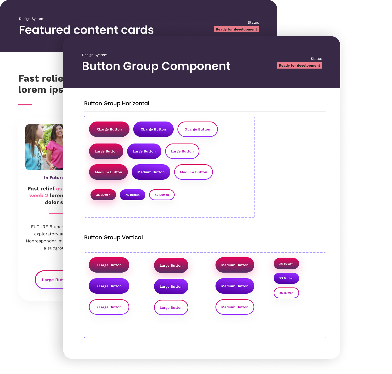
Modular Components in Action
Flexible foundations with
molecular components
We treated each molecule as a flexible building block within the design system. Thanks to Figma’s Auto Layout and Variants, every component, whether it was a button, badge, or card, could be rethemed and reconfigured in seconds. By pairing these tools with core atomic-design rules, we built a library that scaled effortlessly across breakpoints while always keeping usability front and center.
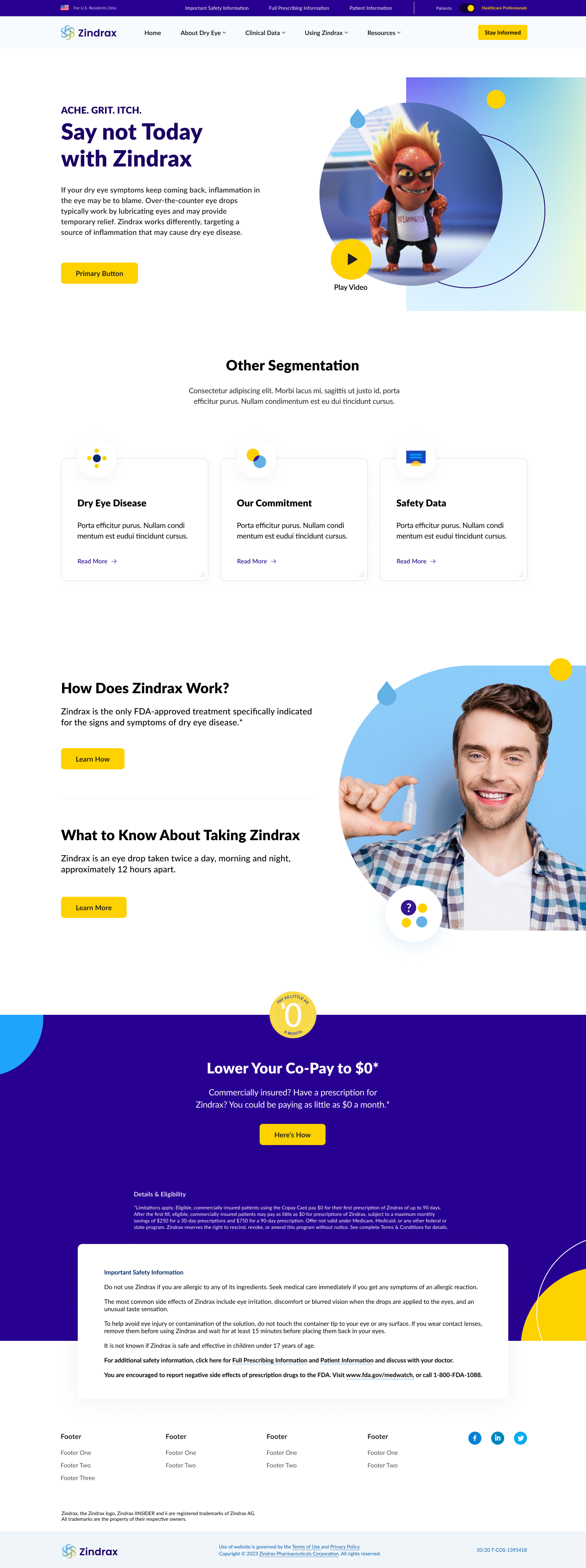
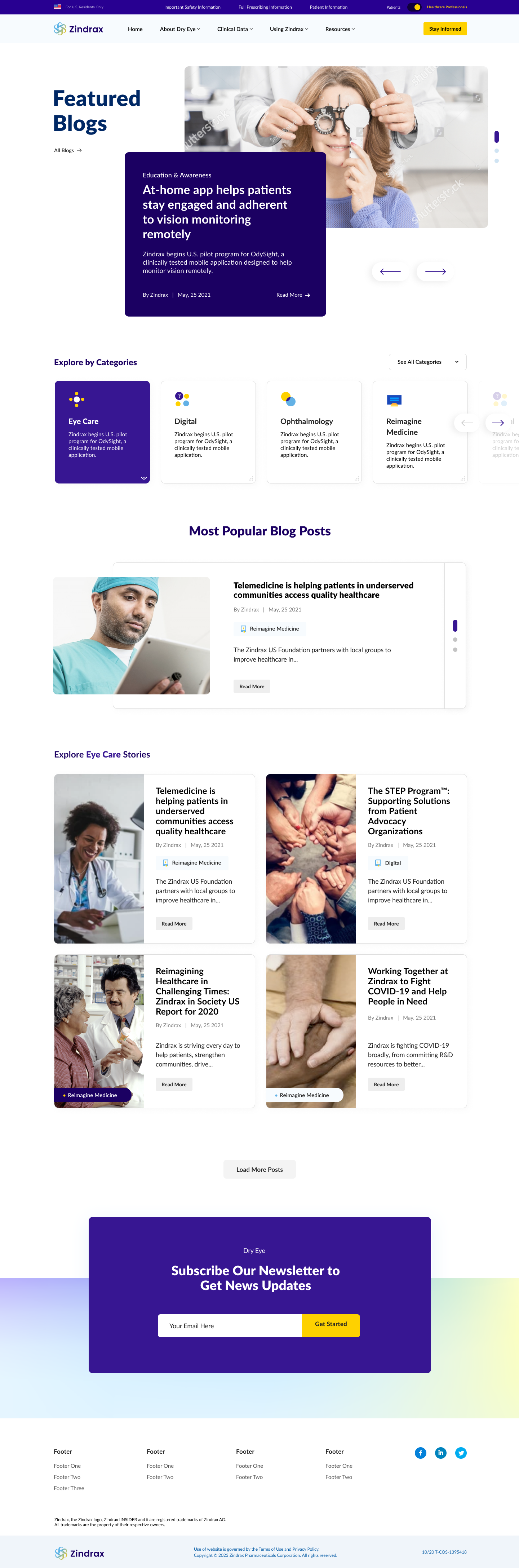
Webpage templates
Reusable, responsive templates that pair pre-tokenised components with ready-made layouts, enabling teams to spin up new landing pages or screens in minutes while staying on-brand and WCAG-compliant.
04.
Results
Elevated design system at scale
A token-driven design system now powers every product, app, and site.
Robust theming
One click swaps palettes or brands, preserving visual coherence across contexts.
Re-organised component library
Clearer hierarchy makes components easier to find and deploy.
Living docs in Figma ↔︎ Storybook
Usage guidelines, code, and accessibility notes stay perfectly in sync.
Consistent naming conventions
A <pattern-state-size> schema eliminates ambiguity and speeds collaboration.
More Case Studies
DesignGost
Product Vision, Product Strategy, and User Experience
Zindrax
Design System Vision and Experience
DupAir
Branding, Product Vision, and User Experience
Havas Health & You
Redesign Vision and Experience
Open for new opportunities and collaboration! Whether it's a professional collaboration or just a friendly chat, I'm all ears.