What I worked on:

Founder

Product Strategy

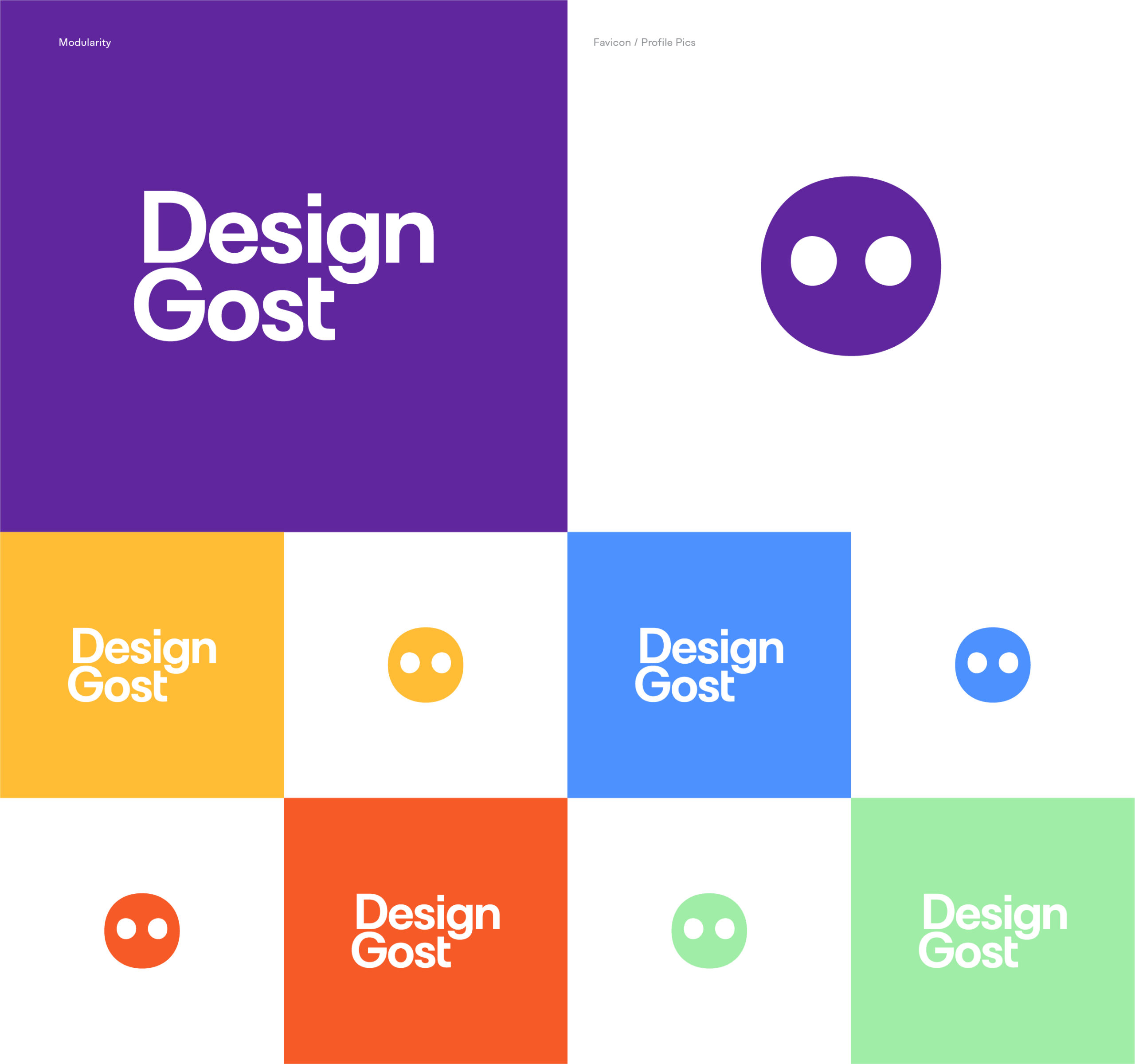
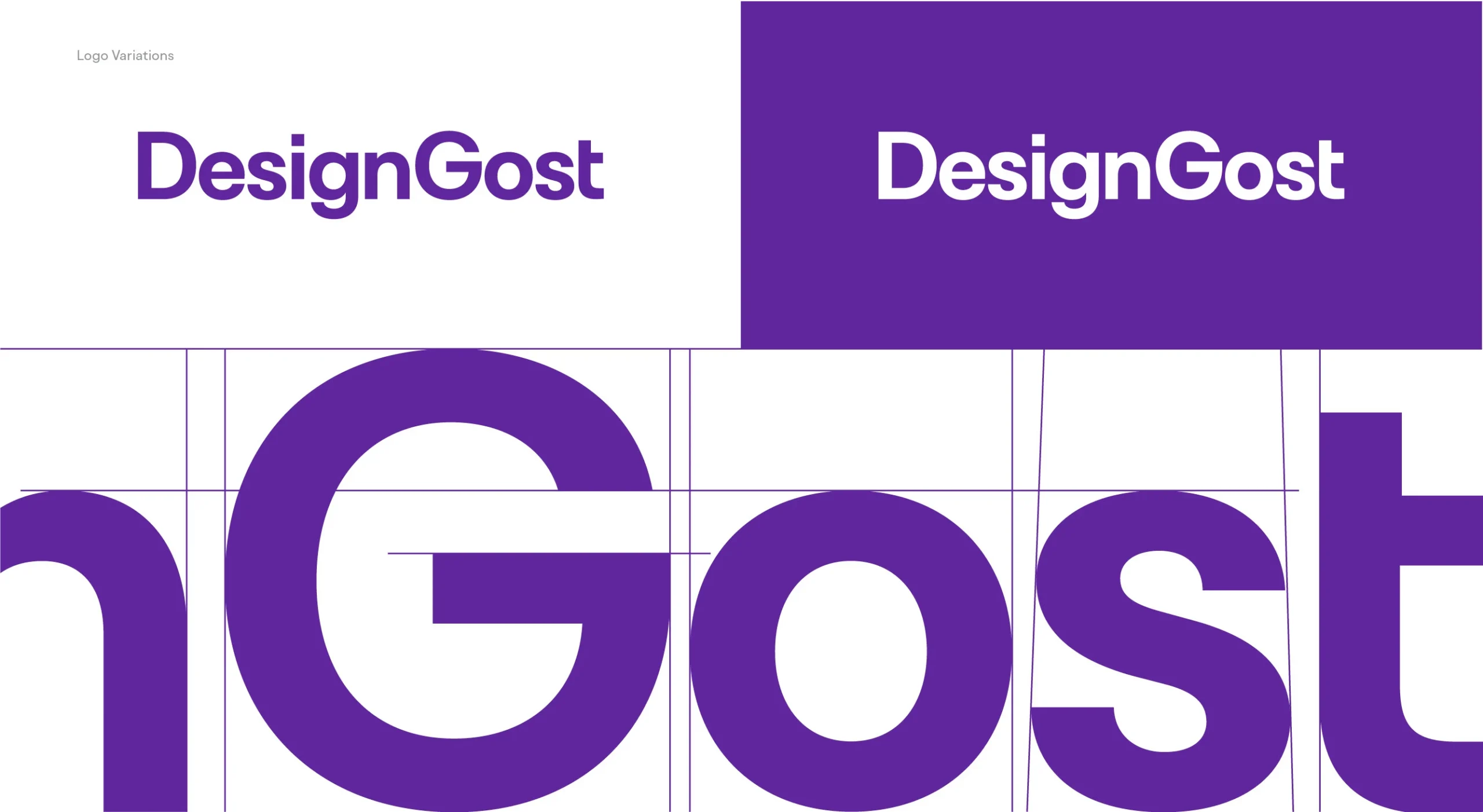
Branding

Product Design

User Experience

Research

Design System

You need a personal Creative Director?

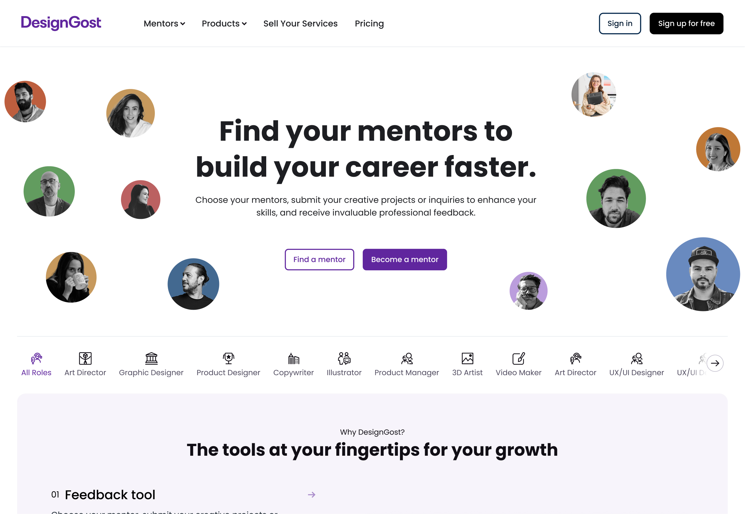
DesignGost is a platform for mentorship that specializes in providing insightful critique on creative projects and guiding emerging creative talent.

I took leadership of our product’s development, attempting to give it a personal touch while remaining consistent with current design and user experience trends. My main goal is to improve mentorship and feedback journeys, making it easy for aspiring creatives to engage with mentors.

Based on our research into user needs, each iteration of the design undergoes a round of user feedback, interviews, and prototype testing. This approach ensures we produce a platform that is oriented towards users and creates real value for them.

Team​

Hakan Ertan
Product Designer
Mesut Ugurlu
Creative Director
1523734935171
Hande Dursun
Marketing Manager
Emre Ertan
Front-End Developer
Orhan Ince
Full-Stack Developer
The problem

Young creatives face difficulty in connecting with top-tier creatives to showcase their work and receive insightful feedback.

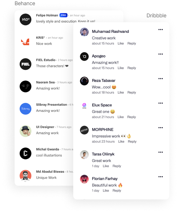
Platforms such as Behance, Dribbble, and ADPlist often lacked in-depth and insigthful feedback on design & creative projects.

Discover

First, before touching anything related to design, I wanted to dive into the psychology, needs, and motivations of our potential users.

Competitive audit

Since the mentoring and project showcase sectors are already crowded, I wanted to look into what was working well and what could be improved.

Competitive audit & the gap

The competition lacks in-depth and constructive feedback culture on design and creative projects.
Behance:

âś… Simplified dashboard

❌ Mentorship

❌ Feedback tool

❌ 1:1s

âś… Direct Messages

âś… Landing pages

âś… Online store

Dribbble:

âś… Simplified dashboard

❌ Mentorship

❌ Feedback tool

❌ 1:1s

âś… Direct Messages

âś… Landing pages

âś… Online store

ADPList:

âś… Simplified dashboard

âś… Mentorship

❌ Feedback tool

âś… 1:1s

âś… Direct Messages

❌ Landing pages

❌ Online store

User Interviews / Primary Research

After observing the psychology + competition in this market, I wanted to know firsthand about our target audiences’ experiences so that I could tailor the final product to them.

To understand our users’ emotions, thoughts, and behaviors, we employed UX methods including semi-structured video interviews and open-ended questions for qualitative user research.

Questions:

  • Why are you seeking mentorship and feedback for your design projects, and how do you think it will help you grow as a designer?
  • What specific features or tools are you looking for in a mentorship and feedback platform?
  • What do you hope to gain emotionally from using DesignGost, and what features would make you feel most satisfied as a user?
  • Can you share a time when receiving feedback from a mentor positively impacted your design work or career goals?

Analyzing the data

81
young creatives

95+
data points

4
main insights

3
different flows
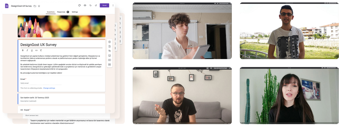
"I believe my chances of success would triple if I had access to insightful feedback for my projects and skills."

Insights

Professional growth priority

Participants emphasized mentorship and feedback for their professional development as designers. They see access to experienced mentors and insightful feedback as crucial for refining skills, learning new techniques, and navigating career paths effectively.

Feature preferences

Participants specified desired features for a mentorship and feedback platform like DesignGost. They value user-friendly communication channels for connecting with mentors, structured feedback systems providing actionable insights, and access to diverse professionals across various design disciplines.

Long-term relationship building

Interviewees stressed the importance of long-term relationship building on mentorship platforms. They seek features facilitating ongoing connections with mentors, enabling continuous learning, mentorship, and growth over time. Building lasting relationships with mentors is crucial for gaining deeper insights and advancing careers.

Emotional well-being

Participants highlighted emotional support and satisfaction in their user experience. They desire features prioritizing emotional well-being, such as supportive communities, encouragement from mentors, and recognition of achievements, contributing to overall satisfaction with the platform.

Persona

Goals

Improve Design Skills:
Aims to enhance her design skills by receiving constructive feedback from experienced professionals and learning new techniques.

Advance Career:
Wants to advance her career by networking with industry experts, gaining insights into career growth opportunities, and building a strong portfolio.

Gain Confidence:
Emily seeks to boost her confidence as a designer by receiving validation and recognition for her work, as well as overcoming imposter syndrome.

Impactful Design:
Aspires to create designs that have a meaningful impact on users’ lives, whether by solving complex problems, improving accessibility, or promoting inclusivity and diversity in design solutions.

Design

When it came to design, I first spent two weeks experimenting with three distinct approaches. Do not even touch the UI; focus solely on the experience and flow.

Testing MVP

When figuring out how the platform should work, I asked myself: What’s the main thing this platform should do? And how can we make it easy for users to do that? The main goal is to help users find a mentor and share their projects or questions easily.

Explorations

Focusing on three main flows:

Soft (MVP) Launch

We needed a structured approach to develop our product effectively. To gather user feedback, gauge interest, test the user experience, and refine our product, we opted for a soft MVP launch strategy. We initially launched the MVP in a smaller market, Turkey, to evaluate its performance.

Results

The strategy of launching a soft MVP in a tiny market, Turkey, to improve our product was successful.

450+
Mentors

6000+
Users

750+
Projects

80+
Weekly new users 

Design improvements

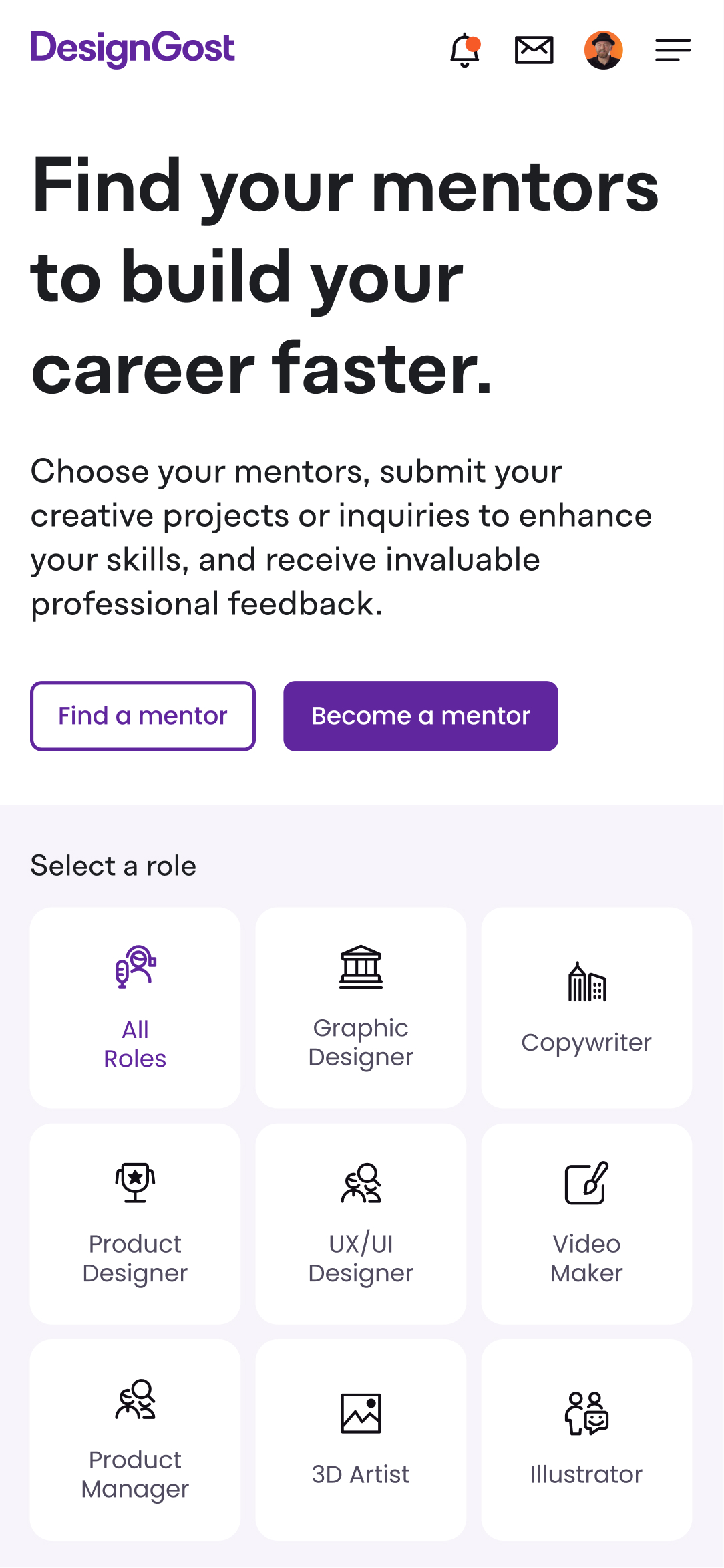
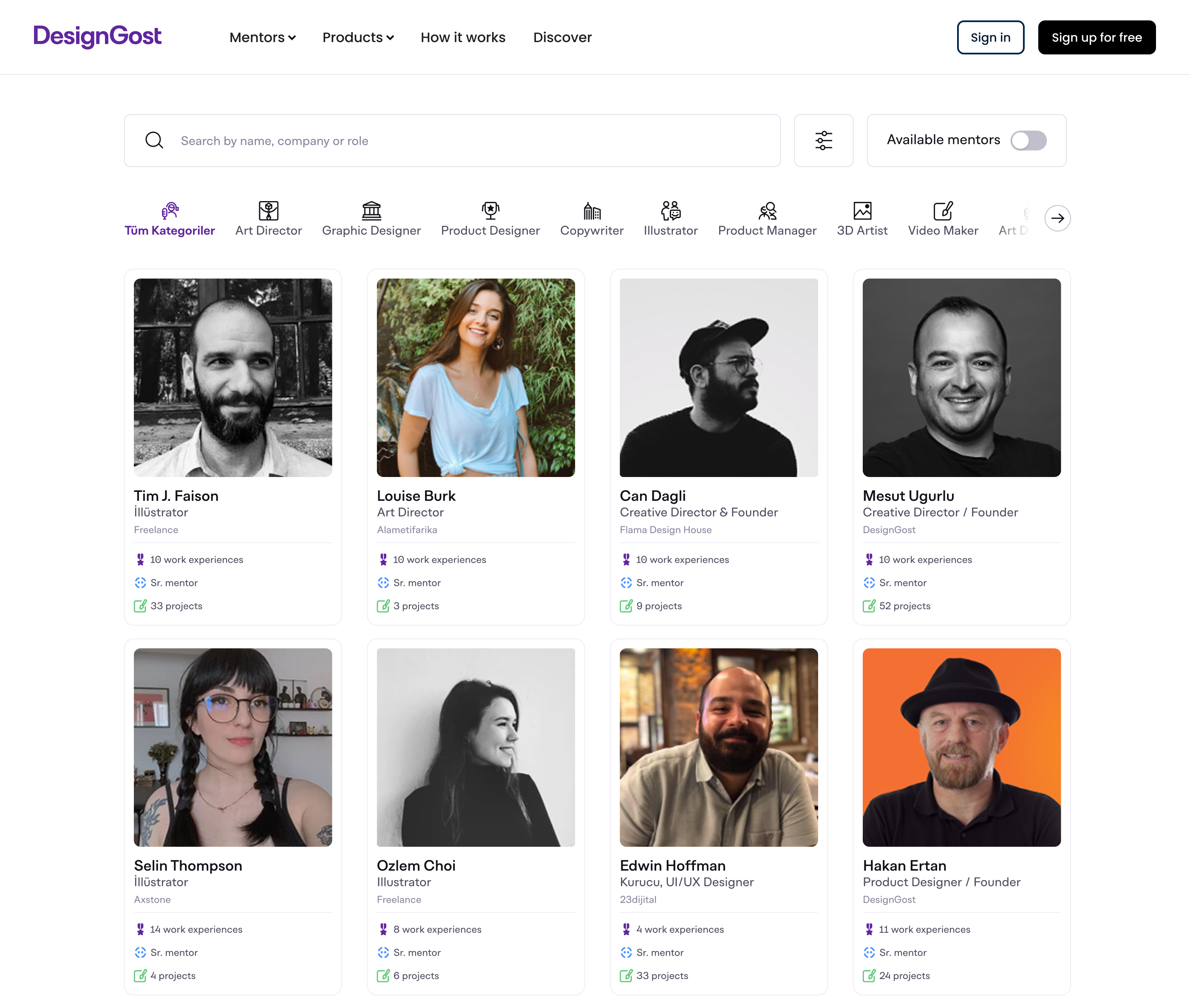
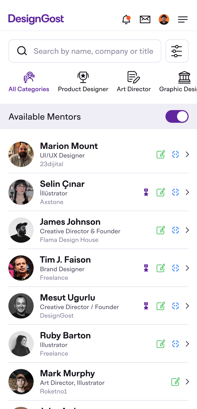
After the soft launch, we continually iterated the designs, making some major improvements based on the various feedback we received.

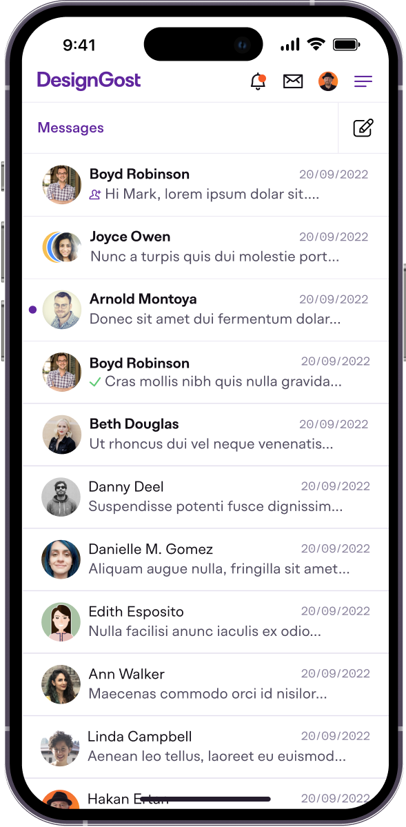
Streamlined mentor discovery

  • In response to user feedback, we’ve streamlined the search process for finding a mentor, prioritizing intuitive navigation.
  • Users can now seamlessly navigate through the mentor search journey, ensuring a smoother experience.

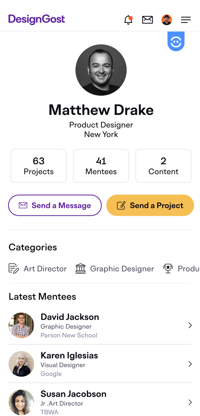
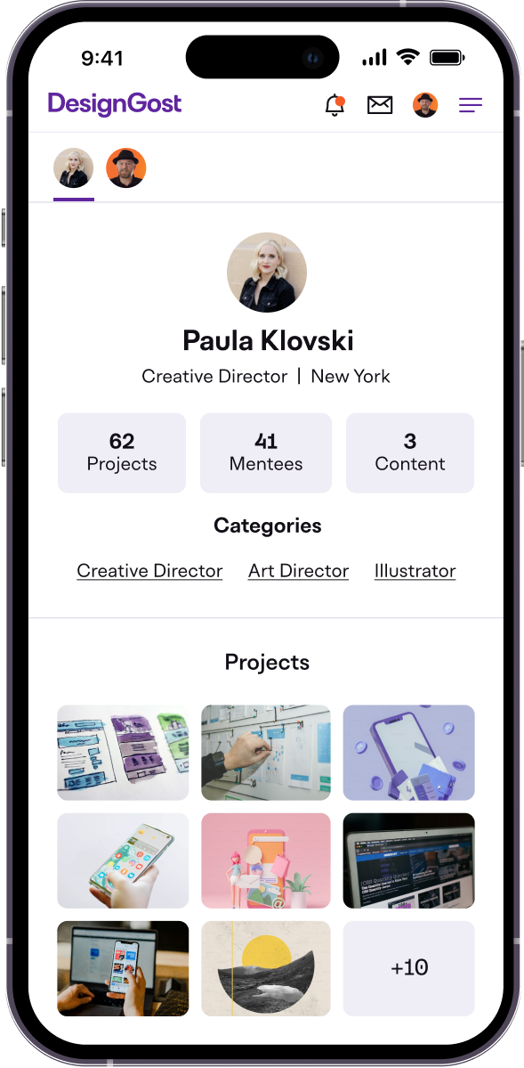
Simplified mentor profile pages

  • Clearer Presentation: Condensing mentor profiles reduce visual noise, enhancing readability and enabling users to swiftly locate key information.
  • Enhanced Accessibility: Streamlining mentor profiles reduces visual clutter, improving readability and enabling users to quickly find important information.

Removal of bottom nav

  • Based on user feedback, to enhance focus, we removed the bottom nav and moved it to the top of the page, allowing users to focus on the content without interruptions.
  • Consolidating the main nav at the top enhances web accessibility, facilitating easier navigation for users with disabilities using screen readers or keyboard navigation.

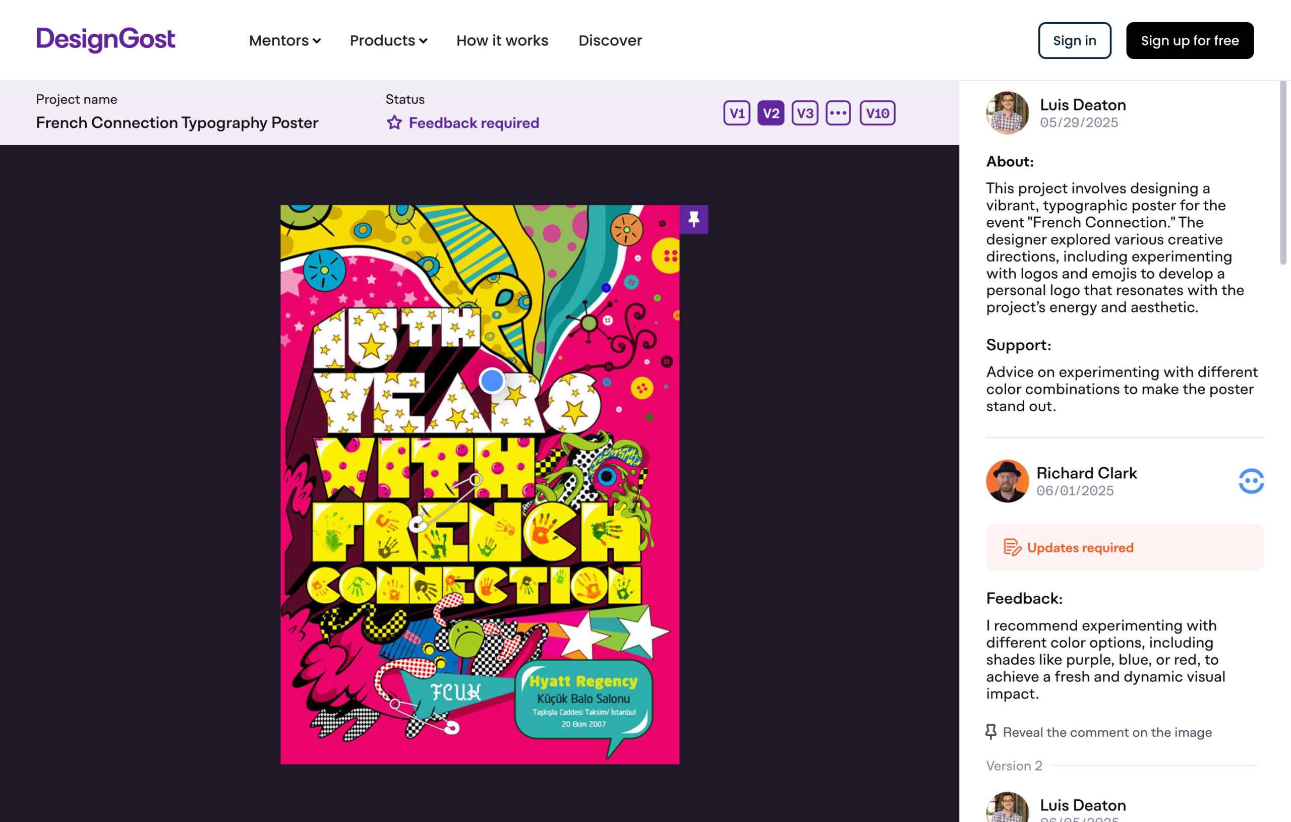
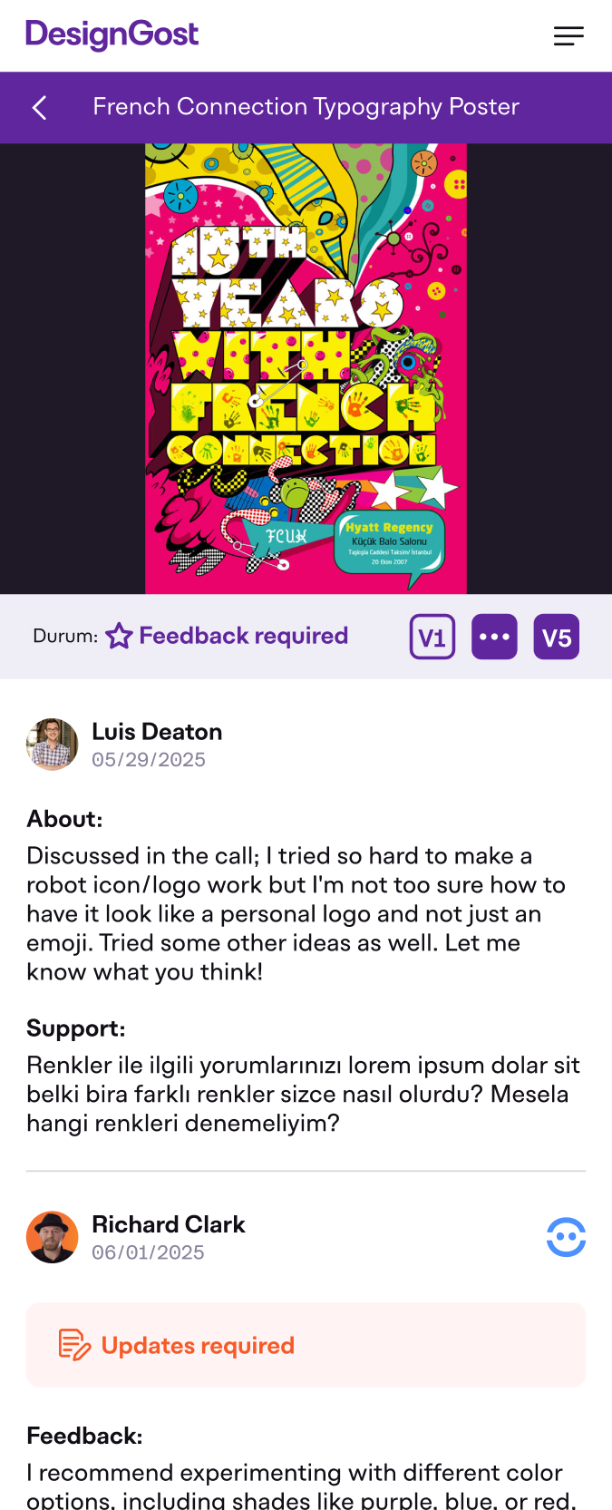
Feedback tool

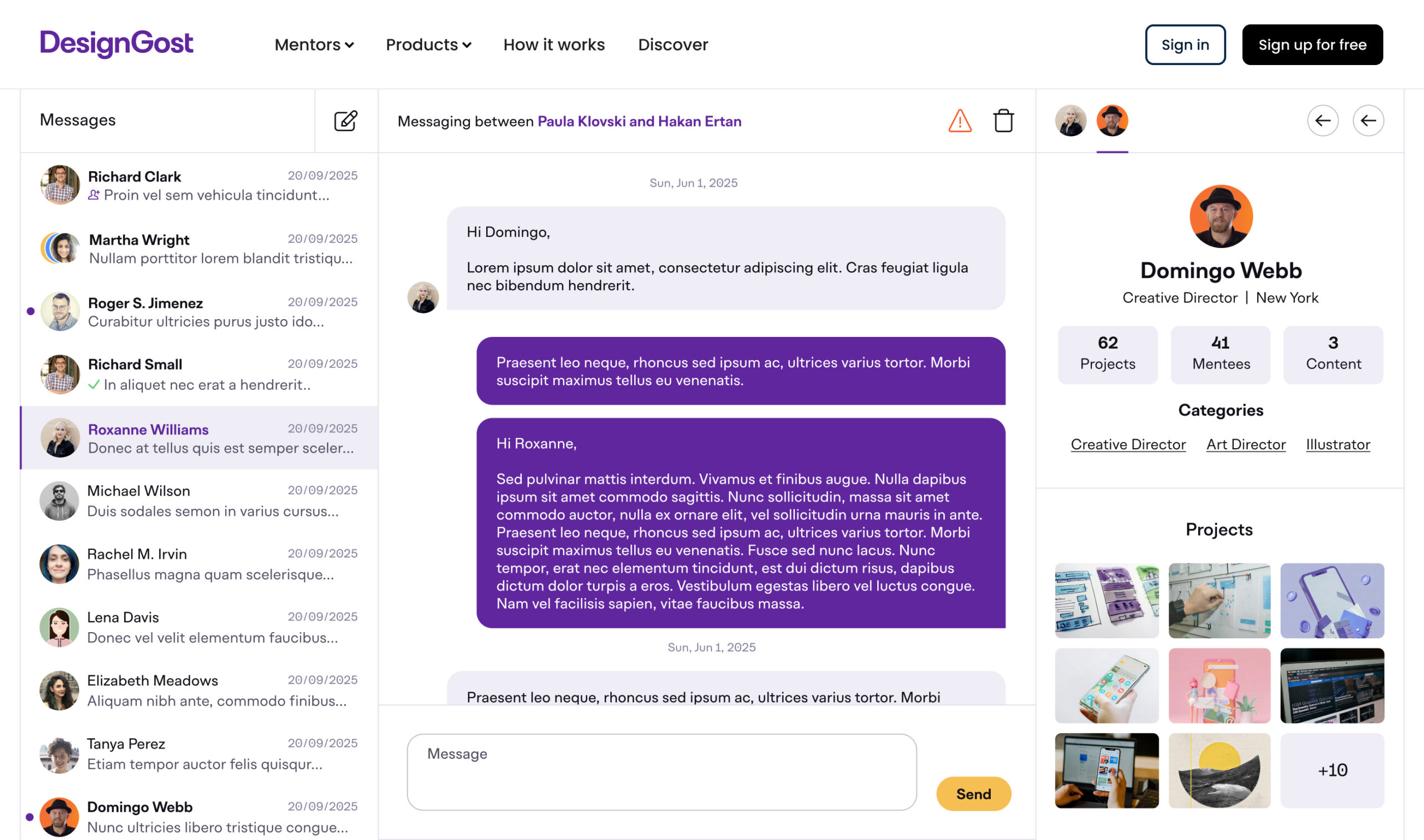
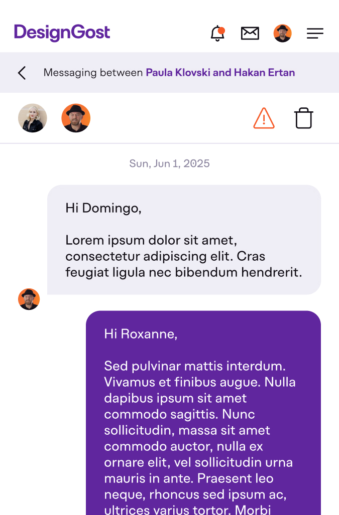
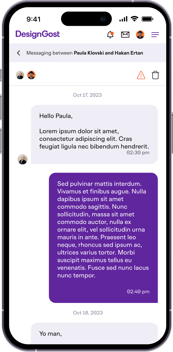
Direct messages

Design system

We needed to create a design system that is easy to use, aligned with code, and flexible enough to handle creating new features quickly.

Foundations

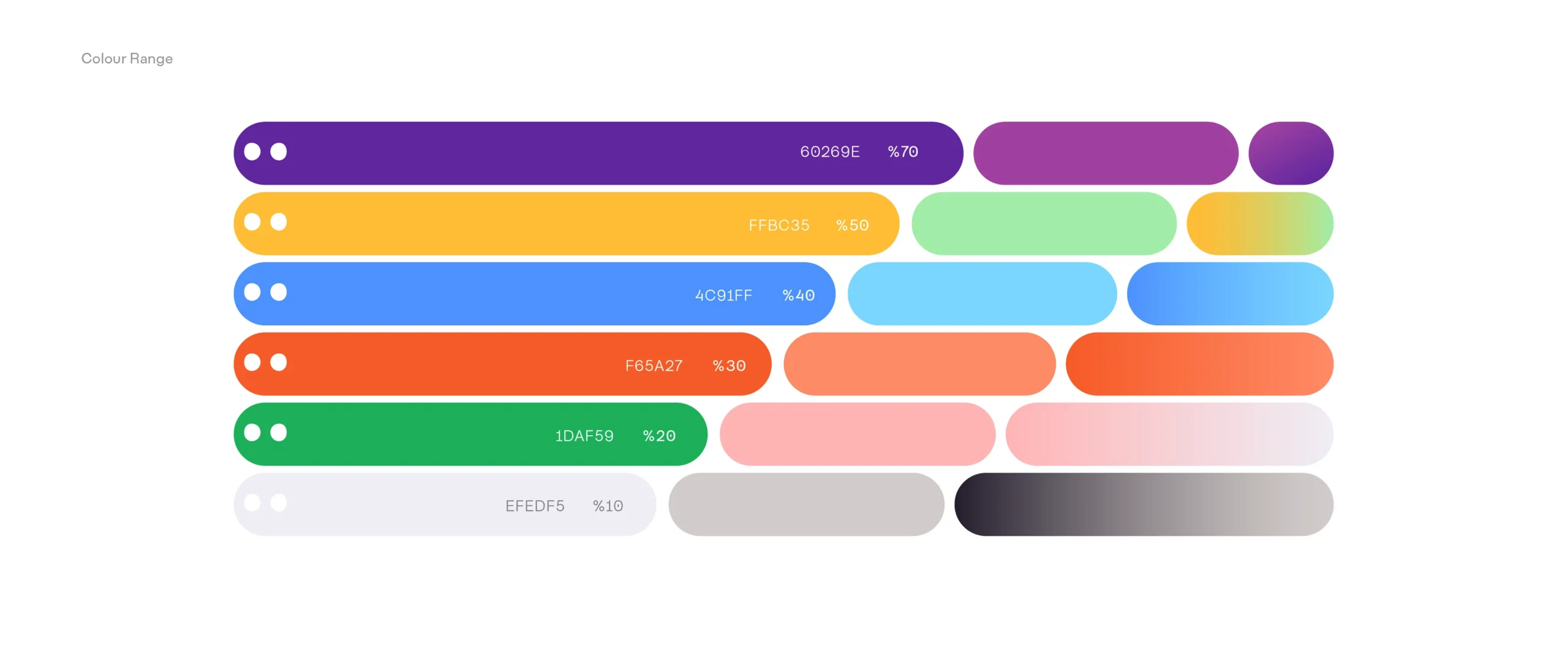
Our approach to building the foundations of the design system involved meticulous attention to details. We carefully crafted the typography scale, informing the sizing system for line-heights, font sizes, grid and spacing, and interactive states. This ensured consistent compatibility across all components. Additionally, our color system was designed with easy theming in mind, while maintaining strict adherence to WCAG standards for accessibility throughout the process.
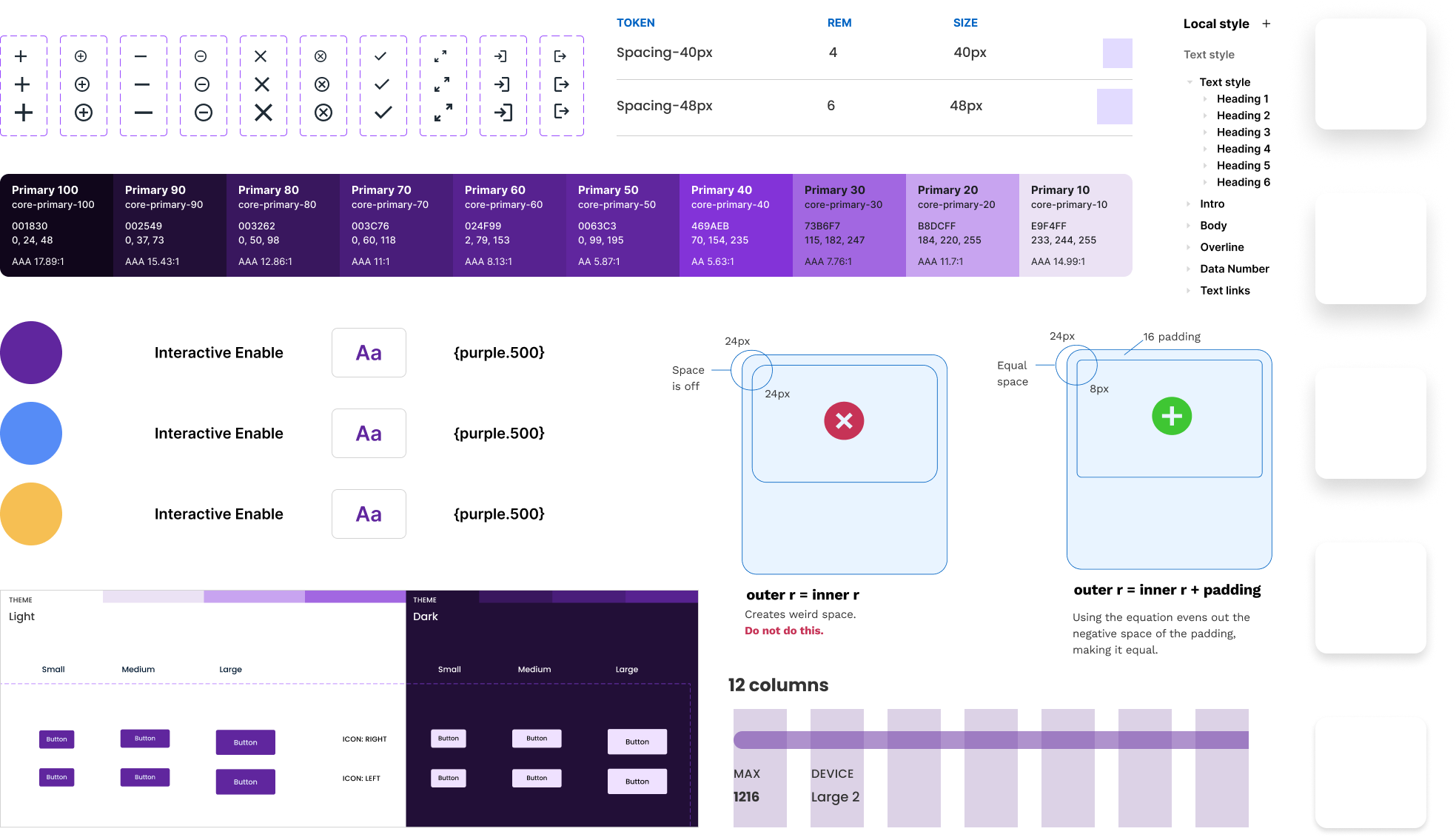
Properties, nested instances, and variants

We have used components as the key building blocks of our design system, using Figma’s auto-layout as well as the variant features to ensure flexibility and editability. We follow atomic design principles and use fundamental rules when we build components, such as buttons, input controls, etc, to make them adjustable for different sizes. Our main aim is to ensure an intuitive user experience and consistency. Further, our components give developers 1:1 parity because the properties are close to the code that they will use, which leads to smooth collaboration with developers.

Project management

Our project management strategy revolves around the Kanban method, using Trello as our primary project management tool. Additionally, we conduct planning meetings twice a week to ensure effective coordination and alignment within the team.

Dev handoff​

We ensured a smooth dev handoff by creating a comprehensive Functional Requirements Document (FRD). Throughout the build process, we provided continuous support to our developers, offering feedback and addressing any emerging edge cases promptly.

Project management method

As a remote team, we leverage the visual capabilities of Kanban boards (Trello). This tool enables our engineers to track progress and workflows effectively, regardless of their location. By simplifying the overall framework, we reduce the risk of bottlenecks and ensure smooth project management.

Key takeaways

Accessibility awareness:

The work with DesignGost helped me recall how critical it is in design to know how to work for maximum accessibility. We were very careful about color contrast, typography, and navigation, ensuring that no one was left behind in using our platform regardless of ability. Continuing ahead, we are fully committed to making our product even more accessible by incorporating operable features, including voice and keyboard support in the next updates.

Optimized resource allocation:

DesignGost showed us how very crucial it is to make smart resource allocations to maximize our productivity and save budget. By managing our time, budget, and team members smartly, we were able to get to the really important aspects of the project without wasteful time consumption. For instance, we moved from PHP to Node.js for the backend and React for the frontend on V2, leveraging the rest of our team’s skills to develop efficiently.

Data-driven decision-making:

Working on DesignGost emphasized the value of data-driven decision-making to inform design choices and optimize outcomes. With analytics, testing users, and performance metrics, we got very valuable information regarding the behavior and preferences of users. With this, we were able to make informed decisions about the new features, priorities, and resource allocation to deliver better user experience and more efficient outcomes.

Open for new opportunities and collaboration! Whether it’s a professional collaboration or just a friendly chat, I’m all ears.