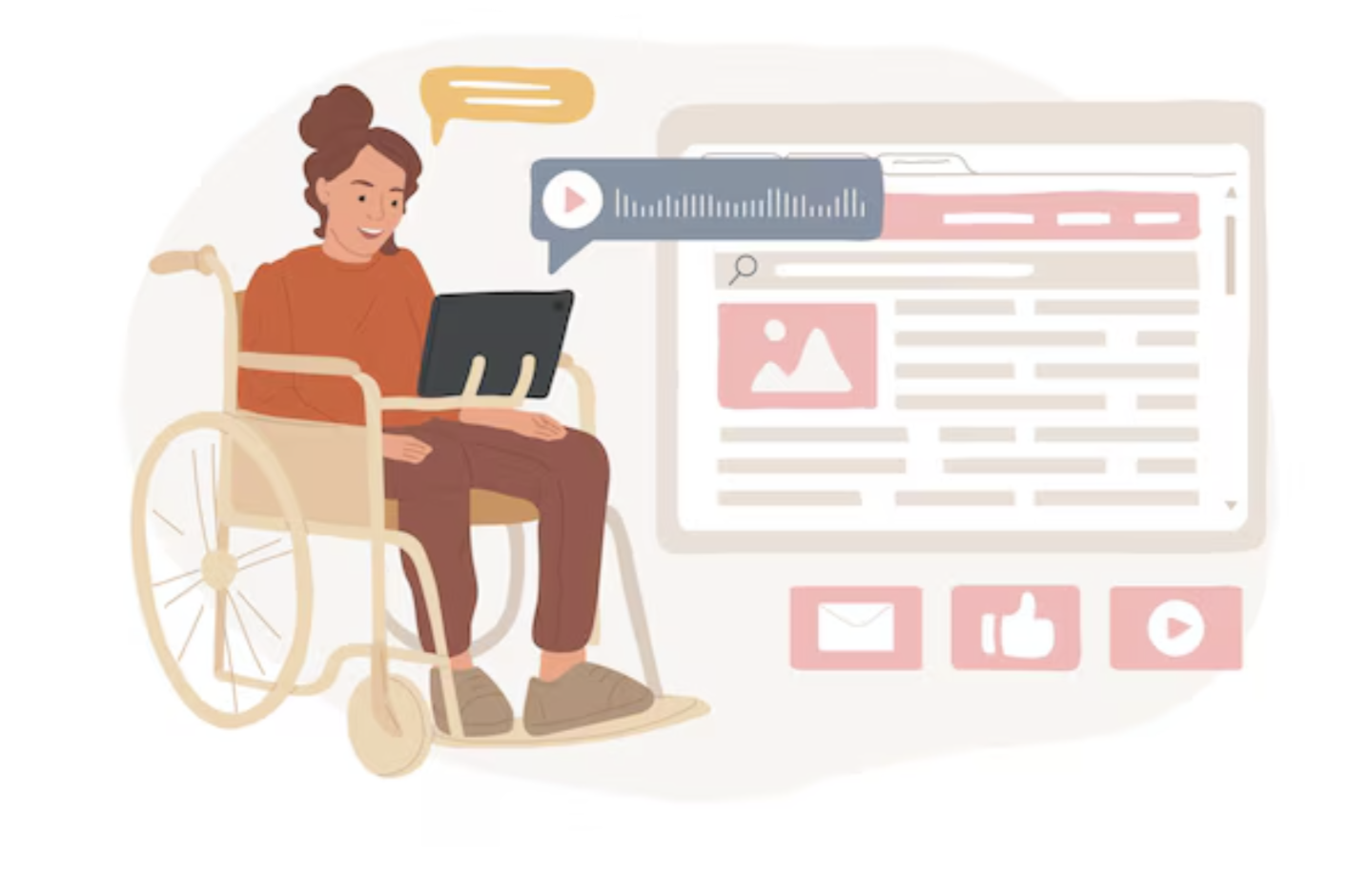
User Experience: Accessibility Standards in Web and Product Design

User Experience: Accessibility Standards in Web and Product Design

Web accessibility is no longer an option; it’s a necessity. With over 1 billion people worldwide living with some form of disability, creating inclusive digital experiences should be a top priority for designers and developers.

In this article, we’ll go over the key principles of web accessibility, common challenges faced by users with disabilities, techniques for achieving accessibility in your designs, tools for testing and auditing accessibility, and real-life case studies of successful implementations.

What will we go over?

  • Understanding accessibility standards
  • Key principles of web accessibility
  • Common accessibility challenges
  • Techniques for achieving accessibility
  • Tools and resources for accessibility testing
  • Implementing accessibility in product and web design
  • Case studies of successful accessibility implementations
  • Future trends in accessibility
  • Resources and further reading

Understanding accessibility standards

Image: interaction-design.org

Let’s first understand what web accessibility is all about and why it is important.

Web accessibility is a framework for building and developing digital products and web applications that are usable by anyone, regardless of physical or cognitive ability. It ensures that people with disabilities can perceive, understand, navigate, and interact with digital content effectively.

The most widely recognized international frameworks and guidelines for building accessible digital products:

Web Content Accessibility Guidelines (WCAG):

The most comprehensive and widely adopted web accessibility standards. It provides precise recommendations for making web content perceivable, operable, understandable, and robust.

WCAG 2 overview: https://www.w3.org/WAI/standards-guidelines/wcag/

Section 508:

Image: accessiblemindstech.com

This is a U.S. federal law that requires all electronic and information technology (EIT) developed, procured, maintained, or used by federal agencies to be accessible to people with disabilities.

https://www.section508.gov/manage/laws-and-policies/

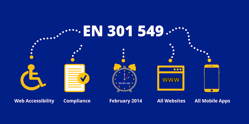
EN 301 549:

Image: bestwebsiteaccessibility.com

A European standard that harmonizes the accessibility requirements for public sector websites and mobile applications within the European Union.

While these standards may have different scopes and target audiences, they all share a common goal: ensuring equal online access to information and services.

https://accessible-eu-centre.ec.europa.eu/content-corner/digital-library/en-3015492021-accessibility-requirements-ict-products-and-services_en

Common accessibility challenges

Some of the common challenges faced by users with disabilities:

  • Visual impairments: People with visual impairments may rely on screen readers or magnification tools to access online content. However, if websites are not properly coded or lack descriptive text alternatives for images, these users may miss out on important information.
  • Auditory impairments: Users who are deaf or hard of hearing may have difficulty understanding audio-only content such as podcasts or videos without captions or transcripts.
  • Motor impairments: Individuals with motor disabilities may have limited dexterity or mobility, making it challenging to use traditional input devices like a mouse or keyboard. Designing for keyboard accessibility and providing alternative input methods can greatly enhance the user experience.
  • Cognitive impairments: Certain conditions, like dyslexia or attention deficit disorder (ADD), can affect how people process information and navigate websites. Using clear language, consistent navigation, and minimizing distractions can help make your content more inclusive.

It’s important to remember that these challenges are not mutually exclusive, and many individuals may experience multiple disabilities. By understanding their needs and designing with empathy, we can create digital experiences that are truly inclusive.

Key principles of web accessibility

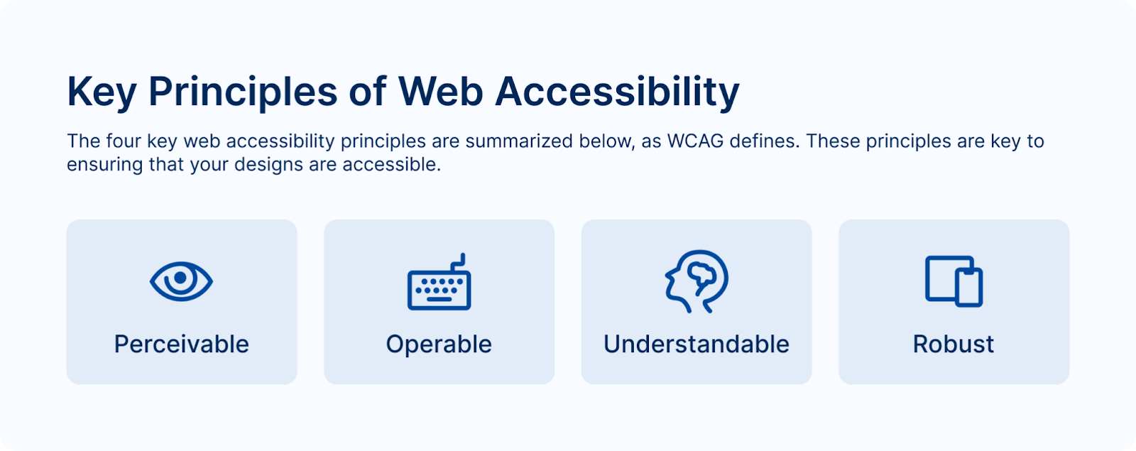
The four key web accessibility principles are summarized below, as WCAG defines. These principles are key to ensuring that your designs are accessible.

Key principles of web accessibility

Web Content Accessibility Guidelines (WCAG):

1. Perceivable

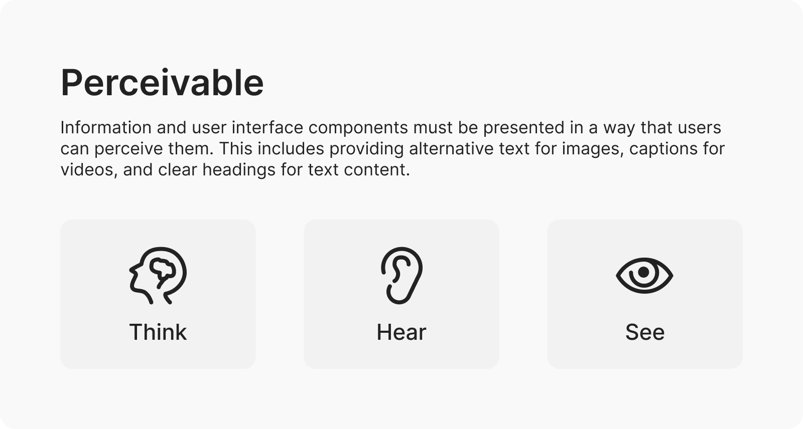
Information and user interface components must be presented in a way that users can perceive them. This includes providing alternative text for images, captions for videos, and clear headings for text content.

  • Alternative text for images: Add descriptive alt text to all images to ensure users with visual impairments can understand the content.
  • Video captions: Provide captions for all videos to make the content accessible to users who are deaf or hard of hearing.
  • Clear headings: Use clear and descriptive headings to structure content and improve navigation for all users.

2. Operable

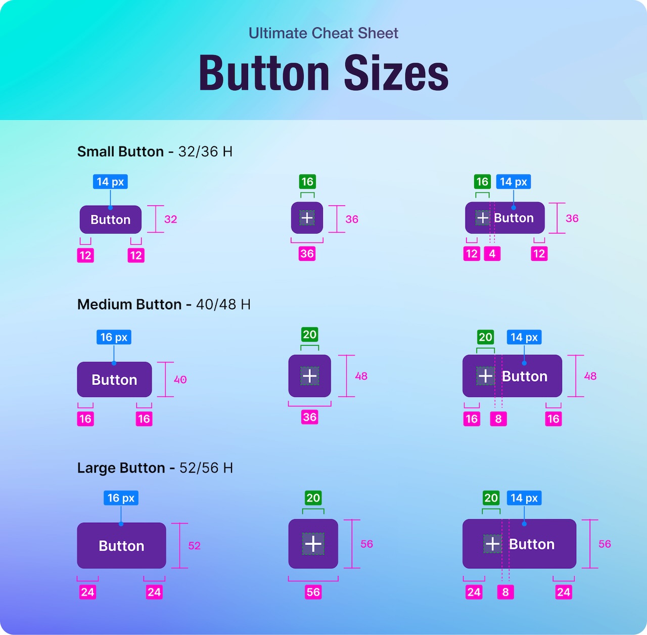
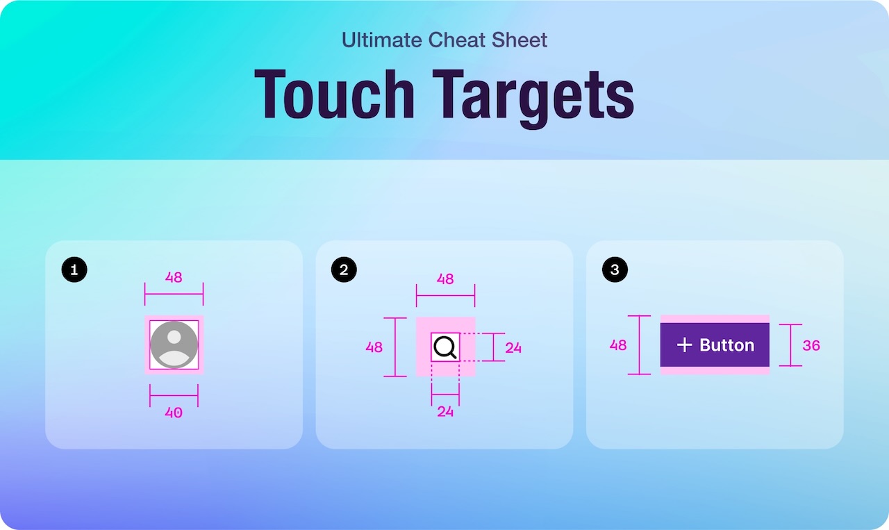
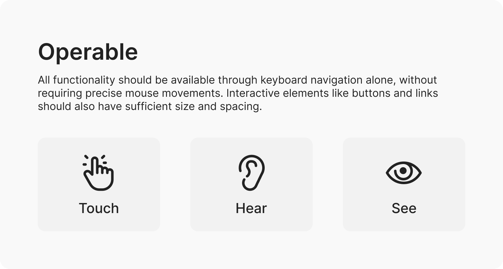
All functionality should be available through keyboard navigation alone, without requiring precise mouse movements. Interactive elements like buttons and links should also have sufficient size and spacing.

  • Keyboard navigation: Ensure all interactive elements, such as links and buttons, can be accessed and activated using only the keyboard.
  • Focus indicators: Provide visible focus indicators to highlight the currently focused element, improving usability for keyboard users.
  • Accessible forms: Design forms that are easy to navigate and complete using only the keyboard, with clear labels and instructions.

3. Understandable

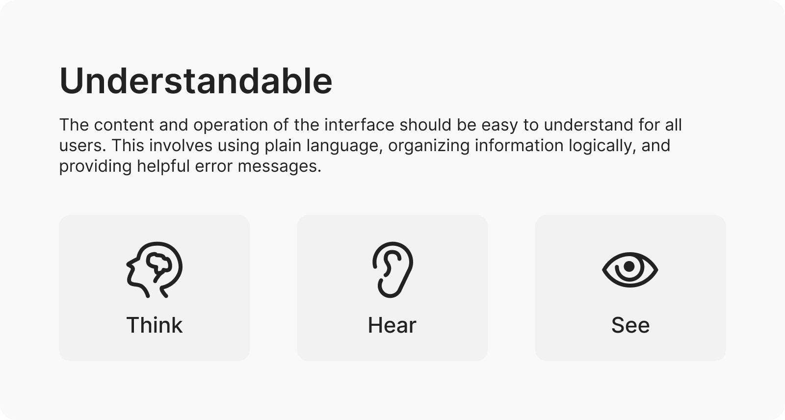
The content and operation of the interface should be easy to understand for all users. This involves using plain language, organizing information logically, and providing helpful error messages.

  • Plain language: Use clear and concise language to convey information, avoiding jargon and complex terminology.
  • Logical layout: Organize content logically and intuitively to make it easier for all users to understand and navigate.
  • Helpful error messages: Provide descriptive error messages that clearly explain the issue and how to resolve it, improving the user experience for all.

4. Robust

The design should be compatible with current and future technologies, including assistive technologies used by people with disabilities. This means following industry best practices and avoiding deprecated features.

  • Compatibility testing: Test your website or application across different devices, browsers, and assistive technologies to ensure compatibility.
  • Avoiding deprecated features: Use modern HTML, CSS, and JavaScript techniques to ensure your design remains compatible with future technologies.
  • Following standards: Adhere to industry best practices and accessibility standards, such as WCAG, to ensure your design is robust and future-proof.

In addition to these fundamental techniques, there are also advanced concepts like ARIA (Accessible Rich Internet Applications) attributes that can further enhance the accessibility of complex web components.

For a more comprehensive list of accessibility best practices:

WCAG documentation >

Tools and Resources for Accessibility Testing

While implementing accessibility techniques is essential, it’s equally important to validate your designs and ensure they meet the required standards.

Here are some tools and resources that can help:

1. Automated Testing Tools

  • Axe: A powerful accessibility testing engine that can be integrated into your development workflow. It analyzes web pages and provides detailed reports on accessibility issues.
  • WAVE: A web accessibility evaluation tool that offers visual feedback on potential issues. It highlights accessibility errors and provides suggestions for improvement.

These tools can quickly identify common accessibility errors such as missing alt text or invalid color contrast. However, it’s worth noting that automated tests can only catch around 30–50% of all accessibility issues, so manual testing is still crucial.

2. Manual Testing Techniques

  • Keyboard Testing: Verify all interactive elements that can be accessed and operated using keyboard navigation alone. For example, ensure users can tab through links and form fields smoothly without encountering any obstacles.
  • Screen Reader Testing: Use screen reader software like NVDA (Non-Visual Desktop Access) or VoiceOver to understand how assistive technologies interpret your content. For instance, listen to how screen readers announce headings, links, and other interactive elements.
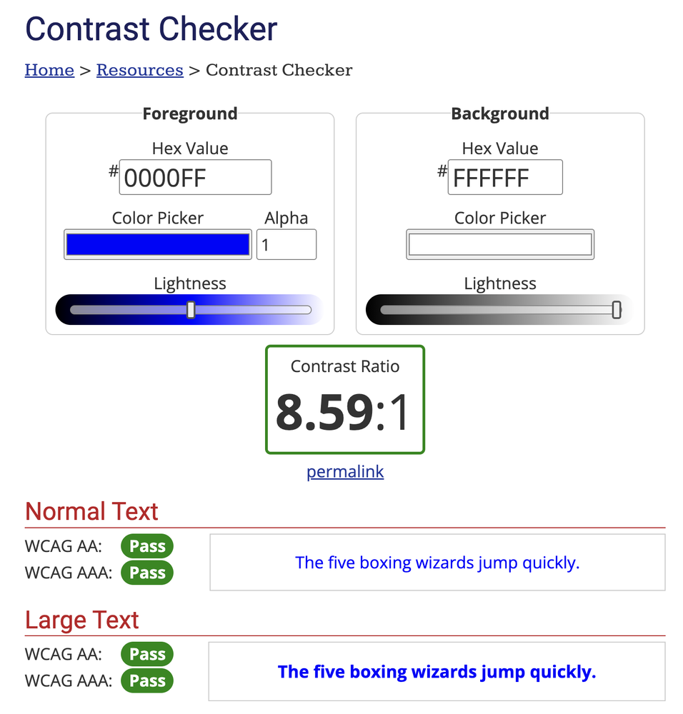
  • Color Contrast Checking: Ensure text elements have sufficient contrast with their background colors using tools like WebAIM’s Contrast Checker. For example, verify that text remains readable for users with low vision or color blindness.

3. User Testing with

Individuals with Disabilities
One of the most effective ways to evaluate the accessibility of your designs is by involving actual users with disabilities in the testing process. This can provide valuable insights into their needs and preferences, helping you uncover usability issues that may have been overlooked.

If you don’t have direct access to such users, there are online platforms like UserTesting or Userlytics that allow you to recruit participants remotely for usability studies.

4. Accessibility Audits

For larger organizations or complex projects, conducting a comprehensive accessibility audit by hiring external experts may be necessary. These audits typically involve a detailed review of your design and codebase, followed by a comprehensive report with actionable recommendations.

Example audit:

Summary and Checklist: Android Native Mobile App Accessibility >

Implementing Accessibility in Product and Web Design

Image: freepick.com

Creating accessible designs is a shared responsibility that requires collaboration between designers, developers, content creators, and other stakeholders.

Incorporating best practices into your design approach establishes accessibility as a foundational element and mitigates the need for expensive revisions or legal complications in the future.

Some best practices for integrating accessibility into your design process:

  • Education and awareness: Ensure that everyone involved in the project understands the importance of web accessibility and its impact on users. Consider emphasizing the ongoing need for education and awareness to maintain a culture of inclusivity.
  • Inclusive design workshops: Conduct workshops or training sessions to help teams develop empathy towards users with disabilities and learn practical techniques for inclusive design. Share examples or case studies of successful workshops to illustrate their effectiveness in fostering inclusive design practices.
  • Accessible design systems: Establish a set of reusable components, design patterns, and guidelines that adhere to accessibility standards. Explain how accessible design systems contribute to creating inclusive products and websites by promoting consistency and efficiency in design projects.
  • Accessibility reviews: Incorporate accessibility checkpoints or reviews at key milestones of the design process to catch any potential issues early on. Provide specific examples of checkpoints or criteria that should be evaluated during these reviews, such as keyboard accessibility and color contrast.
  • Checklists and guidelines: Provide designers and developers with easy-to-use checklists or guidelines that outline the specific accessibility requirements for different components or interactions. Consider incorporating links to current accessibility checklists or guidelines, such as those provided by WCAG, to help readers implement accessibility best practices effectively.

Case Studies of Successful Accessibility Implementations

Image: freepick.com

Case studies offer more than just inspiration—they provide practical insights and valuable lessons learned that you can apply to your projects, helping you create digital experiences that are truly inclusive and impactful.

To further illustrate the impact of accessible design, you may want to take a look at some real-life case studies where organizations have successfully implemented inclusive practices:

  • Banking apps: Explore how a leading bank redesigned its mobile app to enhance accessibility for users with visual impairments. Learn about the specific challenges faced during the redesign process and the innovative solutions implemented to address them. Discover the tangible benefits experienced by both users and the bank as a result of these accessibility improvements.
  • E-commerce websites: Discover the journey of an online retailer towards creating a fully inclusive shopping experience for all users. Explore the accessibility enhancements made to the website, such as improved navigation, clearer product descriptions, and enhanced checkout processes. Learn how these changes positively impacted user engagement, conversion rates, and overall customer satisfaction.
  • Government portals: Take a deep dive into the challenges faced by public sector websites in ensuring accessibility and how one government agency successfully overcame them. Explore the strategies employed to make the portal more inclusive, including the adoption of accessible design principles, the implementation of assistive technologies, and user testing with individuals with disabilities. Gain insights into the broader impact of accessibility improvements on citizen engagement, government transparency, and compliance with accessibility regulations.

Future Trends in Accessibility

As technology continues to evolve, new opportunities and challenges arise in ensuring digital accessibility for all users.

  • Emerging technologies and trends: Explore specific examples of emerging technologies and trends that are shaping the future of accessibility. This could include advancements in AI-driven accessibility solutions, the rise of inclusive design frameworks, Natural Language Processing (NLP) for improved screen reader capabilities, machine learning algorithms for personalized accessibility recommendations, and Augmented Reality (AR) and Virtual Reality (VR) for immersive accessibility experiences.
  • Potential challenges and considerations: Discuss potential challenges associated with future trends in accessibility, such as ensuring the ethical use of AI in accessibility applications, addressing the accessibility implications of emerging technologies like virtual reality, or navigating evolving regulatory landscapes and standards.
  • Opportunities for innovation: Highlight opportunities for innovation in addressing accessibility challenges. This could involve leveraging emerging technologies to develop new accessibility solutions, fostering interdisciplinary collaboration to promote inclusive design practices, or advocating for policy changes to support digital accessibility initiatives.
  • Practical advice for UX designers and developers: Offer practical advice for staying ahead in the field of accessibility. This could include staying informed about emerging technologies and accessibility standards, participating in relevant professional development opportunities, actively engaging with accessibility communities and resources, and incorporating accessibility considerations into the design process from the outset.

Resources and Further Reading

In this section, you will find a curated list of resources to deepen your knowledge about accessibility. Whether you’re a beginner or an expert, there’s something here for everyone:

Remember, knowledge alone is not enough – it’s what we do with that knowledge that truly matters. Let’s commit to making accessibility a fundamental aspect of our design process, striving to create digital experiences that are not only usable but truly inclusive and empowering for all. Together, we can build a more accessible and inclusive digital world.

As we come to the end of this article, I want to hear from you! Share your experiences and insights on accessibility in the comments below.

Thank you for reading. Don’t forget to share with your network.

Availability

Open for new collaborations! Whether it’s a professional collaboration or just a friendly chat, I’m all ears.

Designers Help Stray Dogs – Donation Campaign

Designers Help Stray Dogs

Fundraising Campaign

We Feed Friends

It was an open call to photographers, graphic designers, illustrators and art directors: Let your next work go to stray dogs and cats as food. We get stray dogs in Istanbul food by selling your work.

Challenges

Istanbul boasts a population of 14 million people, making it the eighth-largest city in the world. But it is the city’s estimated 150,000 stray cats and dogs that draw a lot of attention. For centuries, locals have left out food and water for their beloved street creatures.

When Turkey’s Ministry of Forestry and Water drafted a law that would send city dogs to “wildlife parks” on city outskirts, thousands of animal rights activists were outraged. The law was set aside because of broad opposition.


Solution

I decided to run a fundraising campaign to get thousands of stray dogs food and shelter as well as make an attempt to raise awareness on loving animals.

Illustrators, art directors, graphic designers, and photographer friends sent their works and we sold them on the campaign website.

And, yes we did it and got them a ton of food.
Credit:
Director: Hakan Ertan
Copywriter: Ender Emiroğlu
Creative Director: Hakan Ertan
Producer: Hande Dursun
Cinematographer: Hakan Ertan
Music: Mattia Cupelli
Voice Over: Ali Bilensir
Production: Solid Interactive
Campaing website
Newspaper websites
Twitter shares
Happy friends 🙂

DesignGost

What I worked on:

Founder

Product Strategy

Branding

Product Design

User Experience

Research

Design System

You need a personal Creative Director?

DesignGost is a platform for mentorship that specializes in providing insightful critique on creative projects and guiding emerging creative talent.

I took leadership of our product’s development, attempting to give it a personal touch while remaining consistent with current design and user experience trends. My main goal is to improve mentorship and feedback journeys, making it easy for aspiring creatives to engage with mentors.

Based on our research into user needs, each iteration of the design undergoes a round of user feedback, interviews, and prototype testing. This approach ensures we produce a platform that is oriented towards users and creates real value for them.

Team​

Hakan Ertan
Product Designer
Mesut Ugurlu
Creative Director
1523734935171
Hande Dursun
Marketing Manager
Emre Ertan
Front-End Developer
Orhan Ince
Full-Stack Developer
The problem

Young creatives face difficulty in connecting with top-tier creatives to showcase their work and receive insightful feedback.

Platforms such as Behance, Dribbble, and ADPlist often lacked in-depth and insigthful feedback on design & creative projects.

Discover

First, before touching anything related to design, I wanted to dive into the psychology, needs, and motivations of our potential users.

Competitive audit

Since the mentoring and project showcase sectors are already crowded, I wanted to look into what was working well and what could be improved.

Competitive audit & the gap

The competition lacks in-depth and constructive feedback culture on design and creative projects.

Behance:

✅ Simplified dashboard

❌ Mentorship

❌ Feedback tool

❌ 1:1s

✅ Direct Messages

✅ Landing pages

✅ Online store

Dribbble:

✅ Simplified dashboard

❌ Mentorship

❌ Feedback tool

❌ 1:1s

✅ Direct Messages

✅ Landing pages

✅ Online store

ADPList:

✅ Simplified dashboard

✅ Mentorship

❌ Feedback tool

✅ 1:1s

✅ Direct Messages

❌ Landing pages

❌ Online store

User Interviews / Primary Research

After observing the psychology + competition in this market, I wanted to know firsthand about our target audiences’ experiences so that I could tailor the final product to them.

To understand our users’ emotions, thoughts, and behaviors, we employed UX methods including semi-structured video interviews and open-ended questions for qualitative user research.

Questions:

  • Why are you seeking mentorship and feedback for your design projects, and how do you think it will help you grow as a designer?
  • What specific features or tools are you looking for in a mentorship and feedback platform?
  • What do you hope to gain emotionally from using DesignGost, and what features would make you feel most satisfied as a user?
  • Can you share a time when receiving feedback from a mentor positively impacted your design work or career goals?

Analyzing the data

81
young creatives

95+
data points

4
main insights

3
different flows

"I believe my chances of success would triple if I had access to insightful feedback for my projects and skills."

Insights

Professional growth priority

Participants emphasized mentorship and feedback for their professional development as designers. They see access to experienced mentors and insightful feedback as crucial for refining skills, learning new techniques, and navigating career paths effectively.

Feature preferences

Participants specified desired features for a mentorship and feedback platform like DesignGost. They value user-friendly communication channels for connecting with mentors, structured feedback systems providing actionable insights, and access to diverse professionals across various design disciplines.

Long-term relationship building

Interviewees stressed the importance of long-term relationship building on mentorship platforms. They seek features facilitating ongoing connections with mentors, enabling continuous learning, mentorship, and growth over time. Building lasting relationships with mentors is crucial for gaining deeper insights and advancing careers.

Emotional well-being

Participants highlighted emotional support and satisfaction in their user experience. They desire features prioritizing emotional well-being, such as supportive communities, encouragement from mentors, and recognition of achievements, contributing to overall satisfaction with the platform.

Persona

Goals

Improve Design Skills:
Aims to enhance her design skills by receiving constructive feedback from experienced professionals and learning new techniques.

Advance Career:
Wants to advance her career by networking with industry experts, gaining insights into career growth opportunities, and building a strong portfolio.

Gain Confidence:
Emily seeks to boost her confidence as a designer by receiving validation and recognition for her work, as well as overcoming imposter syndrome.

Impactful Design:
Aspires to create designs that have a meaningful impact on users’ lives, whether by solving complex problems, improving accessibility, or promoting inclusivity and diversity in design solutions.

Design

When it came to design, I first spent two weeks experimenting with three distinct approaches. Do not even touch the UI; focus solely on the experience and flow.

Testing MVP

When figuring out how the platform should work, I asked myself: What’s the main thing this platform should do? And how can we make it easy for users to do that? The main goal is to help users find a mentor and share their projects or questions easily.

Explorations

Focusing on three main flows:

Soft (MVP) Launch

We needed a structured approach to develop our product effectively. To gather user feedback, gauge interest, test the user experience, and refine our product, we opted for a soft MVP launch strategy. We initially launched the MVP in a smaller market, Turkey, to evaluate its performance.

Results

The strategy of launching a soft MVP in a tiny market, Turkey, to improve our product was successful.

450+
Mentors

6000+
Users

750+
Projects

80+
Weekly new users 

Design improvements

After the soft launch, we continually iterated the designs, making some major improvements based on the various feedback we received.

Streamlined mentor discovery

  • In response to user feedback, we’ve streamlined the search process for finding a mentor, prioritizing intuitive navigation.
  • Users can now seamlessly navigate through the mentor search journey, ensuring a smoother experience.

Simplified mentor profile pages

  • Clearer Presentation: Condensing mentor profiles reduce visual noise, enhancing readability and enabling users to swiftly locate key information.
  • Enhanced Accessibility: Streamlining mentor profiles reduces visual clutter, improving readability and enabling users to quickly find important information.

Removal of bottom nav

  • Based on user feedback, to enhance focus, we removed the bottom nav and moved it to the top of the page, allowing users to focus on the content without interruptions.
  • Consolidating the main nav at the top enhances web accessibility, facilitating easier navigation for users with disabilities using screen readers or keyboard navigation.

Feedback tool

Direct messages

Design system

We needed to create a design system that is easy to use, aligned with code, and flexible enough to handle creating new features quickly.

Foundations

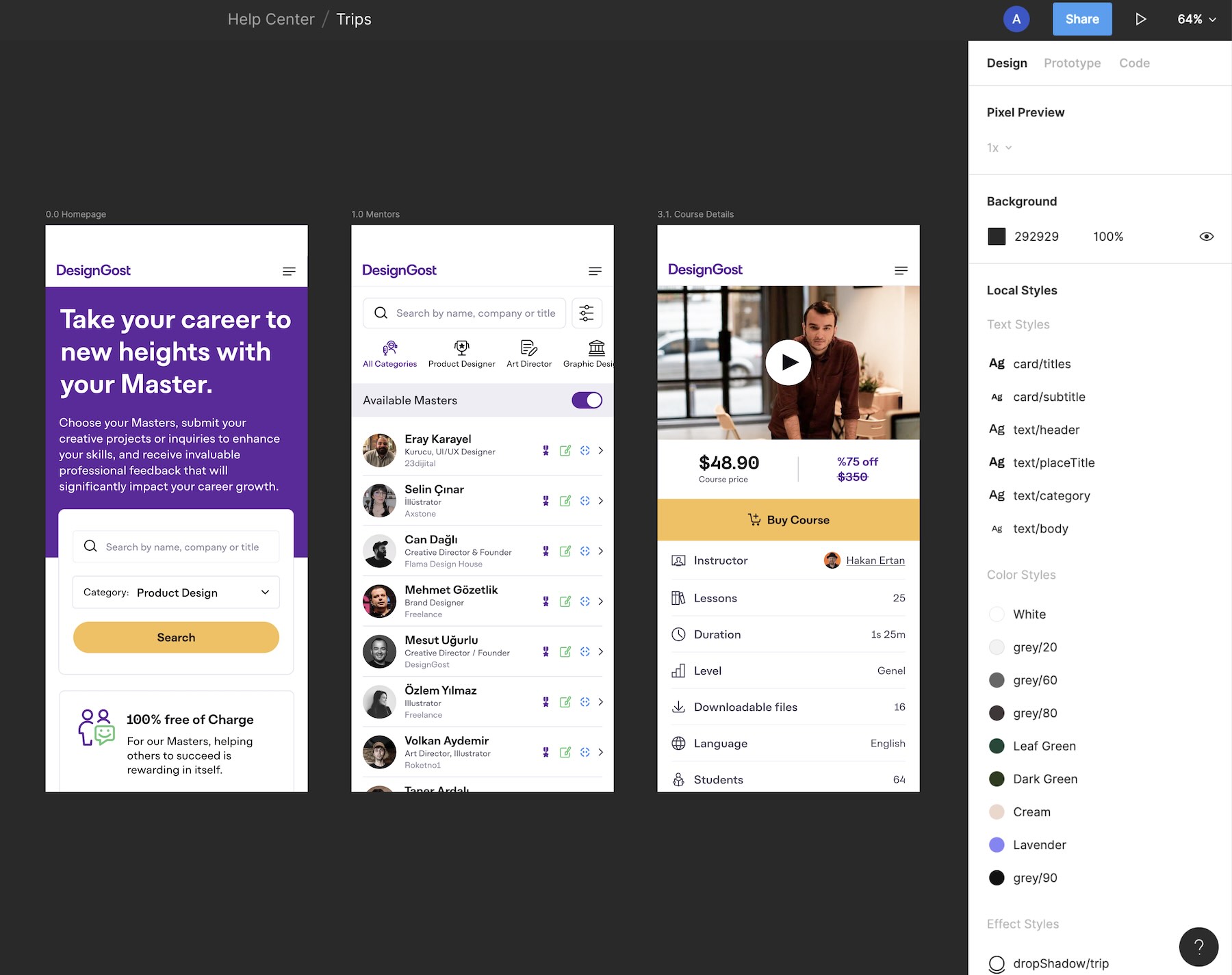
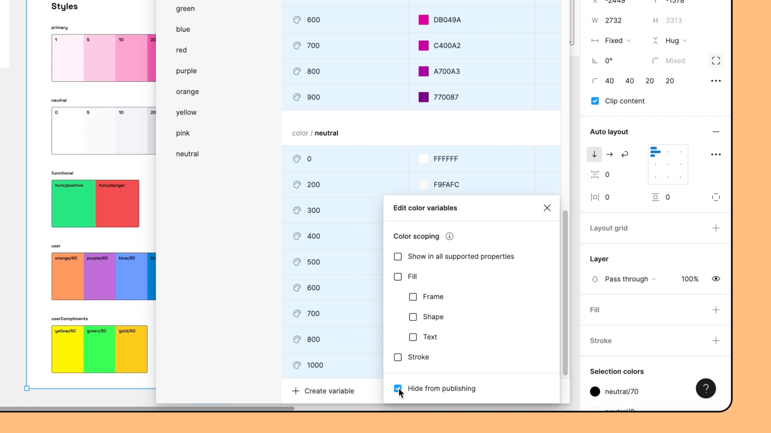
Our approach to building the foundations of the design system involved meticulous attention to details. We carefully crafted the typography scale, informing the sizing system for line-heights, font sizes, grid and spacing, and interactive states. This ensured consistent compatibility across all components. Additionally, our color system was designed with easy theming in mind, while maintaining strict adherence to WCAG standards for accessibility throughout the process.

Properties, nested instances, and variants

We have used components as the key building blocks of our design system, using Figma’s auto-layout as well as the variant features to ensure flexibility and editability. We follow atomic design principles and use fundamental rules when we build components, such as buttons, input controls, etc, to make them adjustable for different sizes. Our main aim is to ensure an intuitive user experience and consistency. Further, our components give developers 1:1 parity because the properties are close to the code that they will use, which leads to smooth collaboration with developers.

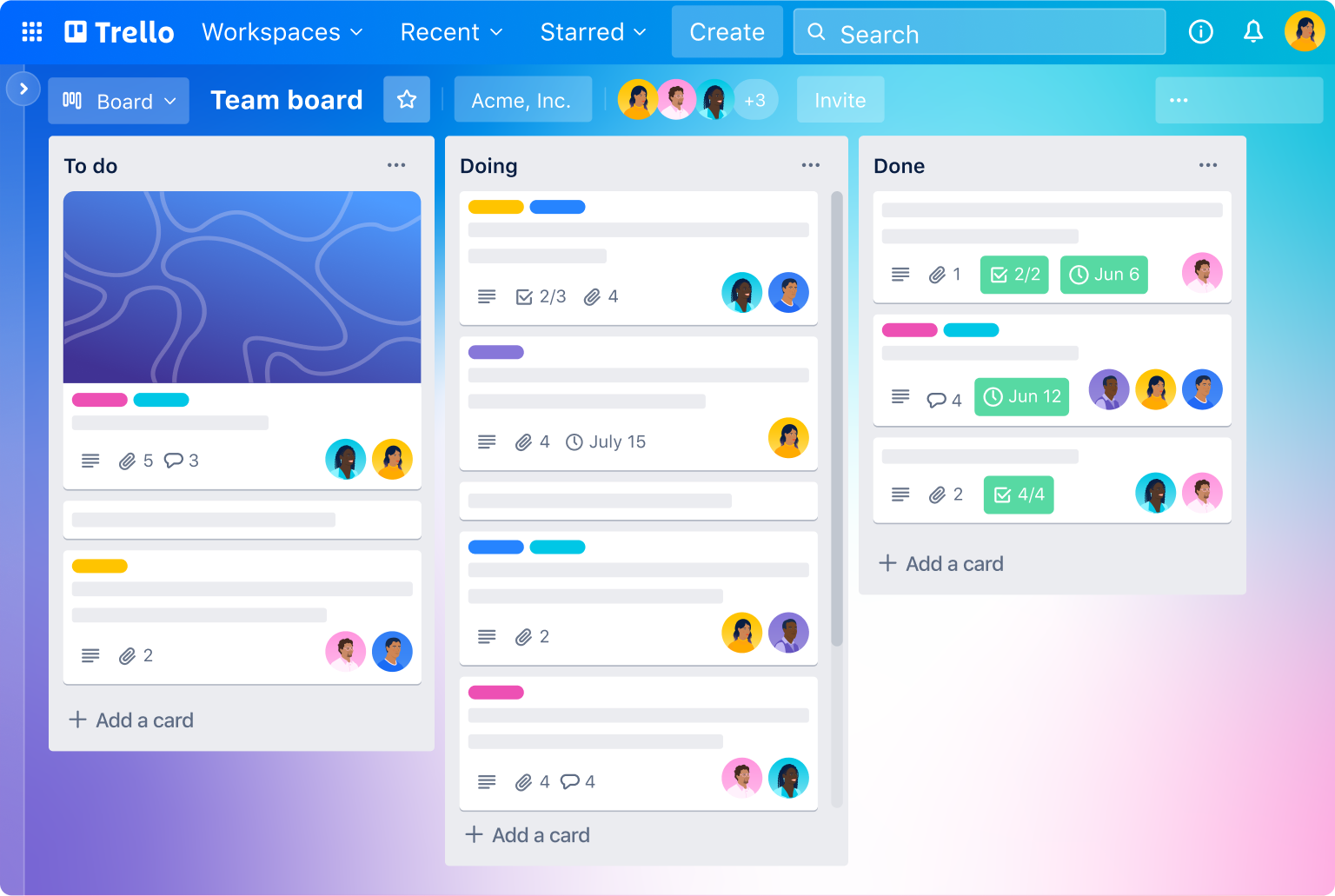
Project management

Our project management strategy revolves around the Kanban method, using Trello as our primary project management tool. Additionally, we conduct planning meetings twice a week to ensure effective coordination and alignment within the team.

Dev handoff​

We ensured a smooth dev handoff by creating a comprehensive Functional Requirements Document (FRD). Throughout the build process, we provided continuous support to our developers, offering feedback and addressing any emerging edge cases promptly.

Project management method

As a remote team, we leverage the visual capabilities of Kanban boards (Trello). This tool enables our engineers to track progress and workflows effectively, regardless of their location. By simplifying the overall framework, we reduce the risk of bottlenecks and ensure smooth project management.
Key takeaways

Accessibility awareness:

The work with DesignGost helped me recall how critical it is in design to know how to work for maximum accessibility. We were very careful about color contrast, typography, and navigation, ensuring that no one was left behind in using our platform regardless of ability. Continuing ahead, we are fully committed to making our product even more accessible by incorporating operable features, including voice and keyboard support in the next updates.

Optimized resource allocation:

DesignGost showed us how very crucial it is to make smart resource allocations to maximize our productivity and save budget. By managing our time, budget, and team members smartly, we were able to get to the really important aspects of the project without wasteful time consumption. For instance, we moved from PHP to Node.js for the backend and React for the frontend on V2, leveraging the rest of our team’s skills to develop efficiently.

Data-driven decision-making:

Working on DesignGost emphasized the value of data-driven decision-making to inform design choices and optimize outcomes. With analytics, testing users, and performance metrics, we got very valuable information regarding the behavior and preferences of users. With this, we were able to make informed decisions about the new features, priorities, and resource allocation to deliver better user experience and more efficient outcomes.

Open for new opportunities and collaboration! Whether it’s a professional collaboration or just a friendly chat, I’m all ears.

Ibexa – DXP Platform

Ibexa - DXP Platform

The new generation Digital Experience Platform

Time for businesses to get digital

Ibexa helps B2B companies to stay relevant and succeed by transforming traditional sales strategies into frictionless buying experiences

Challenges
eZ Systems announced company name change to ibexa. The new name reflects the repositioning of the company as a leading B2B Digital Experience Platform vendor. Ibexa wanted to create a consistent identity for the new website with the corresponding renewed logo and brand identity. It was essential to establish a design system and create a responsive design that helped Ibexa marketing team scale up with ease.
 
Project Scope

UX Design

Research was the most important part that led me in the right direction while working on UX design. This was the fundamental part that we needed to take care of. I started with accumulating all the data from research and started planning prototypes.

 
UI Design
 
The goal was to create a modern, flat, colorful, and dynamic design style that would allow us to elevate the Ibexa brand, and deliver the messages in a more user-friendly environment.
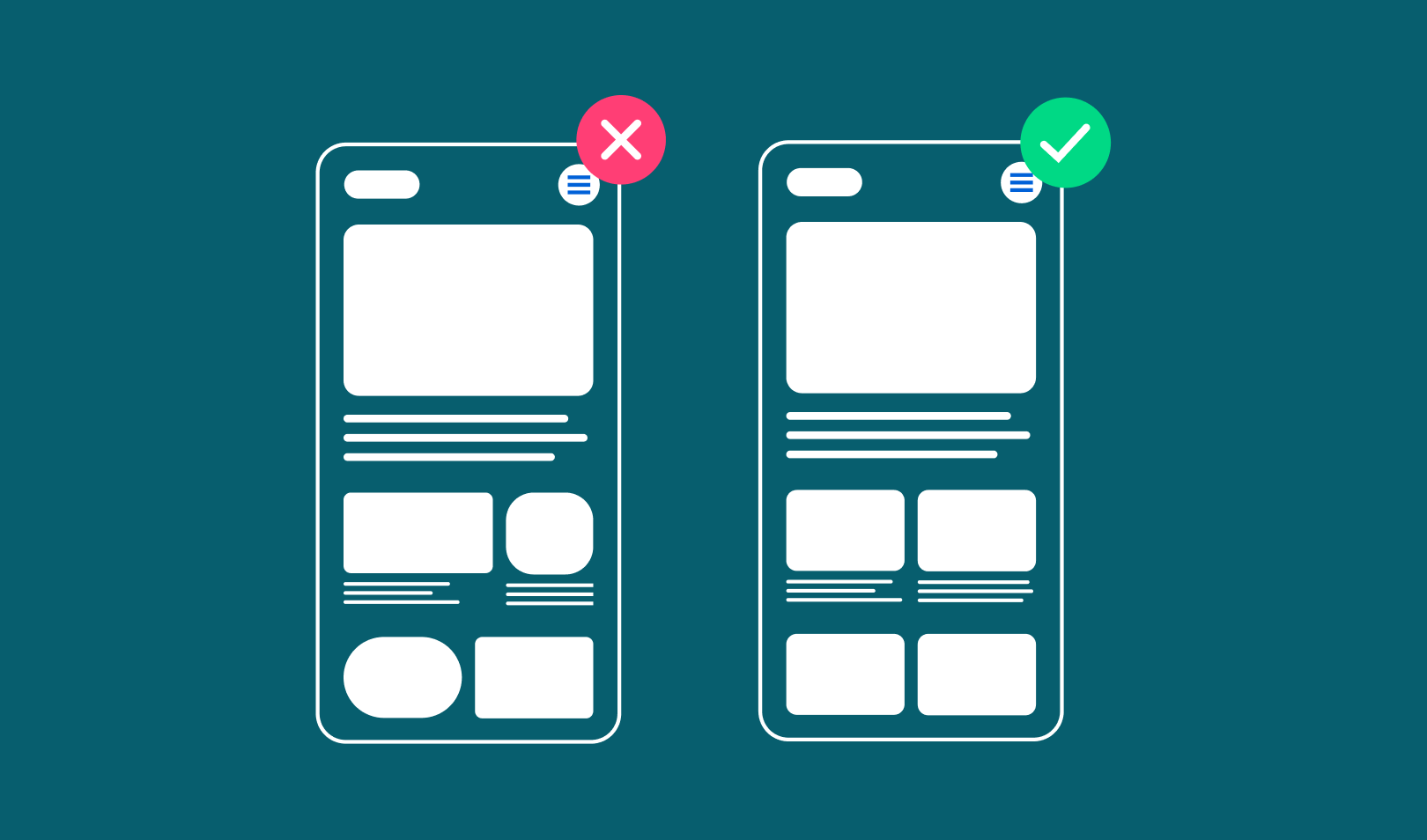
 
Visual Design
 
we decided to have a flat, modern, and colorful style that allows Ibexa to easily convey complex messages in multiple scenes and directions.

Wireframes

After playing with various structures and styles to find the best viable solution, we established clear goals with the marketing and product team during the exploration phases. We tried different approaches to solve complex challenges in the wireframing process.

Design System

Based on the created wireframes, I’ve built a color scheme and a general design system that helps Ibexa marketing team scale up with ease. I created components, modules, and items to provide complete control to create new pages and landing pages using the pre-existing design system in place.

Component samples

Solution

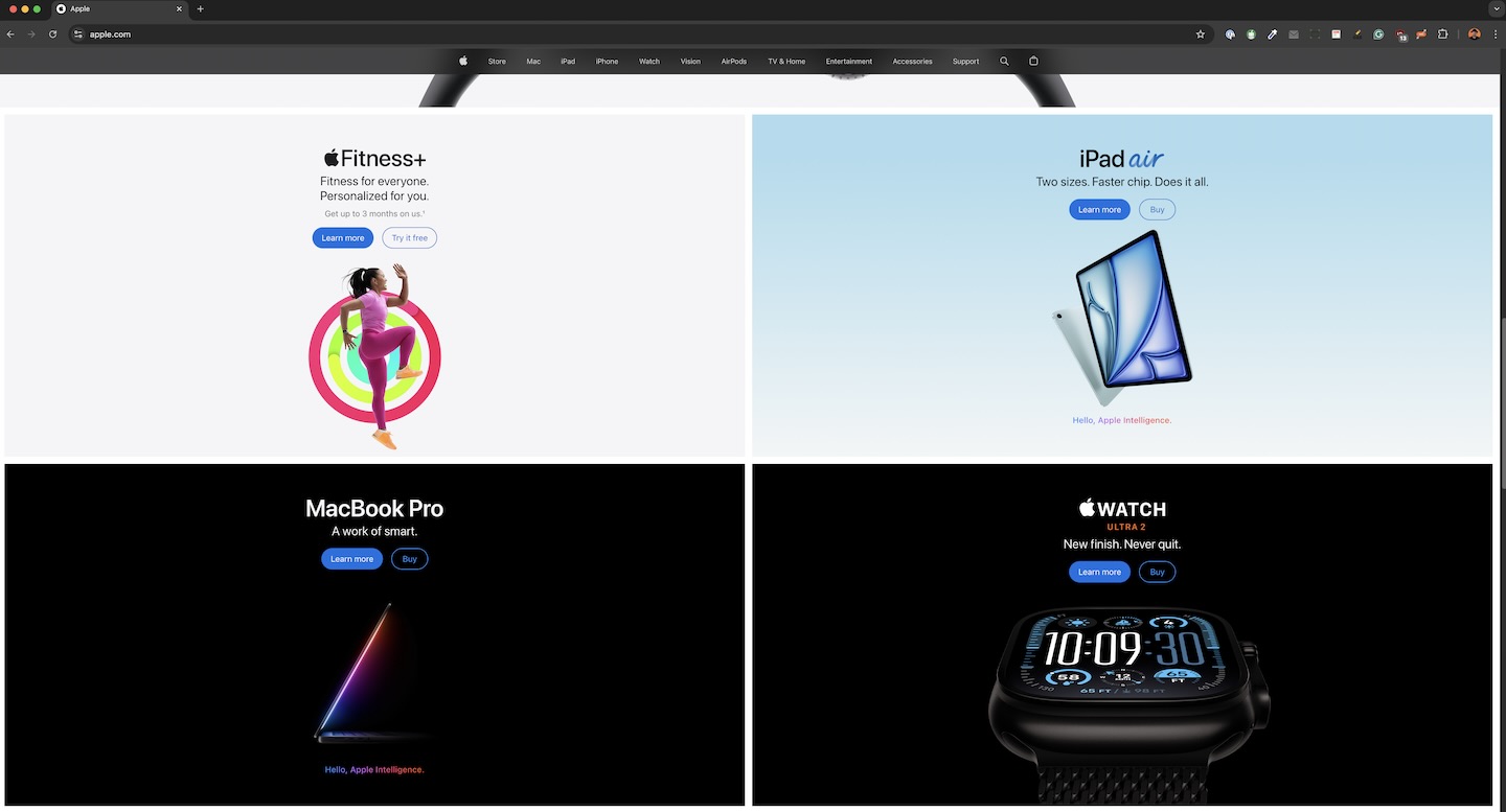
After creating all the components, I jumped into the final UI design phase. I followed all the wireframes and applied the components from the design system.

The goal was to create a modern, flat, and dynamic design style that would allow us to elevate the Ibexa brand, and deliver the messages in a more user-friendly environment.
Open for new opportunities and collaboration! Whether it’s a professional collaboration or just a friendly chat, I’m all ears.