- Hakan Ertan
- January 19, 2025
- No Comments
- 8 minutes
The Invisible Rules of UX Design: Gestalt Principles
When it comes to User Experience (UX) Design, our job isn’t just about making things look good, it’s about creating intuitive, seamless experiences that make people feel confident and comfortable using our products. That’s where psychology comes in.
As a product designer, I’ve found that one of the most powerful tools in a designer’s toolkit isn’t a wireframing app or a UI library; it’s understanding how people perceive the world. Enter Gestalt Principles, a set of psychological rules that explain how we naturally group visual information.
What are Gestalt Principles?
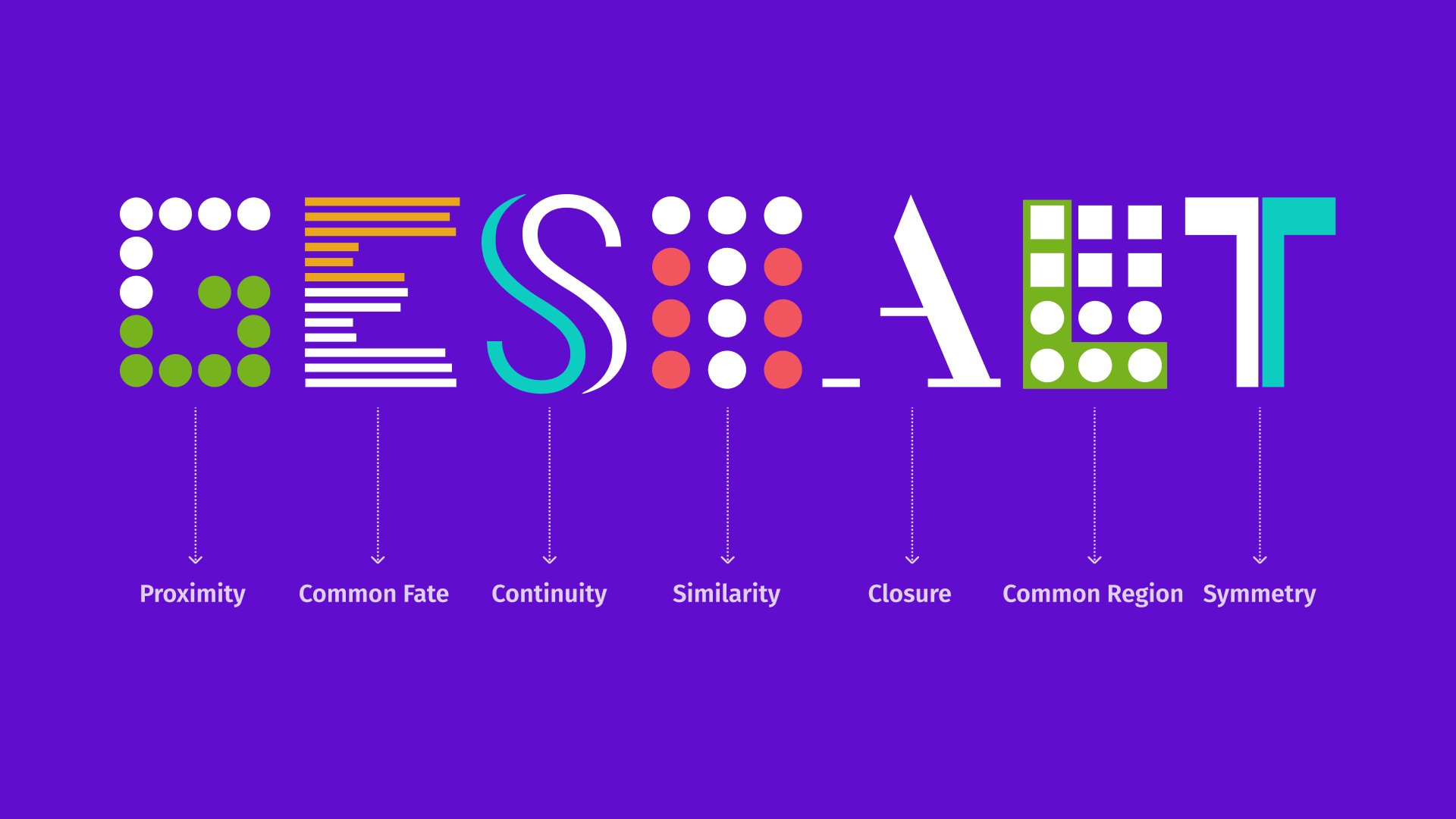
Gestalt Principles describe how humans naturally interpret visual elements, not as individual parts, but as unified wholes. For example, our brains can perceive a triangle even when only parts of it are drawn. These mental shortcuts help us make sense of visual input quickly and efficiently.
In UX design, Gestalt principles help us build interfaces that align with how users already think and perceive. This alignment reduces cognitive friction and makes experiences feel effortless.
Practical applications
Designs that follow Gestalt principles are easier to scan, simpler to navigate, and more intuitive to use. They allow us to guide the user’s eye, group related content, and reduce visual noise, all while maintaining a clear hierarchy and improving overall usability.
Let’s dive into how each principle can elevate your UX game with real-world applications.
1. Proximity:
Keep what belongs together close together
The principle: We naturally group elements that are near each other.
Why it works: Proximity helps users instantly understand relationships between elements without needing extra labels or lines.
How to use it:
- Forms: Place labels close to their input fields; think “Email Address” right above the text box.
- Grids or lists: Group product details like price, rating, and shipping info together near the product image.
- Navigation: Keep related menu options side-by-side to help users understand structure at a glance.
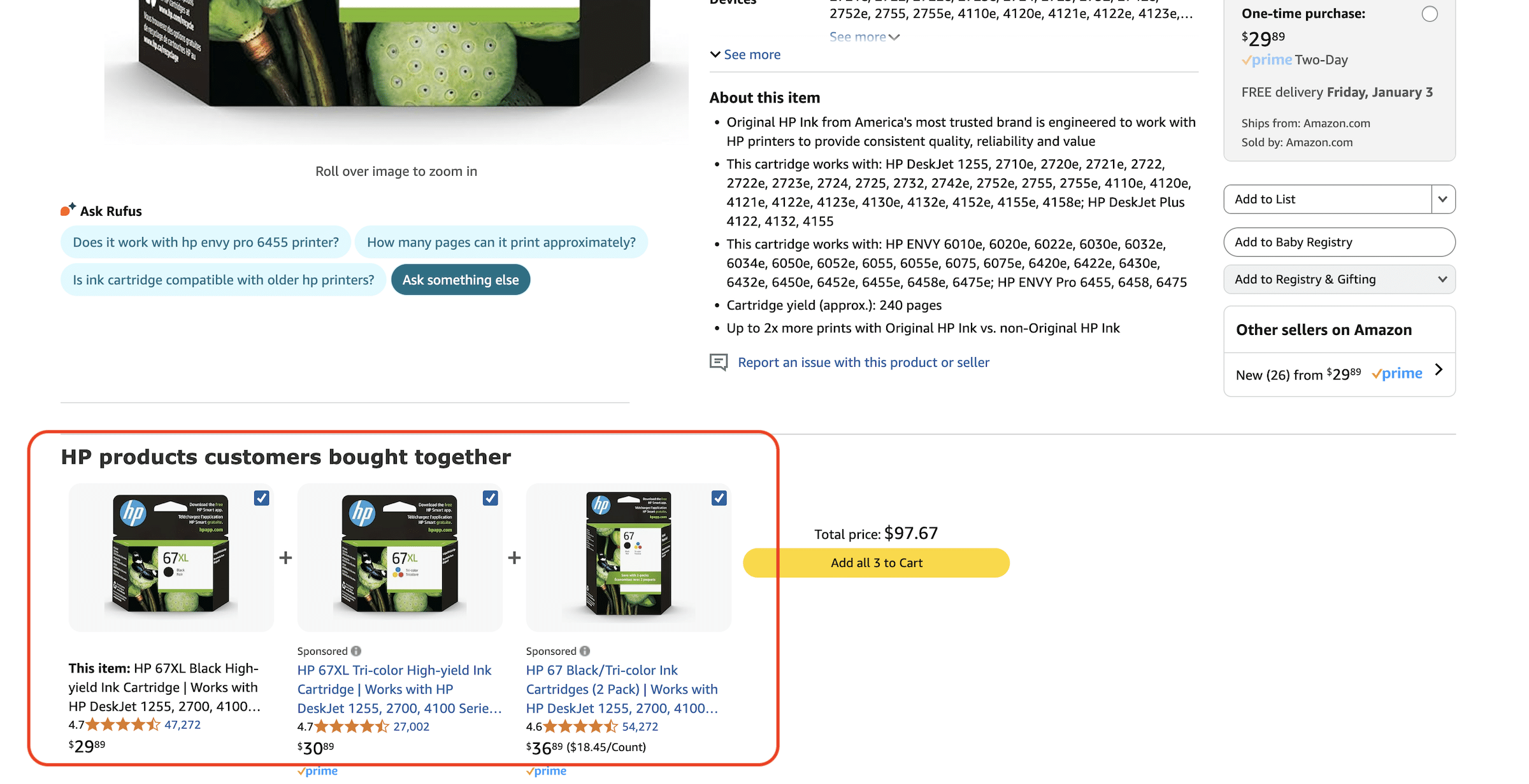
Example: E-commerce sites like Amazon cluster product information close to the image, making it easy to evaluate everything in one quick glance.
2. Common Fate:
Motion mignals relationship
The principle: We see elements that move together as being related.
Why it works: When elements change or animate in sync, it signals a shared purpose, helping users follow what’s happening on screen.
How to use it:
- Animate related content (like images and text in a carousel) together.
- Keep transitions and hover effects consistent for grouped actions.
- Sync animations—buttons in the same group should react at the same time.
Example: Spotify nails this. When you open a playlist, the cover and tracklist slide in together. When a song plays, the controls move in harmony, creating a sense of cohesion and clarity.

3. Continuity:
Guide the eye naturally
The principle: We prefer to follow smooth paths and lines.
Why it works: A well-aligned layout leads the eye effortlessly from one element to the next, reinforcing a logical flow.
How to use it:
- Align menus, buttons, and text in a linear or curved flow.
- Use arrows, spacing, or visual guides to create progression.
- Stick to consistent element sizes along the path for smoother scanning.
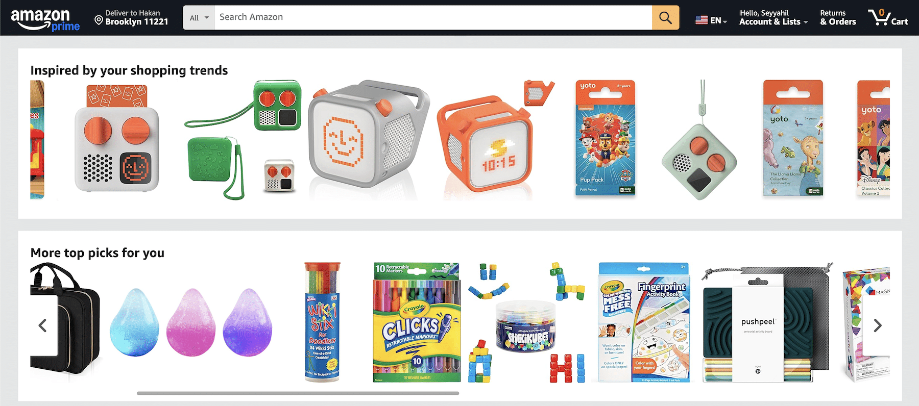
Example: Amazon’s horizontal carousels let your eye flow left to right, mirroring how we naturally read.
4. Similarity:
Make like things look alike
The principle: We group elements that look similar.
Why it works: Consistency in color, shape, or size helps users quickly identify what things do—even before they interact.
How to use it:
- Use similar styling for related buttons (like “Add to Cart” and “Buy Now”).
- Keep navigation menus uniform in size, shape, and hover behavior.
- Design product cards with consistent layouts for easy comparison.
Example: Amazon uses the same button shape and color for buying actions, reinforcing their shared purpose instantly.

5. Closure:
Let the mind fill in the blanks
The principle: We mentally complete incomplete shapes or visuals.
Why it works: Suggesting instead of showing everything encourages interaction and curiosity—without cluttering the interface.
How to use it:
- Use partially visible elements in carousels to suggest more content.
- Create logos or icons with implied shapes.
- Show dashed progress bars or sequences users can mentally “complete.”
Example: Amazon leaves thumbnails partially visible at the edge of carousels, prompting users to scroll and explore.

6. Common Region:
Let the mind fill in the blanks
The principle: Elements within the same visual boundary are perceived as related.
Why it works: Adding borders, backgrounds, or containers clarifies relationships, making the layout easier to digest.
How to use it:
- Group form fields inside boxes or shaded regions.
- Use contrasting background colors for different sections.
- Employ cards or containers to separate dashboard widgets or content blocks.
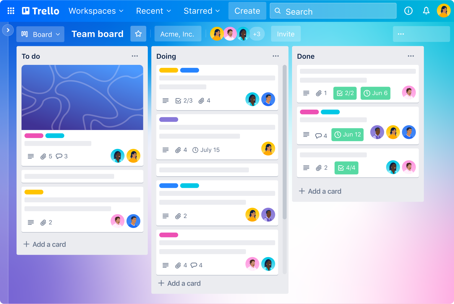
Example: Trello uses card-like columns to group tasks—clear, simple, and effective.
7. Symmetry:
Create calm through balance
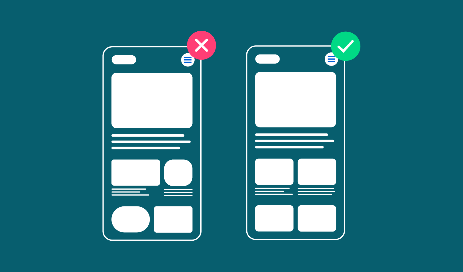
The principle: Symmetrical layouts feel stable, organized, and pleasing.
Why it works: Symmetry gives users a sense of control and order, enhancing clarity and ease of use.
How to use it:
- Balance elements evenly across a central axis.
- Use grid systems for alignment and spacing.
- Introduce small asymmetries for visual interest without chaos.
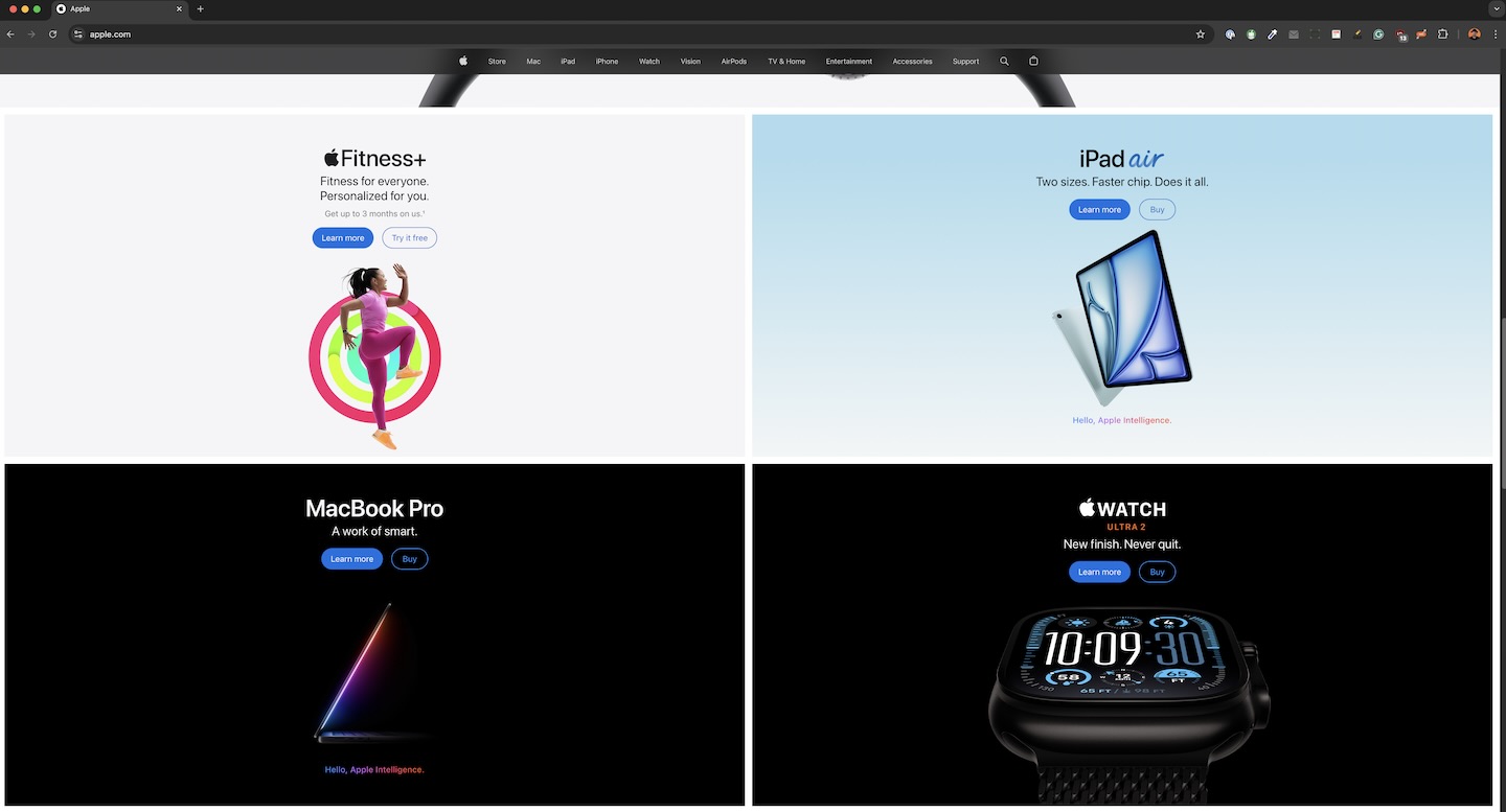
Example: Apple’s homepage is a study of symmetry. Centered visuals, mirrored layouts, and balanced text create a clean, harmonious experience.
8. Figure-Ground:
Highlight what matters
The principle: We distinguish foreground from background to focus attention.
Why it works: Separating key elements from their surroundings makes interfaces easier to scan and interact with.
How to use it:
- Use high-contrast colors for CTAs and important elements.
- Add drop shadows or animations to lift content from the background.
- Make focal elements bigger or differently shaped than surrounding items.
Example: Amazon’s “Add to Cart” button pops in high-contrast yellow—unmistakable and immediately clickable.

When Gestalt isn’t enough
While these principles are powerful, they’re not a silver bullet.
- Complex tasks: Some interfaces need more explicit cues, especially with dense or technical data.
- Accessibility: Relying solely on color or shape can be problematic for users with visual impairments. Always provide multiple cues.
- Cultural or cognitive differences: People perceive things differently depending on their background or abilities. Test and iterate accordingly.
- Responsiveness: What works on desktop may not translate to mobile. Always adapt for screen size and context.
Final thoughts: Design for how people see
Gestalt principles offer more than just visual tricks; they align your designs with how people naturally process information. When used thoughtfully, they help you create experiences that feel right, even if users can’t explain why.
The key?
Balance.
Use Gestalt principles to guide your layout and flow, but never lose sight of usability, accessibility, and context.
Designing with empathy means designing with perception in mind. And when you do that, your users won’t just notice your design, they’ll feel it.
Questions related to the Gestalt Principles
A: While Gestalt Principles are versatile, they aren't universally applicable without consideration. For specialized interfaces, like those in medical or scientific applications, you might need to prioritize clarity over aesthetic grouping.
A: Absolutely. Mobile interfaces benefit greatly from principles like Proximity to manage screen real estate and Similarity to navigate through apps intuitively on smaller screens.
A: Extremely. Understanding how users group and interpret visual information is fundamental to creating effective designs. It's like learning the grammar of visual communication.
A: Absolutely. What feels intuitive in one culture might not in another due to different visual literacy or symbolic meanings. For global products, test designs in various cultural contexts to ensure that Gestalt principles are interpreted as intended.
A: Cultural, educational, and personal experiences can influence perception, so while principles are universal, their application might need adjustment for diverse audiences.
A: It depends on what you want to achieve. If you're aiming for a clean, navigable design, consider Proximity or Similarity. For visual impact, Figure-Ground could be key. Always start with the user's journey in mind.
A: Start by simplifying the design through decluttering. Then, use principles like Figure-Ground to make important elements stand out, or Common Region to organize content into digestible sections. Remember, Gestalt can help manage complexity, not just simplify it.
A: Only if applied without consideration. The goal isn't simplicity for simplicity's sake but clarity and ease of use. Sometimes, complexity is necessary for depth, but Gestalt can help manage that complexity.
A: Gestalt can be applied subtly within the framework of your brand. Use the principles to guide layout and interaction patterns while still allowing for unique branding elements through color, typography, or imagery. The key is consistency within the Gestalt framework
A: Yes, but with careful consideration. Use principles like Similarity and Common Region to create clear patterns and groupings, reducing cognitive load. However, always prioritize clarity and explicitness over purely visual cues.
A: User testing is invaluable. Tools like heatmaps can show how users' eyes travel across your design, giving you insights into whether your application of Gestalt is intuitive or confusing.
Resources
- “Laws of UX: Using Psychology to Design Better Products & Services” by Jon Yablonski
- “Designing for Emotion” by Aarron Walter
- “Universal Principles of Design” by William Lidwell, Kritina Holden, and Jill Butler.
- “The Design of Everyday Things” by Don Norman for understanding human-centered design
- “100 Things Every Designer Needs to Know About People” by Susan Weinschenk for insights into psychology and design


No comment yet, add your voice below!