- Hakan Ertan
- December 31, 2024
- No Comments
- 33 minutes
Psychological Principles for Successful Product Design
Great product design goes beyond aesthetics and functionality—it’s about understanding psychological principles and human behavior. As designers, we create experiences that shape how users interact with products, but these interactions are driven by the way people think, feel, and act. By incorporating psychological principles into design, we can craft products that resonate on a deeper emotional level, driving user engagement and loyalty.
Psychology helps us understand the “why” behind user behavior. From simplifying decision-making to triggering emotions, psychology allows us to create intuitive, effective, and engaging designs. These principles help guide users seamlessly through an experience, making products not just functional, but also memorable.
In this post, we’ll dive into 41 key psychological principles that every product designer should know. Through real-life examples, we’ll explore how these principles have been successfully applied to improve user experiences.
- Hick’s Law
- Miller’s Law
- Jakob’s Law
- Fitts’s Law
- Prägnanz (Simplicity)
- Gestalt Principles
- Zeigarnik Effect
- The Von Restorff Effect (Isolated Item Effect)
- Framing Effect
- Aesthetic-Usability Effect
- Primacy and Recency Effects
- The Mere Exposure Effect
- The Halo Effect
- The Endowment Effect
- The Reciprocity Principle
- Scarcity Principle
- Usability Heuristics (Jakob Nielsen’s Heuristics)
- Pareto Principle (80/20 Rule)
- Fogg Behavior Model
- Mental Models
- The Foot-in-the-Door Technique
- Social Proof
- Cognitive Load Theory
- Cognitive Dissonance
- Behavioral Targeting
- Progressive Disclosure
- Loss Aversion
- Anchoring Bias
- Confirmation Bias
- User-Centered Design
- Visual Hierarchy
- Emotional Design
- Constraint Design
- Color Psychology
- The Peak-End Rule
- Trust Signals
- Feedback
When I incorporate psychology into product design, I ensure that experiences feel natural and rewarding, resulting in higher user satisfaction and loyalty. Whether I’m using Hick’s Law to streamline decisions, Social Proof to build trust, or the Aesthetic-Usability Effect to enhance desirability, I try to transform good designs into exceptional ones.
Great design isn’t accidental; it’s informed by a deep understanding of how people interact with products.
- Decision-making made simple: Psychology helps streamline user choices, reducing cognitive load and improving decision-making.
- Emotionally engaging experiences: Tapping into emotions creates a deeper connection between the user and the product.
- Memorable interactions: Products that delight and surprise users are the ones they remember—and recommend.
Psychological principles in product design
Psychological principles are essential tools for designers looking to create meaningful and user-centered experiences. Here are powerful psychological principles every designer should have in their toolkit:
1. Hick’s Law
What to do: Simplify decision-making by reducing the number of options presented to the user.
Why it matters: Hick’s Law states that the time it takes to make a decision increases with the number and complexity of choices. Reducing options helps users act more quickly and confidently, improving their overall experience.
How to implement:
- Limit the number of options displayed on a single screen or menu.
- Group related items into categories to make navigation intuitive.
Netflix categorizes recommendations into genres, like “Action,” “Comedy,” and “Drama,” rather than displaying an endless list of titles. This allows users to easily navigate and find content based on their preferences, making their experience more intuitive and less overwhelming.

2. Miller’s Law
What to do: Design interfaces that respect the user’s cognitive limits by presenting manageable chunks of information.
Why it matters: Miller’s Law states that people can hold about 7 (plus or minus 2) items in their working memory at a time. Overloading users with too much information leads to confusion and reduces the effectiveness of the design.
How to implement:
- Break down content into smaller, digestible chunks or steps.
- Use progressive disclosure to reveal information as needed.
Google search results display links in groups of 10 per page, keeping the amount of information manageable and allowing users to focus on a subset of options at a time.

3. Jakob’s Law
What to do: Design your product or interface in a way that aligns with user expectations based on their experiences with other, commonly used websites or applications.
Why it matters: Jakob’s Law states that users spend most of their time on other sites and apps, so they develop specific expectations for how things should work. By adhering to familiar conventions, you make your design more intuitive and reduce the learning curve for users.
How to implement: Use common UI elements like standard navigation menus, familiar iconography, and typical page layouts (e.g., top navigation bar, bottom footer with links) to ensure users instantly recognize how to interact with your site or app.
Many websites, like Amazon, place the shopping cart icon at the top right corner of the page. This is a widely recognized convention that users expect to find, making it easier for them to navigate your site and complete purchases without confusion.

4. Fitts’s Law
What to do: Make frequently used and important interactive elements easy to reach and interact with by optimizing their size and position.
Why it matters: Fitts’s Law highlights that the time required to interact with a target is influenced by its size and distance. Larger and closer targets are quicker and easier to use, improving usability and efficiency.
How to implement:
- Enlarge critical buttons like “Sign Up” or “Checkout” to make them stand out and easier to click.
- Position key interactive elements in easily accessible areas, such as near the bottom of the screen for thumb use on mobile.
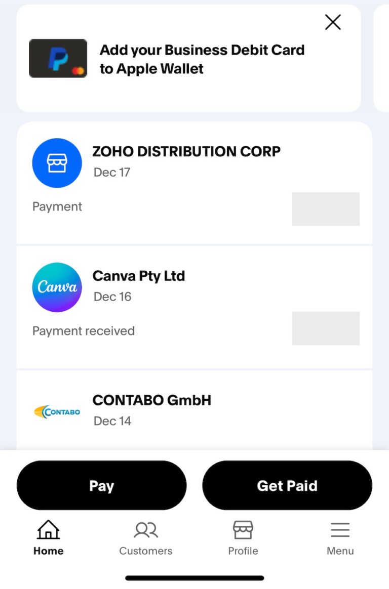
PayPal’s mobile app places the “Pay” and “Get Paid” buttons as large, tappable targets at the bottom of the home screen. Their size and strategic placement make it effortless for users to initiate key actions quickly.
5. Prägnanz (Simplicity)
What to do: Simplify designs to create visually balanced and easily interpretable elements.
Why it matters: The Law of Prägnanz states that people naturally perceive complex images in their simplest form. This tendency helps users process information quickly and reduces cognitive strain, leading to better usability and satisfaction.
How to implement:
- Use clean, uncluttered layouts that highlight the most important information.
- Prioritize minimalistic design with ample whitespace and straightforward visual hierarchy.
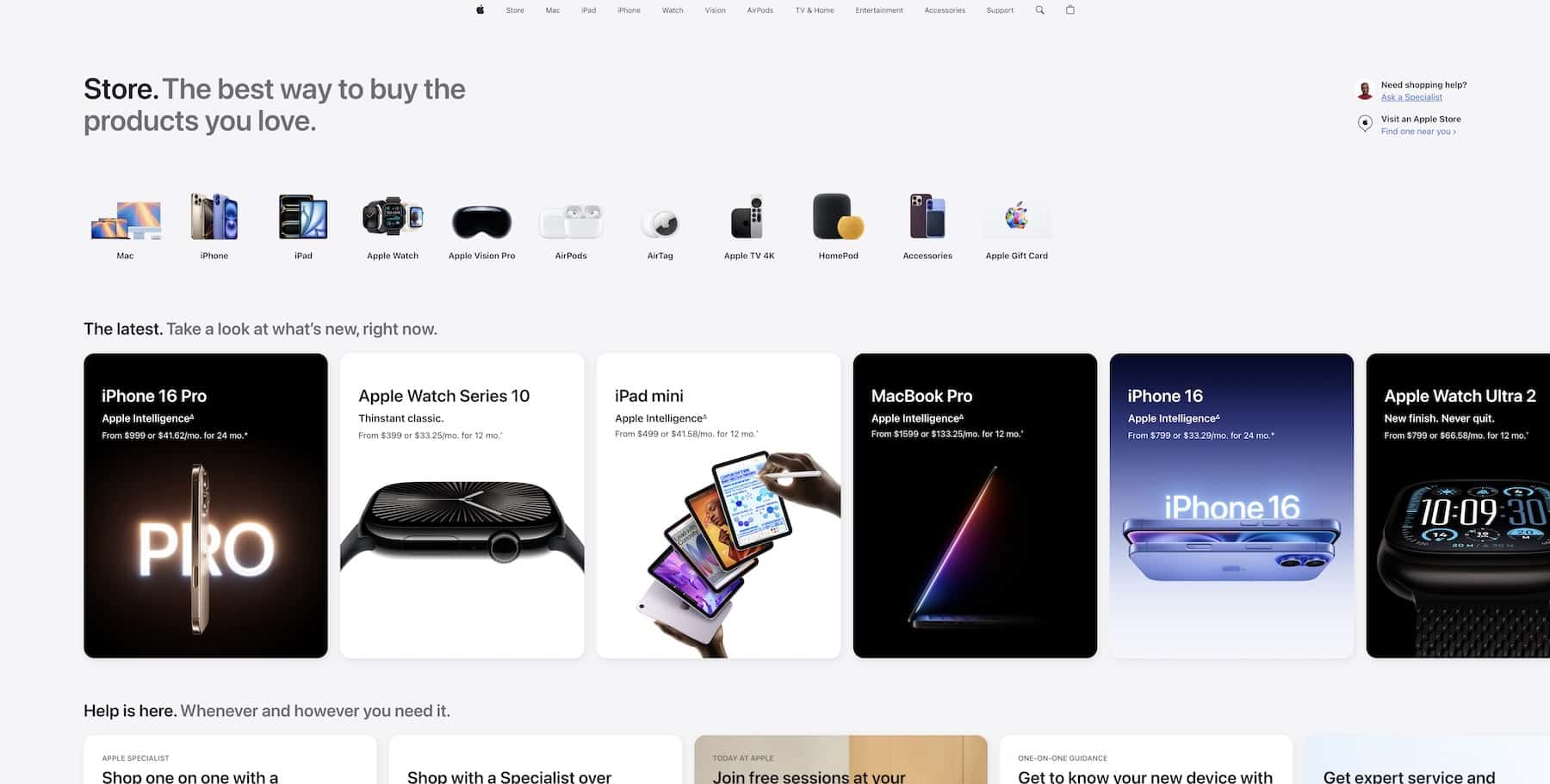
Apple’s website is a great example of the Law of Prägnanz in action. It uses minimalistic layouts, high-quality imagery, and clear, bold typography to present complex information in a simple and intuitive way.
6. Gestalt Principles
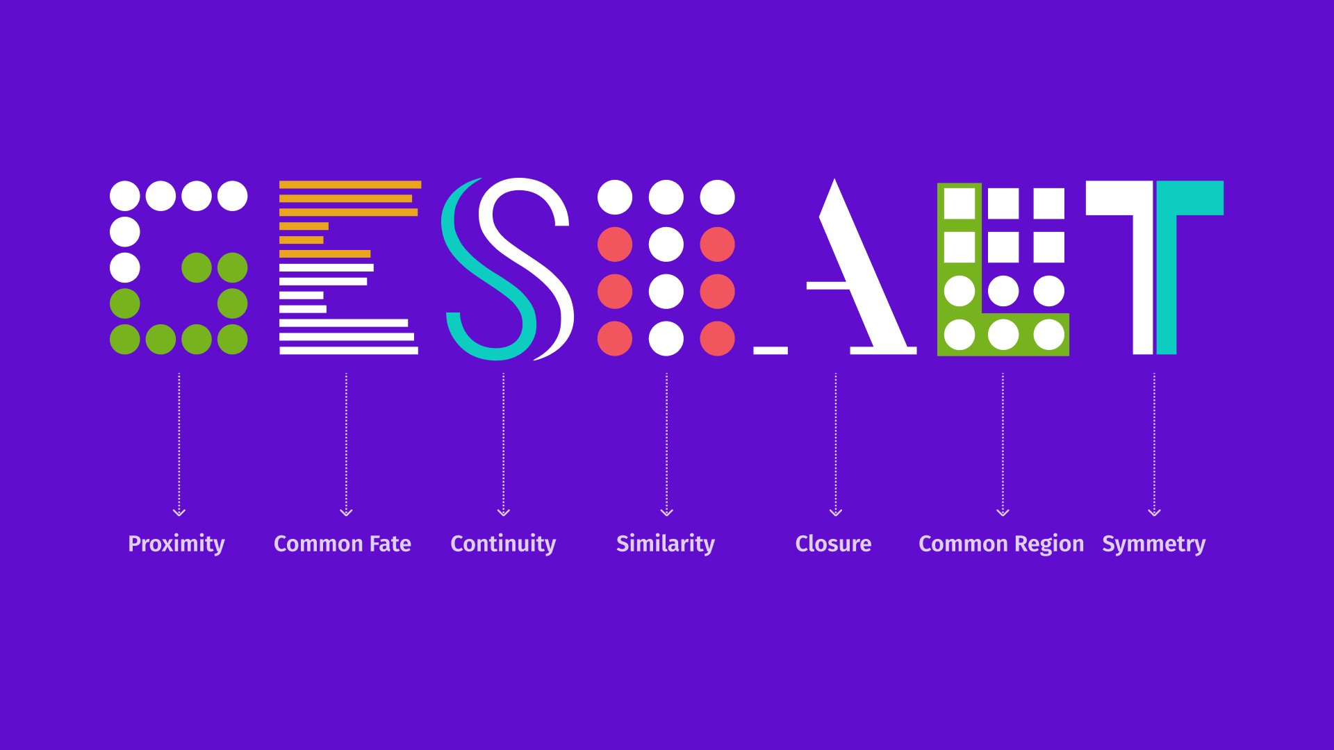
Gestalt Principles, stemming from Gestalt Psychology, are fundamental concepts that explain how humans perceive and process visual information by organizing it into coherent, understandable patterns.
These principles are crucial in interface and product design, ensuring that layouts are intuitive, relationships between elements are clear, and visual hierarchy is effective. The essence of Gestalt theory lies in the brain’s natural inclination to see order and unity in what might initially appear as chaos, simplifying complex visuals into unified wholes.
How to implement:
Read the blog post below for a deep dive into Gestalt Principles.
7. Zeigarnik Effect
What to do: Create tasks that can be partially completed, leaving users with an unfinished action.
Why it matters: The Zeigarnik Effect suggests that people are more likely to recall incomplete or interrupted tasks, making it a powerful tool for driving user retention and task completion.
How to implement: In a shopping cart, allow users to add items and save their selections for later, so they are reminded to complete the purchase.
Spotify’s “Discover Weekly” playlist is a prime example of applying the Zeigarnik Effect—the psychological principle that motivates people to finish tasks they’ve started. The playlist uses data to predict music users will enjoy, keeping them engaged with the service. By creating a sense of incompleteness (every week offering a new playlist to explore), Spotify taps into users’ intrinsic desire to listen to and finish the task. This drives continued usage and strengthens the emotional connection between the user and the brand.

8. The Von Restorff Effect (Isolated Item Effect)
What to do: Highlight key information or elements by making them visually distinct from surrounding content.
Why it matters: The Von Restorff Effect states that items that stand out are more likely to be remembered, which is crucial for emphasizing critical actions or messages.
How to implement: Place a standout, unique offer or feature on a webpage, like a limited-time discount or an exclusive product, that is visually distinct from the rest of the content.
On Walmart’s website, highlight exclusive deals or time-sensitive offers by using bold colors, larger fonts, or distinct imagery to make them stand out from the rest of the products. For example, a “Flash Deals” might be showcased in dark blue with a countdown timer to draw attention and create a sense of urgency, making it stand out from the surrounding items on the page.

9. Framing Effect
What to do: Present information in a way that highlights positive aspects or desired outcomes to influence decision-making
Why it matters: The Framing Effect states that the way options or information are presented can significantly influence how users perceive and react to them. By framing information positively, you can guide users toward a specific action, leading to higher engagement and conversions.
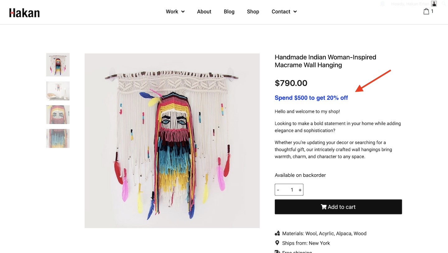
How to implement: On a checkout page, frame the price by saying, “Save $20 on your next purchase” rather than “Spend $80 to get $20 off.” This focuses on the benefit of saving, rather than emphasizing the amount needed to spend.
10. Aesthetic-Usability Effect
What to do: Recognize that users often perceive more aesthetically pleasing designs as easier to use. When designing products, interfaces, or any user experience, prioritize visual appeal alongside functionality.
Why it matters: The Aesthetic-Usability Effect states that people are more likely to tolerate minor usability flaws in visually attractive designs. A beautiful design creates a positive emotional response, which can make users feel that the product is easier to use, more reliable, and worth their time and investment. This principle plays a key role in forming first impressions and building long-term relationships with users.
How to implement:
- Design with beauty in mind: Incorporate principles of design such as balance, contrast, emphasis, movement, pattern, rhythm, and unity. Choose pleasing color schemes, typography, and layout designs.
- Design for delight: Add subtle animations, micro-interactions, or other delightful elements that enhance the emotional appeal without compromising usability.
- Consider accessibility: Ensure the aesthetic enhancements are inclusive by adhering to accessibility standards, such as maintaining sufficient color contrast and supporting screen readers.
- Iterative design: Use feedback from user testing to refine the design. Ensure that the aesthetic improvements do not compromise the functionality but enhance the perceived usability.
- User testing: Conduct usability tests where you observe how users interact with both aesthetically pleasing and less attractive versions of the same interface to gather data on user response and tolerance for usability issues.
- Consistency across platforms: Maintain a consistent aesthetic across different platforms or devices to reinforce the positive user perception of usability.
- Educate your team: Make sure that all team members understand the importance of aesthetics in usability, encouraging designers, developers, and product managers to work collaboratively towards a visually appealing product.
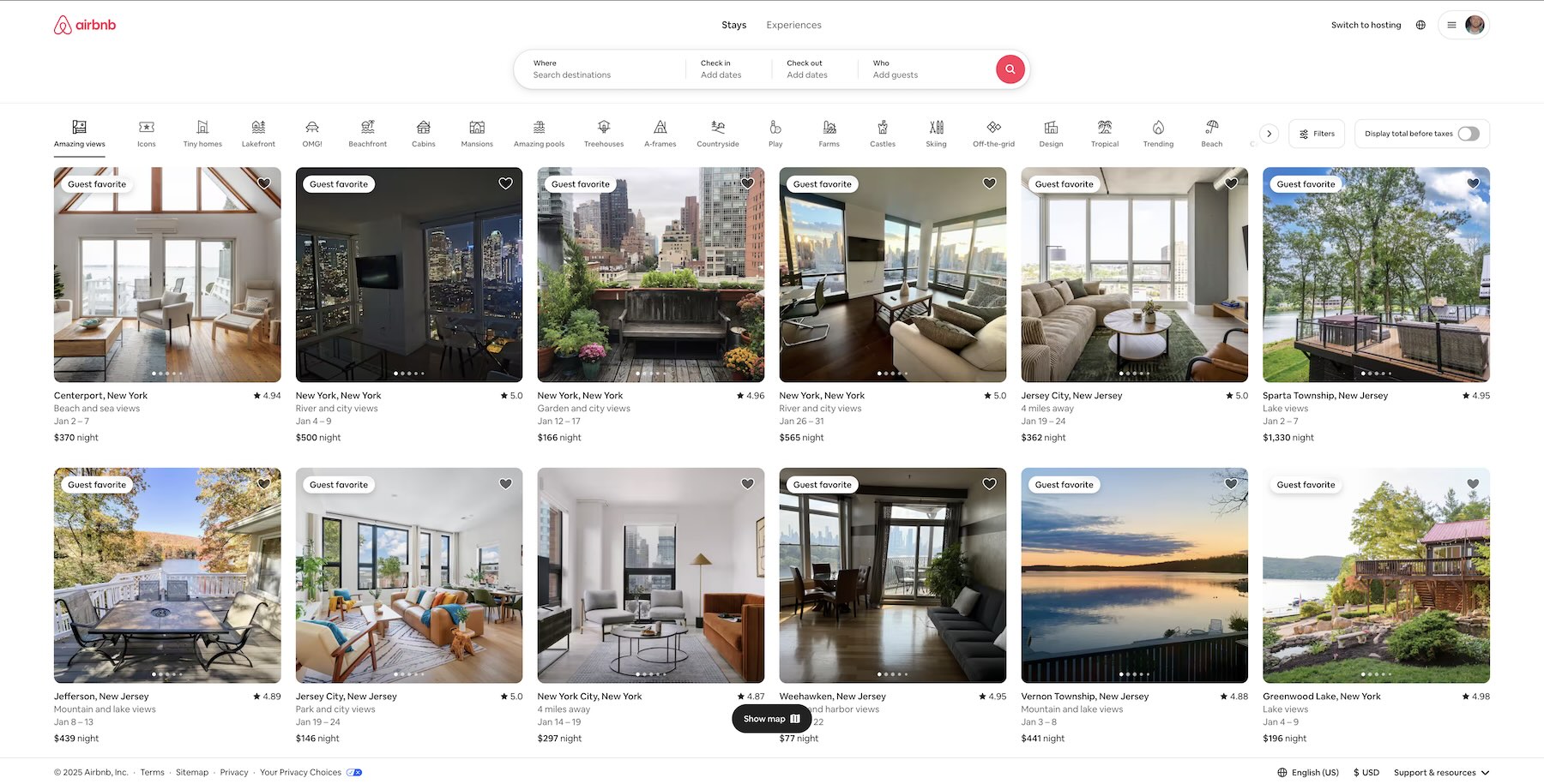
Airbnb.com uses beautiful photography and cohesive design elements, making the site visually engaging and easy to navigate, thus enhancing the perceived usability of the platform.
11. Primacy and Recency Effects
What to do: Place the most important information at the beginning or end of a sequence to take advantage of users’ natural tendency to remember these positions.
Why it matters: The Primacy and Recency Effects refer to the tendency for people to remember the first and last items in a sequence more clearly than those in the middle. By strategically positioning critical information in these spots, you can increase the likelihood that users will remember it and act upon it.
How to implement: In a product onboarding flow, place the key benefits of your service or the most important call-to-action at the beginning and end of the process.
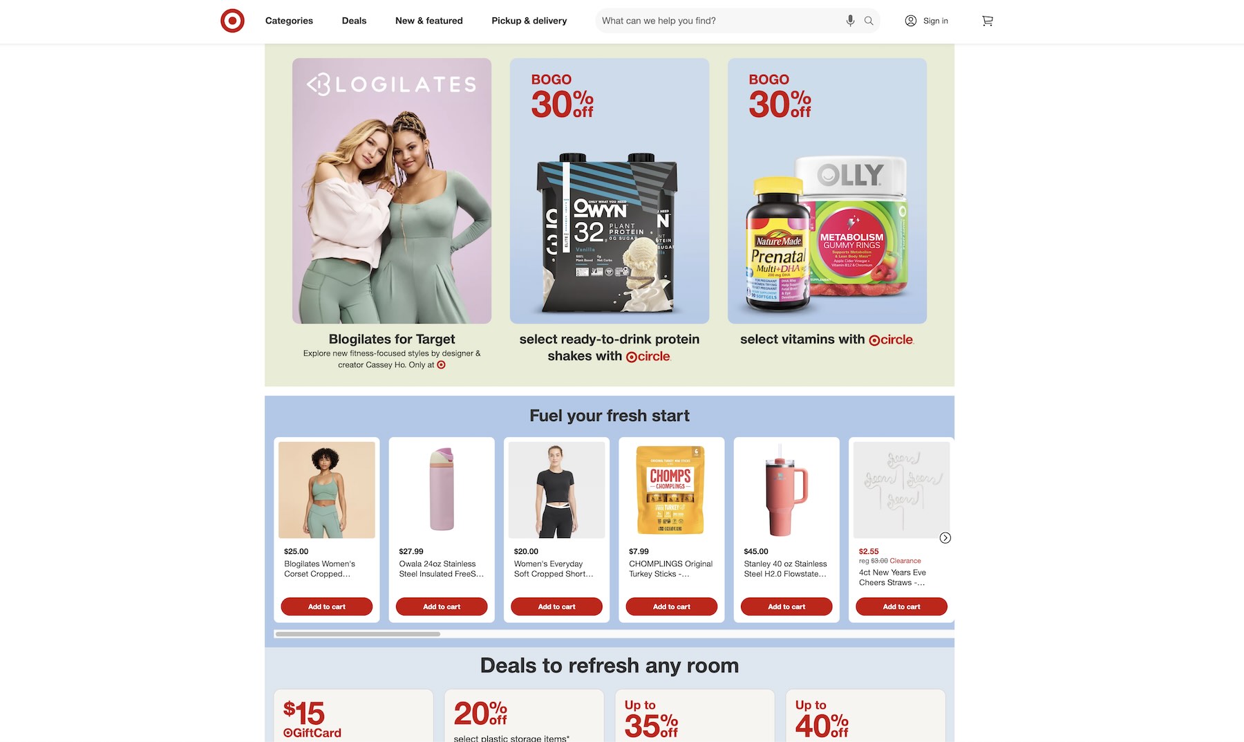
An e-commerce website might highlight a special offer at the top and bottom of a product page to capture attention and encourage conversion.
12. The Mere Exposure Effect
What to do: Increase user familiarity with your design elements through consistent presentation and repetition.
Why it matters: The Mere Exposure Effect states that people tend to develop a preference for things they are exposed to repeatedly. This principle can help establish trust, improve brand recall, and enhance user comfort with your product.
How to implement:
- Use consistent branding, such as logos, colors, and typography, across all touchpoints.
- Reintroduce key elements (like navigation styles or calls to action) throughout the user journey without overwhelming the user.
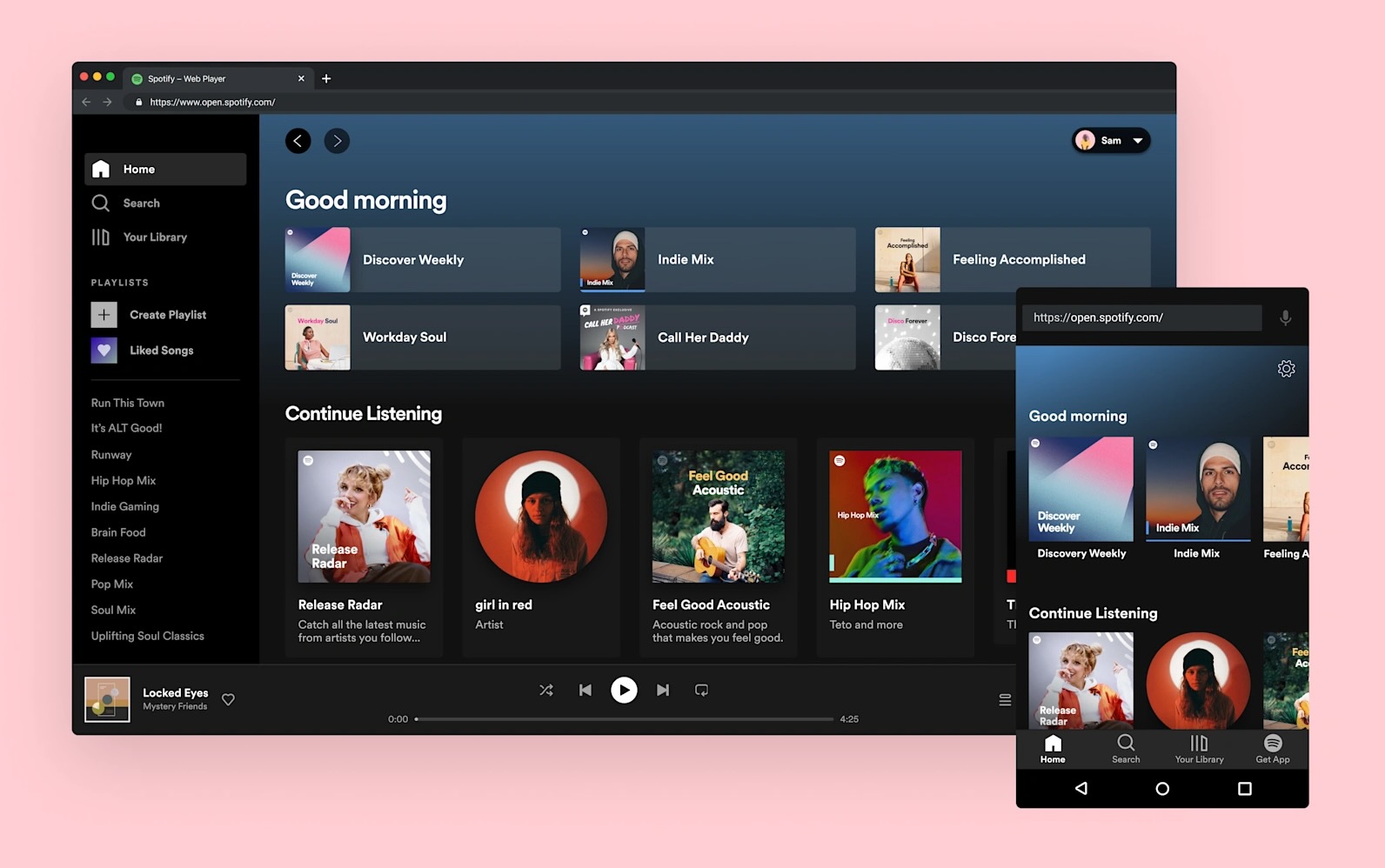
Spotify applies the Mere Exposure Effect by maintaining consistent branding across its app, website, and marketing campaigns. The familiar green-and-black color palette, logo, and interface create a sense of reliability and recognition.
13. The Halo Effect
What to do: Enhance the overall user experience by ensuring that your product’s most prominent features (such as design, usability, or customer service) are of high quality.
Why it matters: The Halo Effect suggests that when users have a positive impression of one aspect of your product, they are more likely to assume that other aspects are just as good. A strong first impression can elevate the perception of the entire brand or product.
How to implement:
- Focus on creating a standout experience for key touchpoints like onboarding or customer support to create a positive overall impression.
- Ensure the design, content, and functionality of your app or website are top-notch, as they will influence how users perceive the rest of the product.
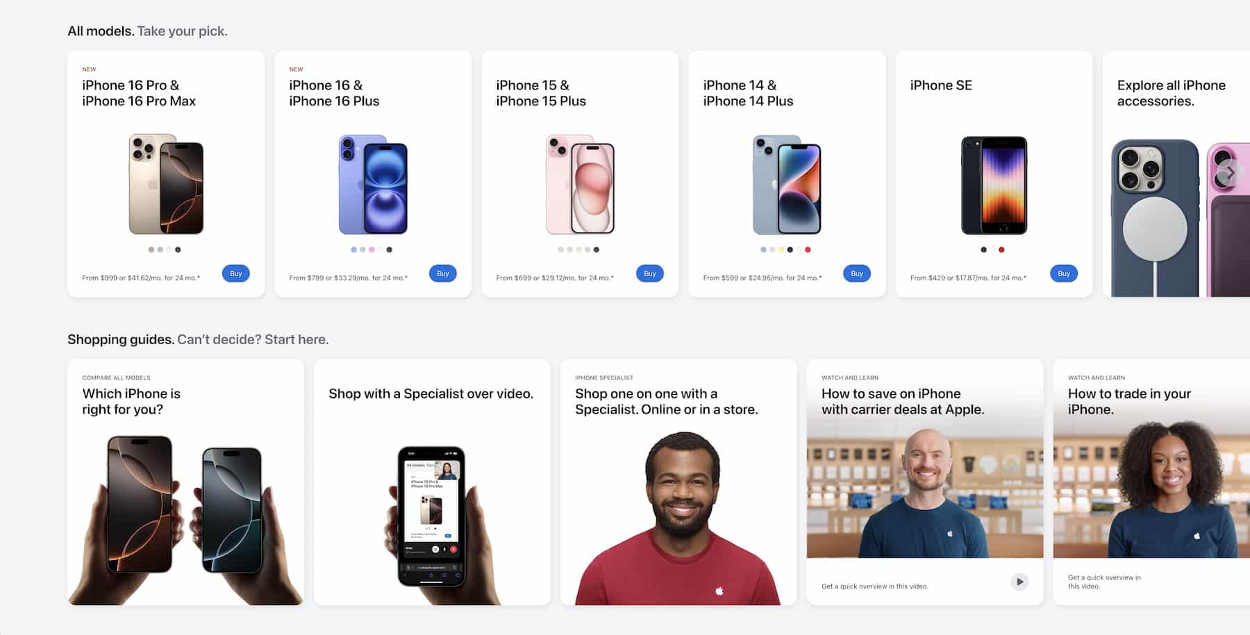
Apple’s sleek and user-friendly product designs, like the iPhone, set the tone for how users perceive the entire Apple ecosystem. The design quality of their flagship products positively influences users’ perceptions of other devices, such as the Apple Watch or MacBook, even if they aren’t necessarily their first purchase.
14. The Endowment Effect
What to do: Create a sense of ownership or attachment in your users by allowing them to personalize or customize their experience.
Why it matters: The Endowment Effect states that people tend to place more value on things they own than on things they do not. By making users feel like they “own” a part of the product or service, they are more likely to engage with it and stick around.
How to implement:
- Offer options for users to personalize their experience, such as customizing their profile, dashboard, or app settings.
- Use progress bars, achievements, or exclusive content to give users a sense of ownership over their journey or progress.
Airbnb allows hosts to customize their listings, such as choosing photos, writing descriptions, and setting house rules. By personalizing their listings, hosts feel more attached to their property listings and are likely to continue using the platform for longer periods.

15. The Reciprocity Principle
What to do: Offer users something of value for free or a special benefit, creating a sense of obligation to reciprocate.
Why it matters: The Reciprocity Principle states that people feel obligated to return a favor or kindness, even if the initial gesture is small. By providing something valuable—such as free content, a discount, or an unexpected gift—you can build goodwill with users, which encourages them to engage with your brand or make a purchase.
How to implement:
Offer users a free trial, a discount on their first purchase, or valuable resources (like an ebook or webinar).
Dropbox offers free storage to new users as a gesture of goodwill, leading them to reciprocate by upgrading to paid plans or referring the service to others.

16. Scarcity Principle
What to do: Highlight limited availability or time-sensitive offers to create a sense of urgency.
Why it matters: The perception of scarcity can increase desire and prompt quicker decision-making, driving users to act before they miss out.
How to implement:
Use messages like “Only 2 left in stock” or “Offer ends in 24 hours” to make products or deals feel more exclusive and time-sensitive.
Online retailers like Amazon use the scarcity principle by showing stock levels (e.g., “Only 3 left in stock”) or limited-time offers (e.g., “Flash Sale: Ends in 30 minutes”), which encourages customers to make a purchase decision quickly. This strategy effectively increases conversion rates by leveraging urgency and exclusivity.

17. Usability Heuristics (Jakob Nielsen’s Heuristics)

Usability heuristics, first introduced by Jakob Nielsen, serve as a checklist for evaluating user interfaces. They’re essentially design principles that help ensure products are user-friendly. In my work, I use these heuristics to pinpoint areas where users might encounter difficulties, allowing me to refine and enhance the user journey.
Since their introduction in 1994, these heuristics have become a cornerstone of UX design. By focusing on user needs and behaviors, I find that these principles help create designs that are not only functional but also enjoyable to use.
The 10 Usability Heuristics:
- Visibility of system status
- Match between system and real world
- User control and freedom
- Consistency and standards
- Error prevention
- Recognition over recall
- Flexibility and efficiency of use
- Aesthetic and minimalist design
- Help users recognize, diagnose, and recover from errors
- Help and documentation
How to implement:
Read the blog post below for a deep dive into Gestalt Principles.
18. Pareto Principle (80/20 Rule)
What to do: Focus on the 20% of features or actions that deliver 80% of the value or impact to your users.
Why it matters: The Pareto Principle states that a small proportion of inputs often lead to the majority of outputs. In product design, understanding which features or functions your users rely on most allows you to prioritize efforts and resources effectively, improving the user experience and maximizing ROI.
How to implement:
- Use analytics tools to identify the features users interact with most.
- Streamline less-used functionalities to reduce cognitive load.
LinkedIn emphasizes features like profile updates and networking connections on its platform, as these activities account for the majority of user engagement, while less frequently used tools like newsletters or polls are tucked away, ensuring the main experience remains streamlined.

19. Fogg Behavior Model
What to do: Leverage the interplay of motivation, ability, and triggers to design experiences that encourage desired user behaviors.
Why it matters: The Fogg Behavior Model explains that behavior change happens when motivation, ability, and a trigger converge. Without one of these components, the intended action is unlikely to occur, making the model essential for creating effective and engaging designs.
How to implement:
- Motivation: Offer rewards or incentives, like unlocking levels or achievements in an app.
- Ability: Make the task easy to perform, such as providing simple, bite-sized learning modules.
- Triggers: Use notifications or prompts to remind users to take action at the right time, like a reminder to continue their streak or complete a task.
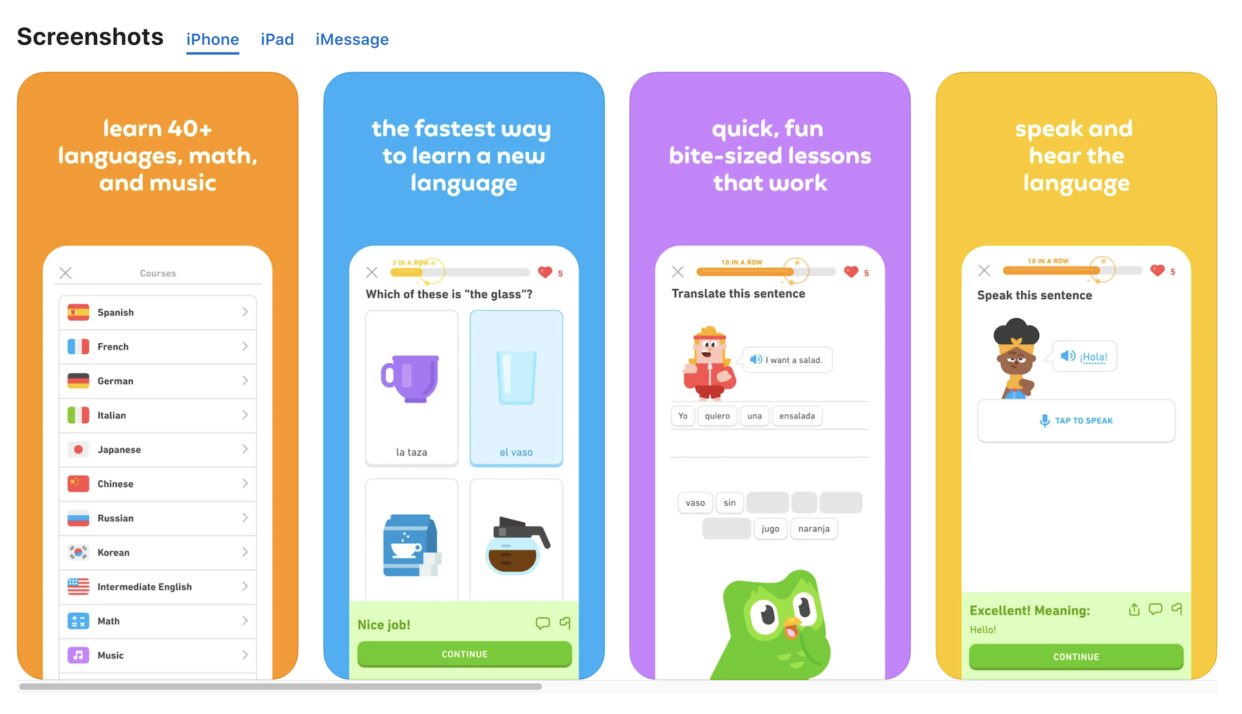
Duolingo is a fantastic example of gamification powered by psychology. The app uses the Fogg Behavior Model, where motivation, ability, and triggers come together to drive behavior change. Duolingo’s streaks and rewards act as powerful motivators, while simple, bite-sized lessons ensure the ability to learn is easily accessible. Push notifications remind users to maintain their streaks, acting as triggers to prompt the behavior. This combination keeps users returning to practice their language skills regularly.
20. Mental Models
What to do: Align your product design with users’ existing mental models to ensure intuitive and seamless interactions.
Why it matters: Mental models represent users’ expectations about how a system should work based on their past experiences. Designing with these expectations in mind reduces cognitive load, increases user satisfaction, and minimizes the learning curve.
How to implement:
- Research user behavior: Conduct user testing and interviews to understand common expectations and thought patterns.
- Maintain consistency: Follow industry conventions and standards for familiar interfaces and workflows.
- Iterate on feedback: Use real-world feedback to refine areas where users struggle due to mismatched expectations.
Slack aligns with users’ mental models of communication by mirroring email threads, direct messaging, and file-sharing systems, making it easier for users to adopt and engage with the platform.

21. The Foot-in-the-Door Technique
What to do: Start by asking for a small request to increase the likelihood of the user agreeing to a larger request later.
Why it matters: The Foot-in-the-Door technique is a psychological principle where individuals are more likely to agree to a larger request if they’ve already agreed to a smaller one. This method taps into the human desire to remain consistent with past decisions, making it easier to get users to take actions you want them to.
How to implement:
- Begin with low-commitment actions: Offer an easy action, such as signing up for a free newsletter or taking a short quiz.
- Gradually increase engagement: Follow up with requests for more substantial actions, like signing up for a paid subscription or providing detailed feedback.
- Incentivize continuation: Reward users for their participation to encourage sustained engagement.
LinkedIn allows users to create a basic professional profile for free. Once users see value in connecting with others and showcasing their expertise, they are more likely to purchase a premium plan to unlock additional features like InMail messaging and advanced analytics.

22. Social Proof
What to do: Highlight evidence of user trust and popularity to influence decision-making.
Why it matters: Social Proof suggests that people are more likely to engage with a product or service when they see others doing the same. It builds credibility, reduces uncertainty, and drives conversions.
How to implement:
- Display customer reviews, ratings, or testimonials prominently.
- Highlight metrics like “10,000+ happy customers” or “Trusted by 100+ businesses.”
- Showcase real-time activity, such as “5 people just purchased this item.”
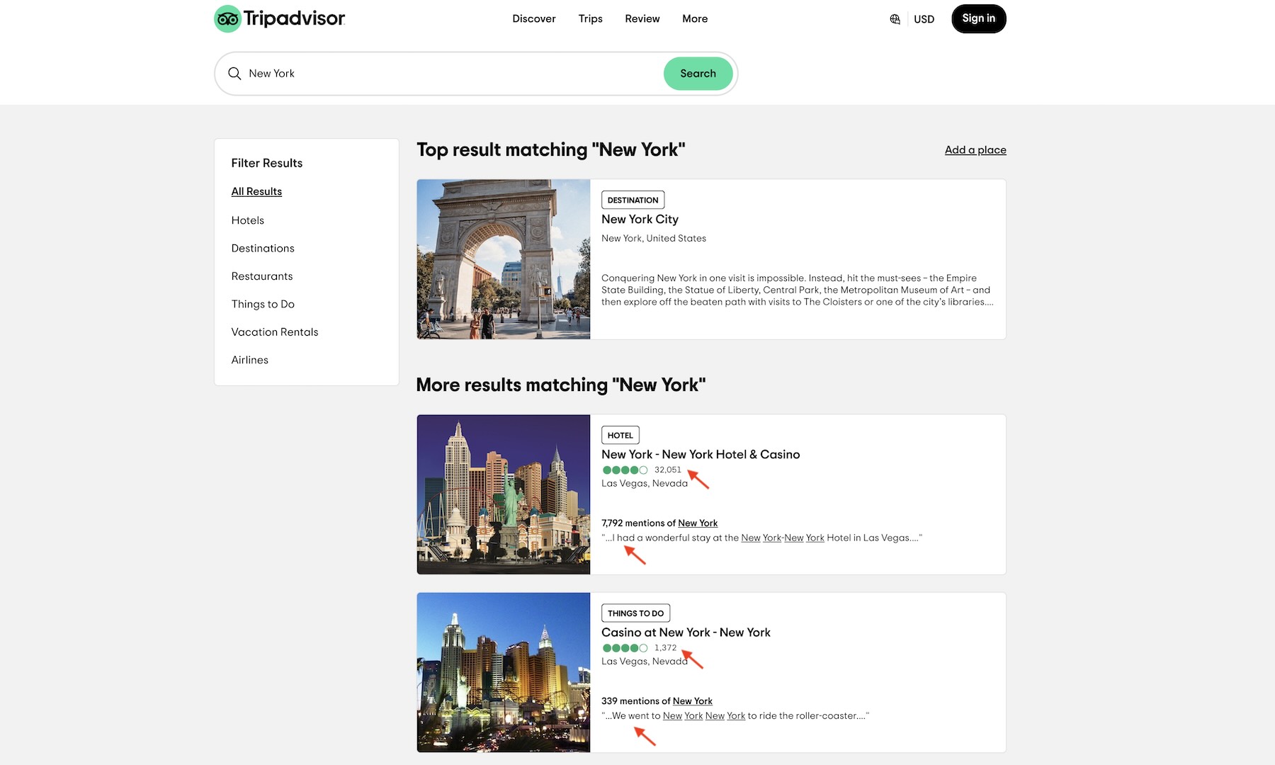
TripAdvisor effectively uses Social Proof by prominently displaying user reviews, ratings, and photos for hotels, restaurants, and attractions. Listings highlight details like average ratings and awards, reinforcing credibility. By aligning with users’ mental models—trusting collective opinions—TripAdvisor reassures users that their decisions are informed by real experiences, building confidence and reducing hesitation.
23. Cognitive Load Theory
What to do: Simplify user interactions and minimize unnecessary information to reduce cognitive strain.
Why it matters: Cognitive Load Theory emphasizes that users have a limited capacity to process information. Overloading this capacity can lead to confusion, errors, and frustration, negatively impacting the user experience.
How to implement:
- Limit the number of choices or steps in a process.
- Use visual hierarchy to prioritize key information.
- Break complex tasks into smaller, manageable chunks.
Delta Air Lines simplifies the flight booking and check-in process by breaking them into clear, sequential steps. Additionally, the mobile app provides users with concise flight updates and reminders to reduce cognitive overload while traveling.

24. Cognitive Dissonance
What to do: Minimize contradictions in messaging and design to prevent user discomfort or confusion.
Why it matters: Cognitive Dissonance occurs when there’s a conflict between users’ beliefs, actions, and expectations. This psychological discomfort can lead to frustration and hinder user engagement, causing users to abandon tasks or disengage with the product.
How to implement:
- Provide reassurance during key decision-making moments, such as customer reviews, return policies, or guarantees, to ease buyer concerns.
- Offer clear explanations for product features and benefits to align expectations with reality.
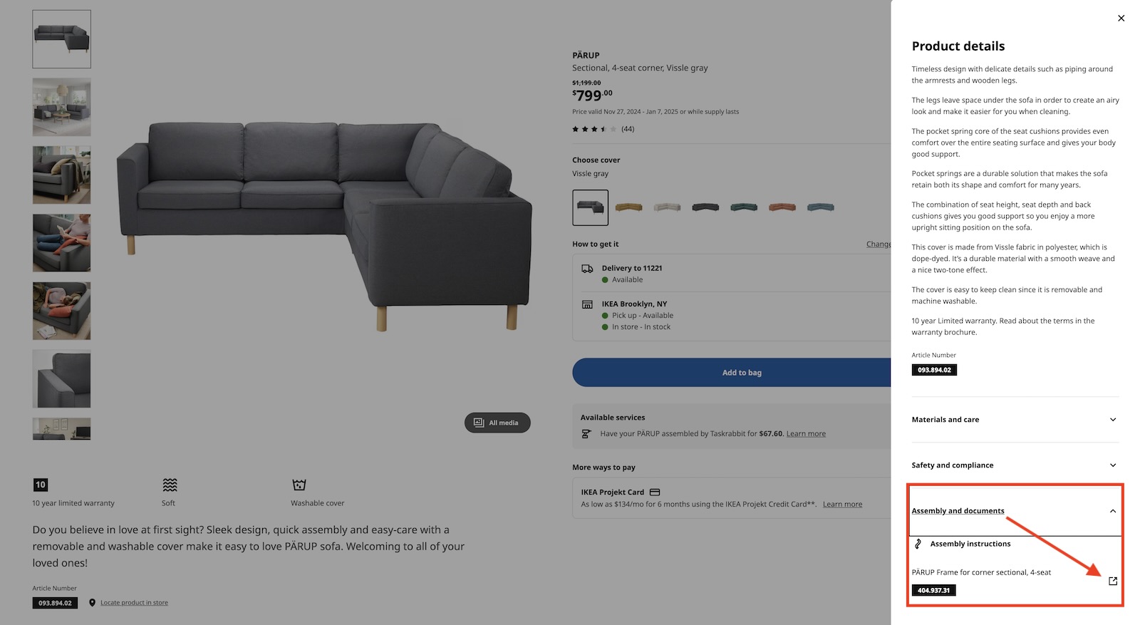
IKEA addresses cognitive dissonance by offering detailed assembly instructions and video tutorials for their products. They further reduce customer apprehension with their “No Questions Asked” return policy, ensuring buyers feel secure about their purchases even if they change their minds later.
25. Behavioral Targeting
What to do: Use user data and behavioral insights to tailor content and experiences to individual preferences and actions.
Why it matters: Behavioral targeting improves user engagement by showing relevant content and offers, increasing the likelihood of conversion and satisfaction.
How to implement: Collect data on user behavior, such as browsing patterns, clicks, and previous interactions. Use this information to present personalized recommendations, offers, or content that aligns with the user’s interests and actions.
Streaming services like Netflix and YouTube use behavioral targeting by recommending videos based on past viewing history, keeping the user engaged with personalized content that encourages longer usage.

26. Progressive Disclosure
What to do: Gradually reveal information or options to the user, keeping initial interactions simple and allowing for more detailed content to be discovered as needed.
Why it matters: Progressive Disclosure helps to manage cognitive load by presenting only the necessary information at each stage, allowing users to focus on their current task without distraction. It also ensures that more advanced or detailed options are available without cluttering the user interface.
How to implement:
- Present users with essential information first, and offer the option to view more details as needed.
- Use expandable sections or “More Info” links to keep interfaces clean and organized.
- Offer advanced settings in a secondary or hidden menu for experienced users who need more control.
On Airbnb, when a user is browsing listings, they are first shown basic details like price, location, and amenities. If they wish, they can click to view more information, such as cancellation policies, neighborhood details, and host reviews. This allows Airbnb to keep the interface simple and easy to navigate while providing advanced users with more in-depth content as needed.

27. Loss Aversion
What to do: Highlight potential losses more than gains to encourage user actions that help avoid negative outcomes.
Why it matters: Loss Aversion suggests that people are more motivated by the fear of losing something than by the possibility of gaining something of equal value. By emphasizing potential losses, users are more likely to take action to prevent them.
How to implement:
- Use messaging that emphasizes the risk of loss if the user doesn’t take action.
- Present “time-sensitive” offers that imply scarcity, encouraging users to act quickly.
- Highlight consequences of inaction in CTAs (Call to Action), like “Don’t miss out” or “Limited time offer.”
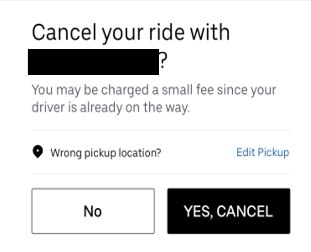
Uber uses loss aversion in its pricing strategy. When a user attempts to cancel a ride, a message may appear saying, “You’ll lose your $5 cancellation fee if you proceed.” This highlights the loss users would incur, encouraging them to reconsider canceling the ride.
28. Anchoring Bias
What to do: Present an initial reference point (anchor) to influence user perception of subsequent information or choices.
Why it matters: Anchoring Bias occurs when people rely too heavily on the first piece of information they encounter (the anchor) to make subsequent judgments. This initial reference can shape their decisions, even if the anchor itself is arbitrary or irrelevant.
How to implement:
- Display higher-priced options first to make lower-priced items seem like a better deal.
- Use “original prices” alongside discounts to highlight savings and make deals appear more attractive.
- Introduce a premium option to make standard options seem more affordable.
Booking.com frequently uses Anchoring Bias by showing a high “original price” next to discounted prices. For instance, a hotel room might be listed for $200, but a special offer shows it as being available for $120, with the original price “crossed out.” This creates the illusion of a better deal, encouraging users to act quickly to “save” money.

29. Confirmation Bias
What to do: Design products that consider the user’s prior beliefs and preferences, but provide balanced information to avoid reinforcing biases.
Why it matters: Confirmation bias refers to the tendency of users to search for, interpret, and remember information that confirms their existing beliefs. If not carefully managed, it can lead to poor decision-making or overly narrow perspectives. Designing for this bias can guide users to explore new possibilities while respecting their preferences.
How to implement:
- Present diverse perspectives: Offer users information that challenges their beliefs or presents alternative viewpoints (e.g., recommend products based on diverse tastes, not just past behavior).
- Encourage critical thinking: Provide users with thoughtful prompts or related information that might help them reconsider assumptions (e.g., showing product comparisons or customer reviews with a variety of opinions).
- Create balanced content: When presenting recommendations or options, balance choices based on the user’s behavior while introducing alternatives that might be outside their usual preferences.
Netflix uses algorithms to recommend shows based on past viewing habits but occasionally highlights trending or critically acclaimed content outside the user’s usual interests, encouraging them to explore new genres.

30. User-Centered Design
What to do: Focus the design process on understanding the needs, preferences, and behaviors of the users to create intuitive and effective products.
Why it matters: User-Centered Design (UCD) ensures that the product is optimized for the actual users, leading to a better experience, increased satisfaction, and higher user engagement. It helps designers focus on real-world usage rather than assumptions, reducing friction and improving usability.
How to implement: Incorporating psychological principles into your design process can elevate the user experience significantly. Here are practical steps to integrate these concepts into your design workflow:
- User research: Conduct in-depth user research to understand your audience’s behaviors, preferences, and pain points. This can be done through interviews, surveys, and behavioral analysis tools, providing valuable insights into how users interact with your product and how their psychological needs can be met.
- Personas: Develop personas that represent key user groups to keep design decisions aligned with user characteristics and goals.
- Test and iterate: Prototyping and usability testing are essential for understanding the real-world application of these psychological principles. Create low-fidelity prototypes and gather user feedback to refine the design. Iteration ensures that the design remains user-centered and behaviorally optimized.
- Focus on simplicity: Reducing cognitive load is key to a seamless user experience. Ensure that the interface is simple, intuitive, and easy to navigate, with elements like clear calls-to-action and minimalistic design that don’t overwhelm the user.
- Leverage feedback: Continuous improvement should be driven by user feedback. Regularly collect data from analytics tools, surveys, and direct user input to refine the experience based on evolving needs and behaviors. This ensures the product remains engaging and relevant to the target audience.
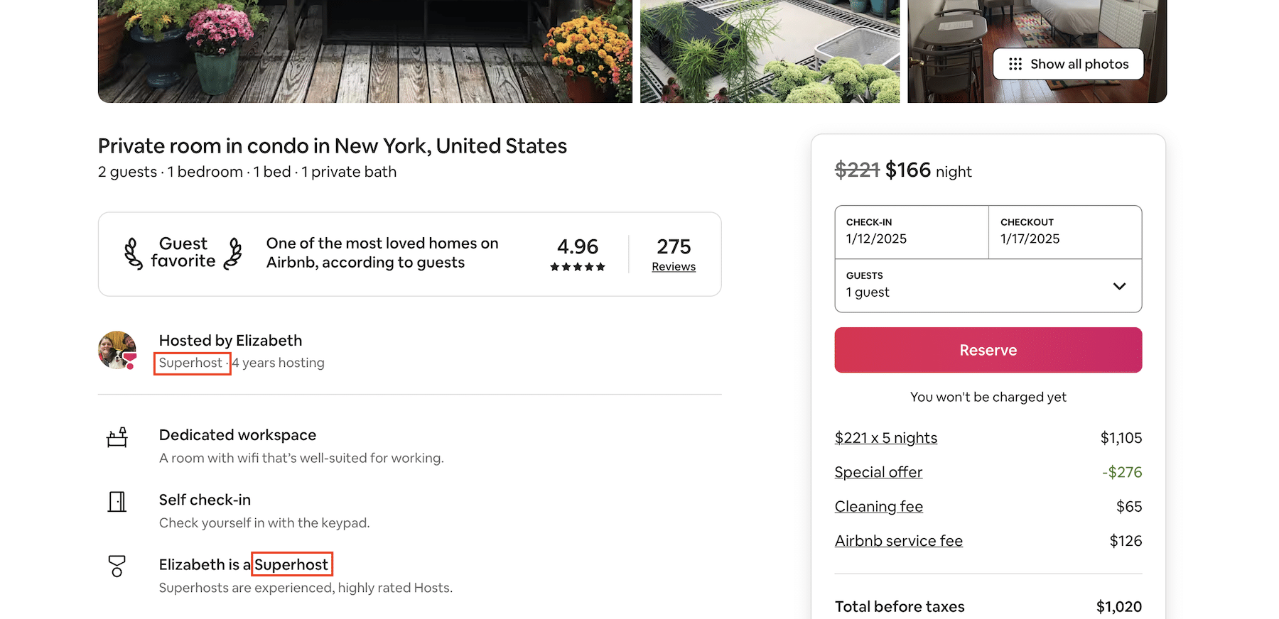
Airbnb utilizes User-Centered Design by incorporating user feedback to continuously improve their platform. Through user research, they understood the need for a seamless booking process and made improvements, like the “Superhost” badge, to enhance trust and help users make informed decisions faster.
What to do: Organize content in a way that guides users’ attention to the most important elements first, using size, color, contrast, spacing, and placement.
Why it matters: Visual hierarchy helps users navigate a page or interface intuitively. By prioritizing elements based on their importance, users can quickly find and interact with what matters most, leading to a more effective and efficient experience.
How to implement:
Read the blog post below for a deep dive into visual design principles.
32. Emotional Design

What to do: I believe the first step is ensuring my product is functional, then I can start layering emotional elements. This process involves diving deep into understanding user emotions, preferences, and behaviors through comprehensive UX research.
Why it matters: Emotional design can significantly transform how users perceive and interact with my product. It leads to increased engagement, fosters loyalty, and creates a more pleasant user experience. By addressing users’ emotional needs, I can make my products memorable and strengthen the bond between users and my brand.
Here’s why Don Norman’s three levels of design model matters:
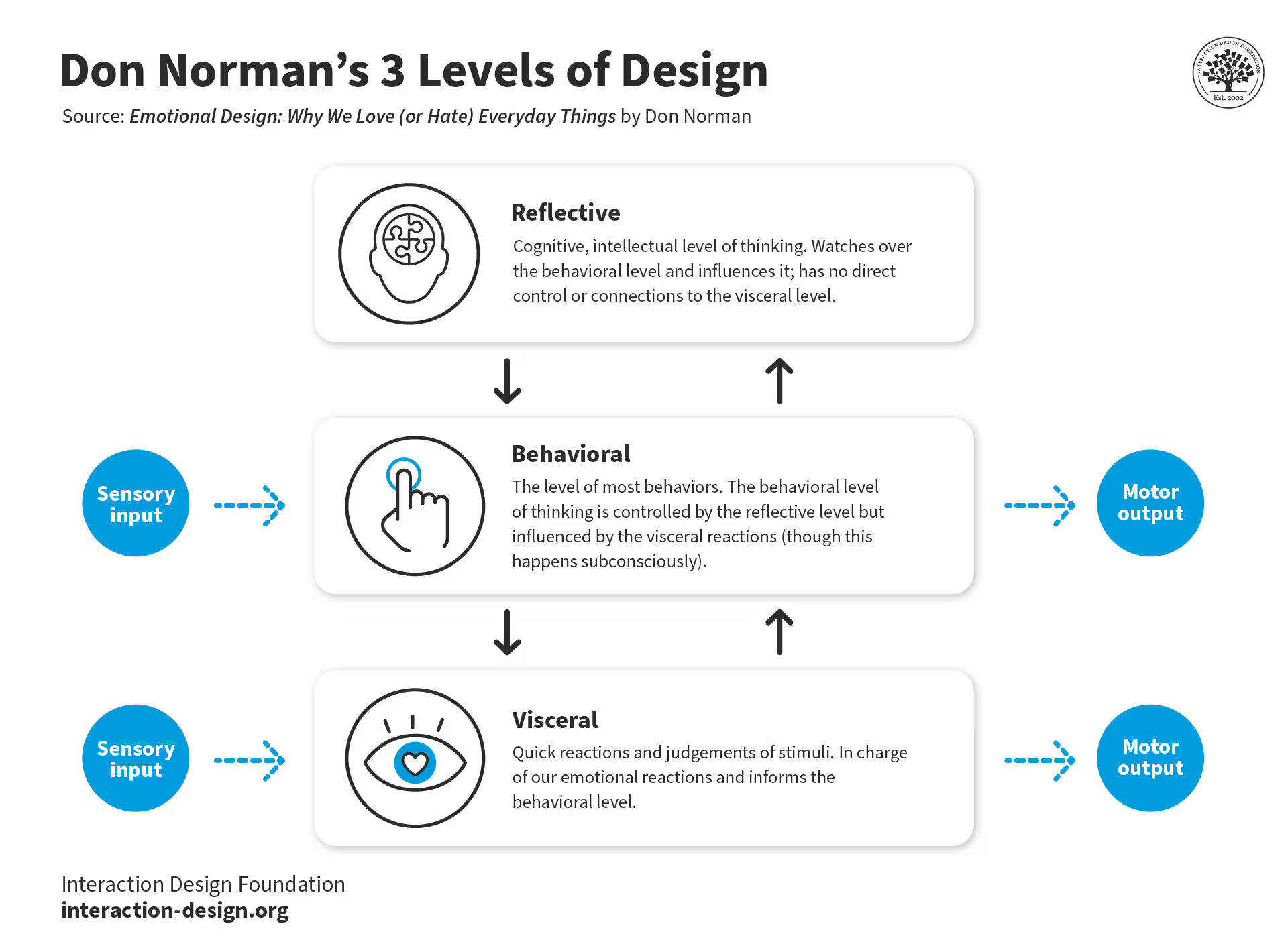
- Visceral: This level is about the initial, instinctive reaction to the product’s appearance, feel, or sound. It’s crucial because first impressions can make or break user interest. A visually appealing or sensorially pleasing product can immediately attract users, setting a positive tone for further engagement.
- Behavioral: Here, the focus is on how well the product performs and how users interact with it. This level matters because it directly affects user satisfaction. If a product is easy to use and effective, users will feel competent and enjoy the experience, leading to higher retention and advocacy.
- Reflective: This level deals with the user’s self-image, memories, and the meaning they derive from the product. It’s significant because it influences long-term loyalty and brand perception. Products that resonate on a personal or cultural level can become part of a user’s identity, fostering a deep, lasting connection with the brand.
How to implement:
- Personality integration: Develop a unique character or mascot for my brand to make users feel more connected. This character should embody the brand’s ethos and appeal to the target audience.
- User engagement: Treat users like old friends by personalizing interactions. This includes remembering user preferences or greeting them in a friendly, familiar manner, which enhances the feeling of being known and valued.
- Visual design: Use color psychology effectively, like using blue to instill trust in banking apps. Contrast guides attention or evokes specific emotional responses.
- Crafting copy: Pay close attention to the tone in my copywriting, making sure it matches the brand’s personality while aiming to evoke positive emotions. The choice of words, phrases, and even the font style should align with the desired emotional impact.
- Microcopy customization: Ensure that small text elements like button labels or error messages resonate with the overall tone of my brand, providing continuity in the user experience.
- Multimedia use: Utilize video and sound to convey my brand’s character more vividly. This might include tutorial videos from a mascot or sound effects that match the brand’s playful or serious tone.
- Personalized experiences: Tailor content or features based on user data, suggesting products, services, or content based on past behavior, making each interaction feel bespoke.
- Surprises and rewards: Incorporate elements that delight, like unexpected rewards for user actions or hidden Easter eggs, adding an element of discovery and joy.
- Storytelling: Embed stories in designs to make the user journey more engaging, whether through the narrative of the product’s development, user testimonials, or interactive scenarios.
- Error management: When issues arise, respond with empathy, using humorous or light-hearted messages to mitigate frustration. Also consider offering small compensations like additional features or discounts as a gesture of goodwill.
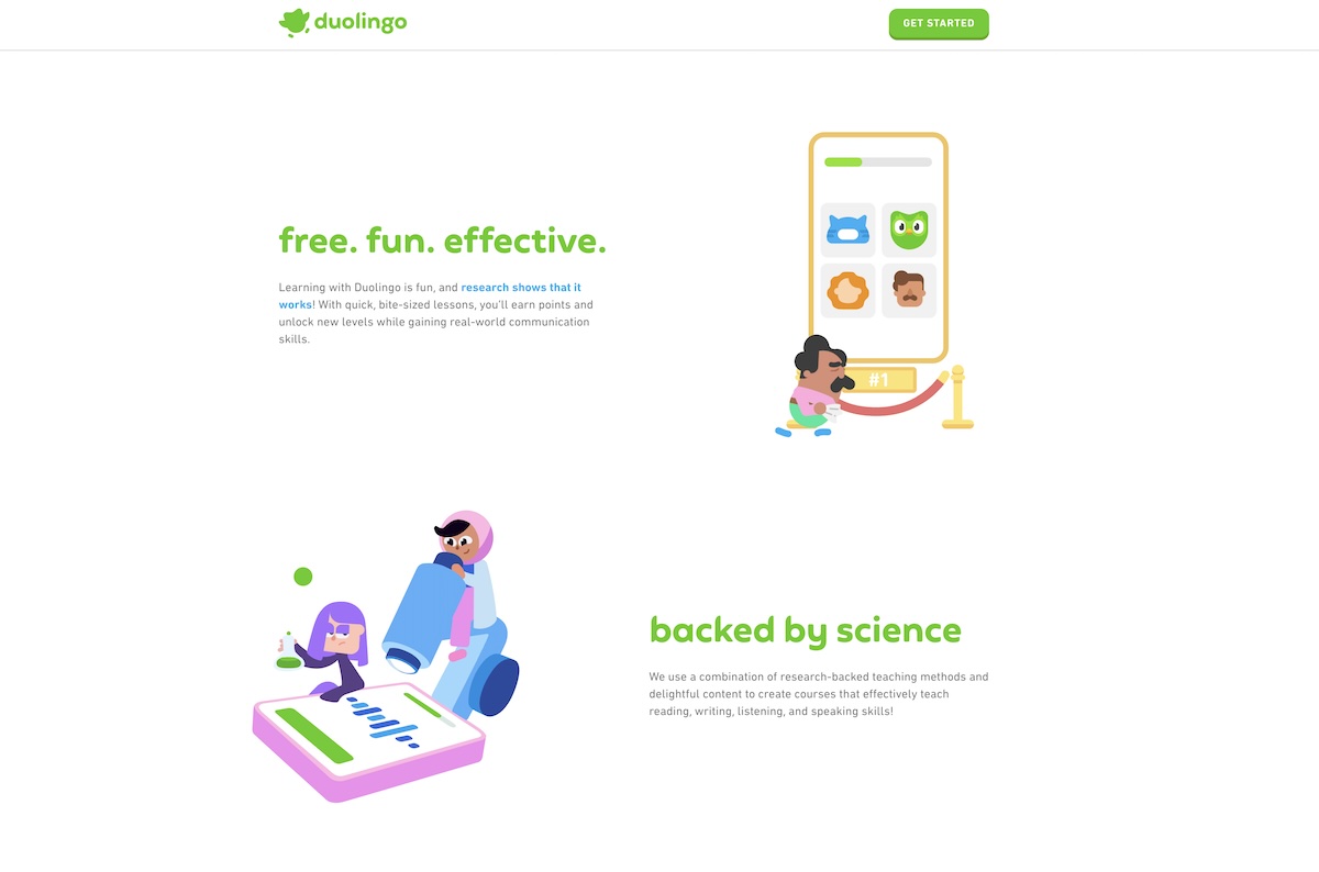
Duolingo leverages Emotional Design to make language learning fun and engaging. The app features a friendly owl mascot, playful sound effects, and celebratory animations that evoke joy and achievement. Gamification elements like streaks and badges keep users motivated, while supportive reminders encourage continued learning. These elements create a positive, emotional connection, fostering loyalty and long-term engagement.
33. Constraint Design
What to do: Implement design constraints to guide user behavior and prevent errors, ensuring users make choices within a defined set of options.
Why it matters: Constraints simplify user decision-making and prevent overwhelming or incorrect actions. By limiting the range of options available, constraints help users stay focused and enhance the overall user experience by avoiding mistakes or confusion.
How to implement:
- Limit choices: Provide users with only the necessary options, hiding advanced features or settings unless needed. For example, when signing up for a service, only request essential information (name, email, password) rather than overwhelming the user with excessive fields.
- Prevent errors: Design forms or workflows with built-in limitations, such as dropdown menus instead of free-text input or date pickers to prevent manual entry errors.
- Enforce correct sequences: Structure actions in a step-by-step process that guides users logically through the task (e.g., requiring a user to complete a profile before moving on to other settings).
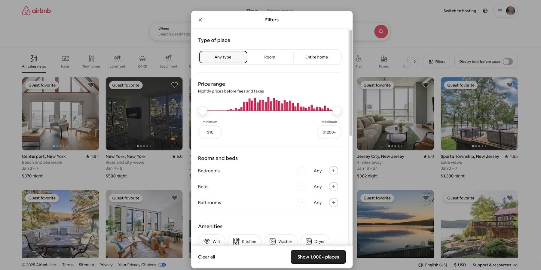
Airbnb implements constraints by allowing users to search for properties based on specific filters, such as location, price range, and amenities. This limitation helps users refine their search and avoid being overwhelmed by irrelevant options.
34. Color Psychology
What to do: Use colors thoughtfully to evoke emotions and influence user behavior based on psychological associations with color.
Why it matters: Color psychology suggests that different colors can evoke specific emotional responses and can influence actions. Understanding these associations helps create designs that resonate with users, improve usability, and drive conversion rates.
How to implement:
- Use blue for trust and security (ideal for financial services or healthcare).
- Apply red to create urgency or encourage action (perfect for sales, CTA buttons, or limited-time offers).
- Utilize green to evoke a sense of calm and balance (ideal for environmental or wellness-related designs).
- Incorporate yellow to draw attention, especially for warnings or calls to action.
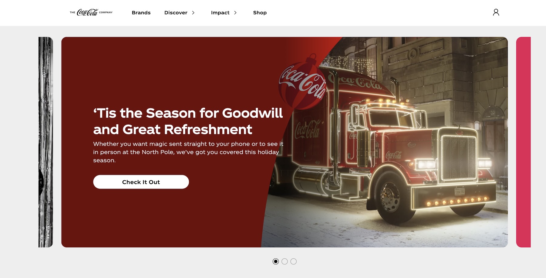
Coca-Cola uses a predominantly red color scheme in its branding to invoke excitement, urgency, and energy. This aligns with its messaging around happiness, refreshment, and enjoyment, making it highly recognizable and emotionally engaging for consumers.
What to do: Focus on creating memorable moments at the high points (peaks) and ending experiences with a positive or impactful conclusion.
Why it matters: The Peak-End Rule states that people tend to judge an experience based on its most intense moments (peaks) and the way it ends, rather than the overall experience. Designing with this principle in mind can lead to more positive user perceptions, higher satisfaction, and stronger emotional connections.
How to implement:
- Identify key moments in the user journey where you can deliver peak experiences (e.g., delightful interactions or surprises).
- Ensure that the experience ends on a high note, such as a smooth checkout process, a thank-you message, or a positive post-purchase engagement.
MailChimp’s final confirmation page for sending campaigns is a perfect application of “The Peak-End Rule.” It acknowledges the gravity of the moment with a playful, encouraging message like, “You’re about to send your campaign to 1,373 subscribers. This is your moment of glory.” The interface also features a fun animation of a sweating chimp hand hovering over a red button, creating a memorable and emotionally engaging peak experience. Once the campaign is sent, a confirmation message with celebratory visuals ensures the experience ends on a positive note, leaving users feeling accomplished and confident.

36. Affordance
What to do: Design interface elements that clearly suggest their function or use.
Why it matters: Affordances guide users by providing clear, intuitive clues about how to interact with UI components. This improves the user experience by making the interface more intuitive and efficient to use.
How to implement:
- Make buttons appear clickable by using design cues like shadows, gradients, or color contrast.
- Design sliders or toggles with visual cues to suggest they can be dragged or switched.
- Use familiar iconography (e.g., a trash can icon for deleting, a magnifying glass for search).
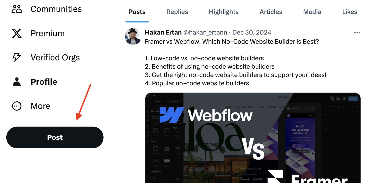
On Twitter, the “Post” button is designed with a black color and pill shape, which visually communicates that it is an actionable item. This simple, clean design ensures that users can quickly identify and use it to post their thoughts without hesitation.
37. Trust Signals
What to do: Display elements that reassure users about the credibility, security, and reliability of your product or service.
Why it matters: Trust signals help reduce user hesitation and anxiety, fostering a sense of safety and reliability. Users are more likely to engage, share personal information, or make a purchase when they feel confident that their interaction with your product is secure and trustworthy.
How to implement:
- Display secure payment badges (e.g., PayPal, Visa, MasterCard) on checkout pages.
- Show customer reviews, ratings, or testimonials prominently on product pages.
- Use clear privacy policies and terms of service linked in accessible locations.
- Highlight industry certifications, security protocols, or any trusted affiliations (e.g., “Trusted by over 1 million users”).
Airbnb displays trust signals such as verified guest and host profiles, reviews from previous users, and secure payment options throughout its platform to create a sense of security and reliability for users booking or hosting accommodations.

38. Feedback
What to do: Provide clear, timely feedback after a user interacts with an interface element.
Why it matters: Feedback helps users understand the results of their actions, providing reassurance and guidance to improve user satisfaction and prevent confusion.
How to implement:
- Use loading indicators, success messages, or visual changes to confirm actions.
- For example, when a user adds an item to their cart, display a visual confirmation like a mini pop-up message or animation.
- Provide error messages or helpful hints when something goes wrong, like a red warning message if a user enters invalid information.
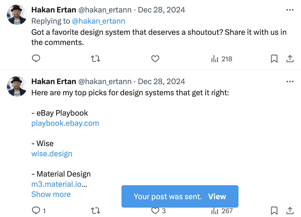
Twitter provides immediate feedback when a user posts a tweet, displaying a confirmation message like “Your post was sent.” It also updates the post count and shows the newly posted post, allowing users to quickly see their action was successful.
Conclusion: Design that connects, inspires, and engages
The intersection of psychology and product design presents a unique opportunity to create experiences that are not only functional but also emotionally resonant. By understanding how users think, feel, and behave, designers can create products that anticipate needs, reduce friction, and foster lasting connections.
Incorporating psychological principles into design is about more than just optimizing usability—it’s about crafting experiences that engage users on a deeper level. Whether through reducing decision fatigue, triggering emotional responses, or providing personalized interactions, these principles help create user experiences that feel natural, intuitive, and even delightful.
By taking a psychological approach to product design, you can ensure that your designs not only meet functional goals but also resonate with users, driving both satisfaction and loyalty. The next time you set out to design a product, remember that the most successful designs are those that reflect a deep understanding of the people who will use them.
What psychological principle has most influenced your design work? Feel free to share your thoughts and experiences!
